Adobe Illustrator Tutorials

MaD-DoC

Member
Oct 27, 2007
6,337
22
0
SLIIT/Malabe
Adobe Illustrator Tutorials http://www.ndesign-studio.com/

Step-by-step Adobe Illustrator tutorials with original source file download. These Illustrator techniques are intended for intermediate users (require some basic knowledge of Illustrator).


Disclaimer
You are free to link, print, and share these tutorials; however, please do not publish (copy & paste directly) on your site, forums, publications, etc.


Halloween Pumpkin

pumpkin.jpg


Let’s have some fun. Learn how to draw a realistic Halloween pumpkin in Illustrator so you can attach to your ecard or email.
Version: Illustrator 9+
Download Source File
1. Basic shapes

First, use the Pen tool and draw the basic shapes of the pumpkin.
1.gif

2. Fill Gradient

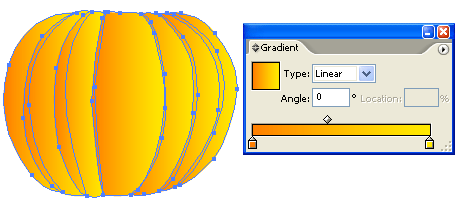
Fill the shapes with a linear gradient with no stroke fill. Gradient color1: R=255 G=127 B=0, color2: R=255 G=127 B=0
2.gif

3. Shading

Select all shapes, go to menu Edit > Copy (Ctrl+C). Then go to menu Edit > Paste in Front (Ctrl+F) to paste in position.

3.gif


With the shapes remain selected, open Pathfinder palette (Window > Pathfinder). Hold down Alt key, click on Add to shape area. This will merge shapes together.
4.gif

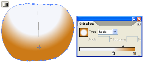
Select the following gradient setting - color1: R=255 G=255 B=255, color2: R=204 G=122 B=22. Slide the white picker toward the right side. With the merged shape remain selected, drag from the upper center toward bottom.
5.gif

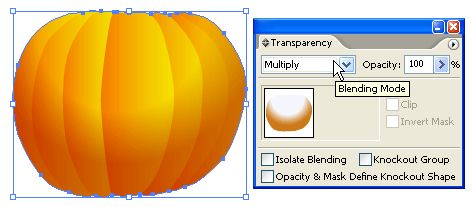
Change the Blending Mode of the merged shape to Multiply.
6.gif

4. Stem

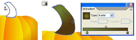
Use the Pen tool and draw a shape of stem on top of the pumpkin. Fill it with a radial gradient as shown. Gradient color1: R=111 G=129 B=46, color2: R=82 G=56 B=17.
7.gif


5. Cutout Face

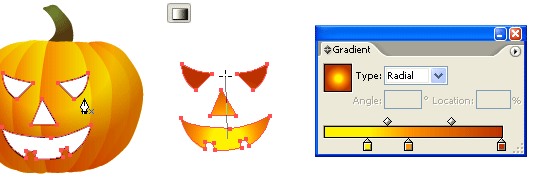
Make a new layer on top of the pumpkin. Use the Pen tool and draw the basic shapes of the face. Select all the shapes (face only), use the Gradient tool and fill it with a radial gradient as shown. Gradient color1: R=255 G=242 B=0, color2: R=255 G=146 B=0, color3: R=187 G=50 B=0.
8.gif

6. Depth

Now, we need to add some depth to the pumpkin cutouts. Use the Pen tool, roughly draw a shape intersect with the left eye cutout. Then Copy the left eye and Paste in Front. Select the left eye shape and the intersect shape, go to Pathfinder, hold down Alt key and click on Intersect shape areas.
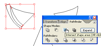
9.gif

Repeat this step until you get all the features done (eyes, nose, and mouth).
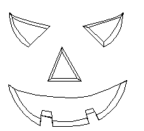
10.gif

7. Shadow & Highligh

Fill the shadow area with a darker gradient (color1: R=255 G=146 B=0, color2: R=187 G=50 B=0). Then fill the highlight area with a lighter gradient (color1: R=255 G=255 B=139, color2: R=255 G=164 B=0).
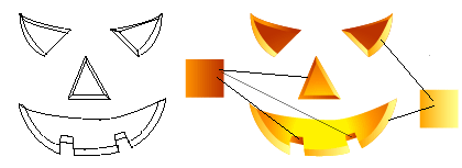
11.gif

Final

That’s it!
12.gif
 
Last edited:

MaD-DoC

Member
Oct 27, 2007
6,337
22
0
SLIIT/Malabe
3D Logo

3d-logo.gif


This tutorial will show you how to make 3D gradient logo in minutes. This technique is great for making 3D graphic objects and icons.
Version: Illustrator CS2
Download Source File
1. 3D text

Use the Type tool, type in "3D Logo". Go to Effect >Warp > Arc and apply the following setting:
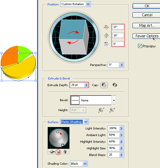
1.gif

2. 3D Extrude & Bevel

Then go to Effect > 3D > Extrude & Bevel and apply the setting as shown in the image below. You can drag around the cube to set the X,Y,Z rotation values. Set the Extrude Depth to 20pt.
2.gif

3. Expand Appearance

Now go to Object > Expand Appearance to remove all effects and convert to paths. After the text object is expanded, Ungrounp the object by Object > Ungroup or press Ctrl+Shift+G. You probably need to do Ungroup 4-5 times in order to break the object apart.
3.gif

4. Merge paths

Select the round corner paths and merge them together by the Pathfinder tool. Hold down Alt key, click on the Add to shape area and the selected paths will be merged. Repeat this step to clean up all round corner paths.
4.gif

5. Apply gradient

Select the top level paths and apply a yellow-green color gradient.
5.gif

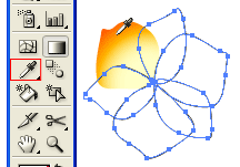
6. Eyedropper

Select the back(depth) paths, use the Eyedropper tool and click on the front paths. This will copy the gradient fill.
6.gif

7. Darken

Keep the back paths selected, go to Gradient pallete and adjust the gradient colors to darker tone.
7.gif

8. 3D logo

You can use this technique to make 3D objects from any shape, text, etc.
Here are the steps:
  1. Apply 3D Extrude & Bevel effect
  2. Expand object
  3. Ungroup object
  4. Apply gradient
  5. Eyedropper gradient fill
9.gif

More…

Here are more samples I made using the same technique.
more-3d-logo.jpg
 
  • Like
Reactions: Challenger SRT8

MaD-DoC

Member
Oct 27, 2007
6,337
22
0
SLIIT/Malabe
iTune Icon

itune-logo.jpg


the challange of this tutorial is to use various Blending modes and blending techniques to replicate the iTune icon. This tutorial is a good exercise to master your Blend techniques.
Version: Illustrator 9+
Download Source File
1. Basic shapes

Start making the basic shapes of the iTune icon. If you need help on how to trace from an image, visit my Tracing Photo tutorial.
1.gif

2. Music note

Make a glossy orb by using my Glossy Button technique. First, make 3 shapes from light color to dark color. Go to Object > Blend > Blend Options, select Specified Steps = 128. Then select all 3 shapes and press Ctrl + Alt + B or go to Object > Blend > Make.
2.gif

Reflection

Make an oval shape and fill with black-white gradient. Make sure the black color is full black (C,M,Y,K=100). Drag it on top of the orb and select Screen Blending Mode.
3.gif

Highlights

Make a tall vertical rectangle and an elongate circle; then Blend it. Duplicate it by Alt-drag to the right.

4.gif


Make a 3 color gradient path.
5.gif

Make another highlight using the same Blending technique as in the previous step and select Screen Blending Mode.
6.gif

3. CD

Use the Gradient tool and fill the CD shapes with white-grey gradient.
7.gif

Rainbow Gradient

Make some multi-color line strokes as shown below. Make sure the first and last stroke is white because it will be transparent. Use the Blend Tool (W), click on the edge of each stroke starting from left to right.
8.gif

Mask

Use the CD shape and mask the rainbow gradient by Ctrl+7 or Object > Clipping Mask > Make. Then select Multiply Blending Mode and adjust the Opacity to 26%.

9.gif


Repeat the previous step to make another rainbow gradient.
10.gif

4. Music note refection

Make 3 oval paths, make sure the outer path is white color(this will make a glow effect). Select all 3 paths, go to Object > Blend > Make (Ctl+Alt+B).
11.gif

Drag it below the music note and select Multiply Blending Mode , 37% Opacity. Duplicate the refection object by Alt-drag to the right side.
12.gif

5. Drop Shadow

The last step is to apply a Drop Shadow effect to the CD. Select the outer CD path, go to Effect > Stylize > Drop Shadow and apply the following setting:
13.gif

Final

Here is the final iTune icon!
final.jpg
 

MaD-DoC

Member
Oct 27, 2007
6,337
22
0
SLIIT/Malabe
Tracing Photo

Tracing Photo

tracing-human.gif


Full detailed tutorial on how to draw and trace people from a photo. Learn how to create realistic illustration with just simple gradient fill. No massive Gradient Mesh!
Version: Illustrator 9+
Download Source File
1. Place a photo

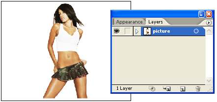
First place a photo in Layer 1 by File > Place or Copy & Paste from clip board. Double click on Layer 1 to change the Layer Options. Set Dim Images to: 30% and lock layer.
1.gif

2. Start tracing

Make a new layer (Layer 2). Hold down Ctrl key and click on the eye icon of Layer 2 to view Layer 2 in Outline mode.
2.gif

Use the Pen Tool and start tracing the basic features of the girl. While you are tracing, there are couple shortcut keys you should know in order to work more faster.
These shortcuts are:
  • Ctrl+[ = Send Backward (This will send object back 1 step)
  • Ctrl+] = Bring Forward (This will bring object front 1 step)
  • Ctrl+Shift+[ = Send to Back (This will send object all the way to the back)
  • Ctrl+Shift+] = Bring to Front (This will bring object all the way to the front)
  • Ctrl+F = Paste in Front (This will paste object in front with same position)
3.gif


3. Make shadow

Draw a new path as shown (top). Then Copy the base path of the face and Paste in Front. Select the copied base path and the new path, open your Pathfinder, Alt-click on Intersect shape areas.
4.gif

Use the same technique from previous step and make all shadow paths for the overall illustration. You don’t have to get into the details yet, one simple shadow path of each part is good enough (ie. eye, lips, shirt, body, etc). Remember to use Ctrl+C for copy; and Ctrl+F to paste object in front. Trust me, this will save you a lot of time!
5.gif

4. Fill in base color

Now fill in the base color for the face, eye, lips, and eyebrow.
6.gif

5. Shadow gradient

Fill the shadow path of the face with a Gradient (white-skin tone) and select Multiply for Blending Mode.

7.gif


Select the other shadow paths and use the Eyedropper Tool to copy the gradient fill of the main shadow path.
8.gif

For the lip and eye shadow, use the Eyedropper to copy the base fill and select Multiply Blending Mode.
6. Body

Use the same technique, copy the gradient fill for the body. Note you might to adjust the gradient of each shadow path to blend in with the overall illustration.
9.gif

7. Hair

Pretty much the same, fill 1 path with the gradient, then use the Eyedropper Tool to copy the fill.
10.gif

8. Shirt

Same technique as the previous steps.

11.gif


9. Skirt

Fill the skirt with a blue gradient, then use the Eyedropper Tool to copy the fill for the shadow.
12.gif

10. Hair details

Now you can add more details to the hair. Make shadow effect by adding Multiply paths. Add some highlights by using lighter gradient color. If you want, you can add more details to the clothes, lips, or add a cool tattoo on her body.
13.gif

Final

After you get used to this tracing technique, you can basically trace anything!
final.gif

More Samples

Here are some samples that I traced from photo using the same technique.
illustration-samples.jpg
 

MaD-DoC

Member
Oct 27, 2007
6,337
22
0
SLIIT/Malabe
Stylish Vector Flower

Stylish Vector Flower

stylish-flower.gif
Learn how to create stylish vector/line flower with Illustrator Blend Tool. This Adobe Illustrator tutorial is great for creating background and large print illustration.
Version: Illustrator 8+
Download Source File
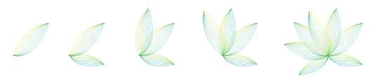
1. Flower petal

Create two stroke paths: one yellow and one blue.
1.gif

2. Blend Options

Go to Object > Blend > Blend Options and set it to Specified Steps = 10. Specified Steps basically tells how many step to blend from 1 object to another.
2.gif

Blend

Now select the 2 petal paths, go to Object > Blend > Make or press Ctrl + Alt + B and you should get something looks like the image shown below.
3.gif

3. Duplicate more petals

Duplicate more petals to form the flower by Copy & Paste or Alt + Drag.
4.gif

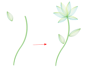
4. Stem

Create a stem by using the same Blend technique as in the previous step. Here I set the Specified Steps = 8.

5.gif


5. Leaf

The leaf is formed by 2 parts, top and bottom. I use Specified Steps = 5 here.
6.gif

6. Put them together

Now put them together to create a beautiful flower.
7.gif

7. Right long leaf

Create a long leaf with Blend step = 3.
8.gif

8. Left long leaf

Repeat the previous step to create the left long leaf.
9.gif

Final

Your final image should looks like the image shown below:
final.gif

More…

Play around with the stroke color, stroke weight, Blend step, Transparency and you might get unexpected nice result. Here is a sample I did in Photoshop, with different Blend Mode, Multiply and Darken. This image style is good for creating website header, banner, wallpaper, background, large print, etc.
more.jpg
 
  • Like
Reactions: djprabhath

MaD-DoC

Member
Oct 27, 2007
6,337
22
0
SLIIT/Malabe
Illustrator CS2 Splash

Illustrator CS2 Splash

illustrator-splash-page.jpg


The previous tutorial shows you how to make Photoshop splash graphic, this Illustrator tutorial will show you how to make Illustrator CS2 splash graphic using the simple gradient and Multiply Blending mode.
Version: Illustrator 9+
Download Source File
1. Create the flower paths

First create the paths of the flower with the Pen Tool.
1.gif

2. Apply Gradient color

Select one of the petals, fill it with Radial Gradient (pick similar colors as shown) and select Multiply in Transparency pallate.
2.gif

Select the un-filled petals, use the Eyedropper Tool, click on the gradient petal to copy the fill. You might need to adjust the gradient fill of each petal with the Gradient Tool.
3.gif

3. Filament

Create a filament, fill it with Linear Gradient and select Multiply in Transparency pallete.
4.gif

Then duplicate it.
5.gif

4. Center

Use the Ellipse Tool, make a circle, fill it with Radial Gradient (as shown) and select Multiply in Transparency pallate.
6.gif

Final

Duplicate the flower and lower the Opacity (Transparency).
7.jpg
 

MaD-DoC

Member
Oct 27, 2007
6,337
22
0
SLIIT/Malabe
Christmas Hat

Christmas Hat

christmas-hat.jpg


In my previous tutorial I showed how to make a Christmas tree, this tutorial shows you how draw a furry Christmas hat.
Version: Illustrator 9+
Download Source File
1. Hat

Start your hat by drawing 2 basic paths and filling them with Linear gradient (red to darker-red).
1.gif

2. Shadow

Make a path (shadow path) like the image on the left. Select the top part of the hat, Copy & Paste in Front (Ctrl+F). Now, select the copied path and the shadow path, hold down Alt key and select Intersect shape areas in Pathfinder pallate.
2.gif

Your path should looks like the image on the left. Repeat this step to make another shadow path for the bottom part of the hat. Then fill these 2 shadow paths with Linear gradient (red to darker-red), in your Transparency pallate, select Multiply.
3.gif

3. Fur

With your Pen Tool, roughly draw a path like the image on the left and fill it with grey color. Go to Effect > Distort & Transform > Roughen

4.gif


Roughen Options

In your Roughen window, enter the following setting: Size=8%, Detail=95/in, select Corner points. You may click on the Preview check box to preview your result.
5.gif

Make a copy of the grey path by holding down Alt + drag (you may use Copy & Paste if you like) and fill it with white. Scale it down a bit and bring it up slightly above the grey path. Select the top part of the hat and its shadow, bring them to front by Object > Arrange > Bring to Front (Ctrl+Shift+]).
6.gif

Use the Ellipse Tool to make the circle and repeat the previous step to make the furry ball.
7.gif

Final

Your final illustration should looks like the image shown below.
final.gif

Have Fun

Now, have fun with your Christmas hat!
christmas-hat-fun.jpg
 

MaD-DoC

Member
Oct 27, 2007
6,337
22
0
SLIIT/Malabe
Chinese Bamboo

Chinese Bamboo

chinese_bamboo.jpg


Do you like the bamboo scene on my Flash site? Well, here is the quick tutorial. This tutorial will show you how to illustrate Chinese bamboo with Illustrator Symbol Sprayer and Mesh Tool.
Version: Illustrator 10+
Download Source File
1. Draw bamboo body

Create a path like the image shown below with the Pen Tool and fill it with green color. Then, select Mesh Tool
mesh_tool.gif
click on the lower left corner of the bamboo body(pt. 1) and pick a lighter tone color(yellow-green). Then, add another Mesh point at the upper left corner of the bamboo(pt. 2). Just a little right above pt. 2, add another point(pt. 3). Now, add the final point beside pt. 2 and select a darker tone green for shadow.
1.gif

2. Create bamboo stick

Select the bamboo body you’ve created in previous step, hold down the ALT key, drag it up to make a copy (you can use Copy & Paste if you like). Then shrink the new bamboo body horizontally with Selection Tool. Send this new bamboo body behind the first bamboo body by select Object > Arrage > Send Backward or press Ctrl+[. Repeat this step until you get a stack of 5 or 6.
2.gif

3. Duplicate bamboo stick

After you’ve finished the first bamboo, make a copy of it by ALT drag or Copy & Paste. Select the new bamboo stick, apply Filter > Distort > Twist(Angle=3) so that they don’t look identical.

3.gif


4. Draw a bended bamboo

We want the bamboo look natural, not Copy & Paste, so we need to create a bended bamboo. Repeat Step 1 & 2 to create a bended bamboo like the image shown below. Now we 3 different versions of bamboo: straight, bended, and twisted.
4.gif

5. Duplicate more bamboo

Make more bamboo by ALT + drag. Selectively copy from different version of bamboo, resize them or flip them around so they don’t look alike.
5.gif

6. Create bamboo leaves

Create your bamboo leaves like the image on the left(below) and fill it with different tone of green. Again, use Mesh Tool to create the lighter spot.
6.gif

7. Make a bamboo leaves Symbol

After you done with the leaves, drag it to the Symbols Pallate to create a new Symbol. If your Symbols Pallate is not showing, go to Window > Symbols or press Ctrl+Shift+F11.

7.gif


8. Symbol Sprayer Tool

Create a new layer and lock the bamboo sticks layer(Layer 1). Select Symbol Sprayer Tool and pick the bamboo leaves Symbol you have created in previous step. Spray it on Layer 2 by dragging the mouse.
8.gif

9. Symbol Sizer Tool

Now, we need to create various size of bamboo leaves. Select Symbol Sizer Tool, randomly click on the bamboo leaves object. Tips: hold down ALT key+click to reduce size.
9.gif

10. Symbol Spinner Tool

Use Symbol Spinner Tool to rotate/spin Symbols.
10.gif

11. Symbol Shifter Tool

Use Symbol Shifter Tool to spread(by drag) bamboo leaves out.

11.gif


12. Symbol Stainer Tool

Select a lighter yellow-green tone color and use Symbol Stainer Tool to stain Symbols (stain Symbols randomly).
12.gif

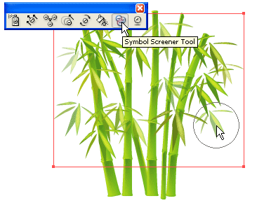
13. Symbol Screener Tool

Use Symbol Screener Tool to reduce bamboo leaves Opacity (selectively click on the leaf symbols). This will get a see-through effect.
13.gif

14. Make more leaves behind

After you done with the leaves on Layer 2, make a new layer(Layer 3) and drag it to the bottom of the layer list. Lock Layer 1 and Layer 2, use Symbol Sprayer Tool to make more bamboo leaves(refer to Step 8-13) on Layer 3.
14.gif

15. Add more bamboo sticks

Finally, duplicate more smaller bamboo sticks and send them behind the big bamboo sticks.
15.gif

16. Final!

Here is the final image.
16.jpg
 

MaD-DoC

Member
Oct 27, 2007
6,337
22
0
SLIIT/Malabe
3D Graphs

3D Graphs

3d-pie-graph.gif


Are you still using the traditional 2D graph for your reports and presentations? This tutorial shows you how to create 3D graphs with Illustrator CS2 at ease.
Version: Illustrator CS2
Download Source File
1. Create the graph

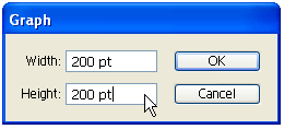
Select the Pie Graph Tool
pie_graph_tool.gif
, click on the Artboard/screen, then enter 200×200px.
1.gif

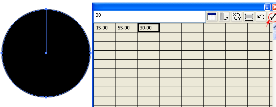
Data Table

Your graph data table will pop up like the image below. Enter 15, 55, 30 and then click on the check mark to apply data. You may close this data table now.
2.gif

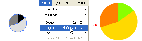
2. Ungroup the graph

You need to ungroup or break the graph in order to apply color and effects to each piece. With the graph selected, go to Object > Ungroup or press Ctrl+Shift+G. There will be a warning box(After a graph is ungrouped you will no longer be able to access its graph style, its data or change its graph designs.) just click Yes. Now Ungroup again, first Ungroup is to break the graph, second Ungroup is to break the object into pieces. Fill with any color as you want and remove stroke color.
3.gif

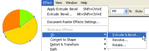
3. Apply Extrude & Bevel

Select any piece(I’ve selected yellow here), go to Effect > 3D > Extrude & Bevel.

4.gif


3D Extrude & Bevel options

If the lower portion window is not showing, click More Options. Now you may drag the cube on the left to specify the Rotation or enter the X-Y-Z Axis values manually. Enter 20pt for Extrude Depth. Add an extra Light by clicking on New Light icon and drag it as shown below.
5.gif

4. Make a Graphic Style

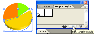
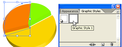
With the yellow piece selected, in Graphic Styles pallate, click on the New Graphic Style icon to make a Graphic Styles of that object. If your Graphic Styles pallate is not showing, go to Window > Graphic Styles or press Shift+F5.
6.gif

5. Apply Graphic Styles

Now select the orange and green piece, click on the Graphic Style you’ve created in previous step to apply the styles onto these objects.
7.gif

Final

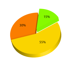
One last step you need to do is to reposit the pie. Notice after you applied the Graphic Styles, the pie is off a bit, use the Selection Tool and put them back together. Now you have a nice colorful 3D pie graph.
3d-pie-graph-final.gif

Bonus Tips

You can use the same technique to create the bar graph like the image below. Click here to download the source file of this Bar Graph sample.

3d-bar-graph.gif
 

MaD-DoC

Member
Oct 27, 2007
6,337
22
0
SLIIT/Malabe
Comic Style Strokes

Comic Style Strokes

comic_stroke.gif


This tutorial will show you how to draw comic style outline strokes with Adobe Illustrator Art Brush.
Version: Illustrator 8+
Download Source File
1. Create an Art Brush

Use the Pen Tool and create a path like the image on the left. Drag it to the Brushes Library pallate. If your Brushes is not showing, go to Window > Brushes of press F5.
1.gif

New Art Brush

When the New Brush options window popup, select New Art Brush.
2.gif

Art Brush Options

Then the New Art Brush Options will pop out, leave everything as default, but select Tints for Colorization Method. Click Ok.
3.gif

2. Apply your strokes

Now you can apply this Art Brush to any stroke by clicking the Art Brush in the Brushes library.
4.gif

Bonus Tips

You can change your stroke color and weight to get various stroke effect.
comic-stroke-final.gif
 
  • Like
Reactions: sandaru d

MaD-DoC

Member
Oct 27, 2007
6,337
22
0
SLIIT/Malabe
Illustrator Template

Illustrator Template

custom-libraries.gif


Do you have certain graphic elements(ie. your logos, credit card logos, icons), Color Swatches, Graphic Styles, and Art Brushes that you commonly use in Illustrator? If your answer is yes, this tutorial might be helpful to you.
Version: Illustrator CS
Download Source File
Introduction

I personally use Adobe Illustrator alot, to save my time and work more efficiently, I have created serveral custom Libraries Illustrator Templates. I have one template with only RGB Color Swatches, one with CMYK Color Swatches, and one with minimal Library items. The minimal Libraries template has removed all unused/unwanted Library items and is use to create my Illustrator tutorial source file. This way I can cut down on the file size because each Library item in your file costs memory. The templates store the Color & Gradient Swatches, Art Brushes, and Graphic Styles that I commonly use in my illustration. Imagine the time it will cost if I need to remove all unused Libraries every time I create a new tutorial file. Or I need to open up an existing file to copy the Color Swatches & Graphic Styles that I want.
Illustrator Template can store: Artboard setting, Color/Gradient Swatches, Graphic Styles, Symbols, Layers, graphic placeholders, and more. For full detailed information on Illustrator Template, please read Illustrator’s Help files.
1. Create your custom Libraries

Most of you probably already know how to create Libraries, so I’m not going to explain all the details. Creating your Libraries is very easy, just drag your object in the Library pallate or select the object and click on the New icon. To remove your Library items, select the items that you want to remove and click on the Trash Can icon.
1.gif

2. Save your template

After you’ve done with the Libraries, go to File > Save as Template and name your template that is best describe the content/setting of the file, ie. RGB Color Setting, For Print.
2.gif

3. New From Template

Now go to File > New From Template and Adobe Illustrator will create a new file with all the setting you’ve created in your template.
3.gif

Conclusion

Start making Illustrator Template now and save your working time!
 

MaD-DoC

Member
Oct 27, 2007
6,337
22
0
SLIIT/Malabe
Adobe Bridge Icon

Adobe Bridge Icon

adobe-bridge.jpg


This tutorial will show you how to replicate the Adobe Bridge icon in Illustrator CS2 using the same techniques as the Photoshop Splash Page Tutorial.
Version: Illustrator CS2
Download Source File
1. Place Images

First, place in the original Adobe Bridge icon image in Layer 1 for reference. Double click on Layer 1 and change the following Layer Options: check Lock and Dim Images to 50%.
1.gif

2. Start Tracing

Make a new layer. Hold down Ctrl key and click on the Visibility icon of Layer 2 to view that layer in Outline Mode. Now use the Pen tool and start tracing the basic shapes of the sea shell.
2.gif

Now you should have something like this:

3.gif


3. Gradient

Select the top layer and apply a 2 colors radial gradient (color 1 = m5, color 2 = c26, m86, y44). Use the Gradient Tool (G) and drag from the lower center to top corner. This will re-position the gradient.
4.gif

4. Multiply Blending Mode

Now in the Transparency palette, select Multiply Blending Mode. Notice this will create the see through effect.
5.gif

5. Back Layer

Select the back sea shell layer, fill it with another radial gradient (color 1 = c21, color 2 = c26, m86, y44). Again, you need to use the Gradient Tool to position the gradient. Then, select Multiply Blending Mode.
6.gif

6. Top layer

Select the top layer and fill it with different color gradient (color 1 = m5, color 2 = c33, m95, y62). Again, select Multiply Blending Mode.

7.gif


7. Eyedropper

Select the rest of the unfilled paths, use the Eyedropper tool and click on the top layer to copy the gradient fill. To get the best result, you might need to use the Gradient Tool to adjust the gradient position of each shape.
8.gif

8. Icon Base

Make a rectangle box and then apply 25pt round corner (Effect > Stylize > Round Corners).
9.gif

9. Drop Shadow

Now go to Effect > Stylize > Drop Shadow and apply the following setting:

10.gif


10. Gradient

Use the Gradient Tool and apply a 3 colors gradient as shown (color 1 = k0, color 2 = k16, color 3 = k13).
11.gif

11. Add New Stroke

To make an inner glow effect, we need to add a new stroke. in the Appearance palette (top right corner dropdown menu), select Add New Stroke.
12.gif

Align Stroke Inside

In the Appearance palette, selct the new added stroke, fill it with 4pt white stroke color. Then open the Stroke palette, and click on Align Stroke to Inside.
13.gif

12. White background

Notice when you place the sea shell on top of the icon base, the sea shell is see-through because the blending mode has been set to multiply? We can get rid of that by adding a white background to the sea shell. First copy the entire sea shell to clipboard, then merge the current sea shell by Alt-click on Add to shape area (Pathfinder palette).
14.gif

Then, Ctrl+F to paste the copied sea shell in front.
15.gif

Final

The image on the left is my version and the image on the right is the original version.
final.jpg
 

MaD-DoC

Member
Oct 27, 2007
6,337
22
0
SLIIT/Malabe
Envelope Distort

Envelope Distort

envelope-distort.jpg


In this tutorial, I will show you how to use Illustrator CS Envelope Distort tool to make a trendy fashion ad.
Version: Illustrator CS2
Download Source File
1. Import a picture

Find a beautiful photo that you would like to use for your artwork. Place it in Illustrator by File > Place. Then lock the layer.
1.gif

2. Base paths

Make a new layer, ‘base paths’. Use the Pen tool, cover the clothes with white paths.
2.gif

3. Envelope text distortion

Copy all white paths from ‘base paths’ layer and paste it in a new layer. If you want, you can just duplicate the ‘base paths’ layer. Now use the Type tool to type in your text message and send it to back (note: your text must be sit below the shape). Then select the text object and the shirt path, go to Object > Envelope Distort > Make with Top Object or press Ctrl+Alt+C. This will distort the text with the selected shape.
3.gif

Repeat this step to make the envelope text distortion for the skirt.
4.gif

Skirt

For the skirt text objects, rotate it to 90 degree.
5.gif

Don’t forget to use the short cut keys. It will save you a lot of time. Just select the shape and text, and press Ctrl+Alt+C.
6.gif

Final

Now you can add some design elements in the background to spice up the artwork.
final.jpg
 

MaD-DoC

Member
Oct 27, 2007
6,337
22
0
SLIIT/Malabe
Abstract Background

Abstract Background

abstract-background.jpg


In my previous tutorial, I’ve showed you how to make stylish flower with Blend Tool. This tutorial shows you how to make hi-tech style abstract background with Illustrator Blend Tool. Very cool and simple!
Version: Illustrator 9+
Download Source File
1. Gradient background

Create a rectangular path and fill it with blue gradient.
1.gif

2. Screen gradient paths

Create another path with Blue-Black gradient and select Screen Blending Mode. This will create a lighter blue gradient shade. If your color setting is CMYK, make sure the black is full black (C,M,Y,K=100). The red arrow on the image is the direction of the gradient fill.
2.gif

Repeat the previous step to create another Screen gradient path.
3.gif

3. Abstract wave

Make 2 white stroke paths.

4.gif


4. Blend Tool

Go to Object > Blend > Blend Options, enter Specified Steps = 20. Then with the 2 strokes selected, go to Object > Blend > Make or press Ctrl+Alt+B. This will blend 2 white strokes and create an abstract wave effect. If you want to change the Blend step, you can go to Object > Blend > Blend Options or double click the Blend Tool(B) on the tool bar.
5.gif

5. Change stroke color

Use Direct Selection Tool (A), select one of strokes and change it to blue stroke color. Notice how 2 strokes blend from blue to white. Isn’t this cool?
6.gif

6. Wild blend

Now go wild with your Pen tool, create 2 wavy strokes and blend them. Play around with the Blend step, stroke weight and color.
7.gif

Repeat the steps and create the last abstract blend, from blue to purple.
Final

Your image should look like something below:
final.jpg

Abstract Desktop Wallpaper

Now you can use this abstract image for your desktop wallpaper. Download this abstract background for your desktop wallpaper.
8.gif

abstract-wallpaper.jpg
 

MaD-DoC

Member
Oct 27, 2007
6,337
22
0
SLIIT/Malabe
Photoshop CS2 Splash

Photoshop CS2 Splash

photoshop_cs2_splash.jpg


Do you like the new Photoshop CS2 splash graphic? Want to learn how to make it? This tutorial shows you how easy it is to create the Photoshop CS2 splash graphic with Adobe Illustrator.
Version: Illustrator 9+
Download Source File
1. Create the feather paths

First create the paths of the feather with the Pen Tool.
1.gif

2. Apply Gradient color

Select the top 2 paths, fill it with Radial Gradient, pick similar colors as shown. Then repeat this step for the rest of the paths.
2.gif

3.gif

4.gif

5.gif

3. Apply Multiply

Select all the feather paths, go to Transparency pallate, select Multiply.
6.gif

Final

Now you can duplicate the feather and lower the Opacity (Transparency).
7.gif
 

MaD-DoC

Member
Oct 27, 2007
6,337
22
0
SLIIT/Malabe
Christmas Tree

Christmas Tree

christmas_tree.jpg


This tutorial shows you how to make a beautiful Christmas tree with Adobe Illustrator.
Version: Illustrator 9+
Download Source File
1. Create the tree foundation

First, roughly create the tree path with Pen Tool and fill it with (green-darker green) gradient. Go to Effect > Distort & Transform > Roughen
1.gif

Roughen Options

When the Roughen options window popup, enter the following values: Size: 5%, Detail: 100/in and select Points=Corner, then click OK.
2.gif

2. Create the art brush

Now we need to make a New Art Brush for the tree branches. With the Pen Tool, make a path as shown below(1), fill with dark green, and apply the same Roughen effect as the previous step. Your path now should look like path(2). Duplicate path(2) by ALT+Drag or Copy & Paste, vertically scale it down a bit, and change it to lighter tone of green(3). Repeat this step, duplicate one more path and fill it with a even lighter tone of green(4).

3.gif


New Art Brush

Select these 3 paths and drag it to the Brushes Library to make a New Art Brush.
4.gif

Art Brush Options

Leave everything as default, but select Tints and Shades from the Colorization Method drop down menu.
5.gif

3. Tree branches

With the Pen Tool, create some wavily stroke paths and fill stroke color with green. Then apply these paths with the Art Brush you’ve created in the previous step. Adjust the Opacity between 40-50% so it blends with the tree. If you want bigger tree branches, apply thicker stroke weight, thinner stroke = smaller branches. Play around with the Opacity and Stroke Weight and try to make the tree looks as natural as possible.
6.gif

4. Christmas balls

Create various size and gradient Christmas balls with the Ellipse Tool. Place some on top of the tree, send some to the back, and put some behind the branches.

7.gif


5. Light bulbs

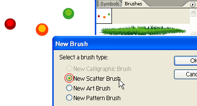
The tree still looks too plain, we need some more decorative lights. Create some light bulbs as shown on the left, drag it to the Brushes Library to make a New Scatter Brush.
8.gif

Scatter Brush Options

When the Scatter Brush Options window popup, select Random for all options and enter the range values as shown below.
9.gif

6. Tree lights

With the Pen Tool, roughly draw a zig zag path from the top to bottom, and apply the Scatter Brush you’ve created in the previous step. Notice how the light bulbs are randomly rendered base on the range values you’ve entered in the Scatter Brush Options, and you can change these setting at any time by double click on the Library object. If you want to have more lights, create another path and apply the same Scatter Brush.
10.gif

Final

Download the source file now and see how it is done!
xmas_tree_final.jpg
 

MaD-DoC

Member
Oct 27, 2007
6,337
22
0
SLIIT/Malabe
3D Bowl

3D Bowl

fruit-bowl.jpg


This tutorial shows you how to create realistic 3D fruit bowl illustration with one of the Adobe Illustrator CS2 new features: 3D Revolve Effect.
Version: Illustrator CS2
Download Source File
1. Create the bowl

Create a path and fill it with yellow color like the image below. Then, select Effect > 3D > Revolve from the menu.
1.gif

2. Apply 3D Revolve Setting

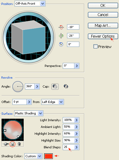
When the 3D Revolve Options window popups, apply the following setting:
  • Click on the More Options if the lower portion window is not showing
  • Create a new light by clicking on the New Light icon and drag those two lights as shown
  • Change Shading Color to orange by: select Custom from the drop drop, click on the sample color box, Color Picker window will pop, then enter this color value (R=255 B=50 G=0)
  • If you want a smooth blending, increse the Blend Steps (default is 25, max is 256). Note: increase Blend Steps will also increase file size and memory usage.
2.gif

3. Create the apple

Create an oval path with the Ellipse Tool
ellipse_tool.gif
and fill it with green color. Then select that green path and apply Effect > 3D > Revolve, leave all options in the 3D Revolve Options window as default and click OK. Now, you should get something like the image shown below:

3.gif


4. Add Drop Shadow

Keep the apple path selected, go to Effect > Stylize > Drop Shadow and apply the setting as shown below.
4.gif

5. Create New Art Brush

First create a path similar to the image as shown below, fill it with black (k=100), and then create the highlight path fill it with 80% black (k=80). Drag it to the Brushes library window to create a New Art Brush. If your Brushes library is not on the screen, go to Window > Brushes or press F5.
5.gif

New Art Brush Options

The Art Brush Option window should pop out, select Tints from the Colorization Method drop down menu, leave everything as default, and click OK.
6.gif

6. Draw the apple’s basin

Create a stroke path with the Pen Tool and select the Art Brush that you’ve created in the previous step. Now place it on top of the apple like the image shown below.

7.gif


7. Duplicate the apple

Select the apple (with basin), hold down the ‘Alt‘ (or ‘Option‘ key for Mac), drag it to make a copy of it. You may also use Copy & Paste to duplicate the apple. Then, change it to red color.
8.gif

8. Adjust 3D Revolve setting

Select the red apple (oval path only), in your Appearance pallate, double click the 3D Revolve effect icon to adjust the options/setting. If your Appearance is not showing, select menu Window > Appearance or press Shift+F6.
9.gif

3D Revolve Options

Now, your 3D Revolve Options window should pop out. Enter the following value(X=57 Y=63 Z=-159). You can change the rotation values manually by entering the numbers or by dragging the cube on the left.
10.gif

9. Fix the apple’s basin

Notice the basin is slightly off from the apple after you changed the rotation values from previous step. Move the basin stroke to center of the apple by using the Selection Tool or Direct Selection Tool.
11.gif

10. Add one more apple

Make one more apple by repeating Step 7 to 9.
12.gif

11. Put them together

Put the apples and the bowl together as shown. Draw a oval shape path, base on the shape of the bowl.
13.gif

12. Mask the apples

Select the the apples and oval path only, go to menu Clipping Mask > Make or press Ctrl+7
14.gif

13. Final

That’s it! Your illustration should look like the image below:
15.jpg
 

MaD-DoC

Member
Oct 27, 2007
6,337
22
0
SLIIT/Malabe
3D Vase

3D Vase

3d-vase.jpg


This tutorial shows you how to create a nice 3D vase in 5 minutes with Illustrator CS2 3D Revolve Tool. It is fun and easy!
Version: Illustrator CS2
Download Source File
1. Create a path

First, create a path like the image shown below with the Pen Tool, go to menu Effect > 3D > Revolve
1.gif

3D Revolve Options

The 3D Revolve Options window should pop up and look like the image below. Click on More Options if the lower portion window is not showing. You can leave most of the setting as default, but add an additional light spot by click the New Light icon and drag it to the lower left corner as shown. Enter 35 for Blend Steps, maximum Blend Steps is 256, higher Blend Steps results better rendering quality but also increases file size and memory.
2.gif

2. Create the flower symbol

Now use the Ellipse Tool, create a flower like the image below. I have a very simply flower illustration here, but you can create anything as you like. Drag the flower to the Symbols Library Pallate to create a new symbol. If your Symbols Pallate is not showing, press Ctrl+Shift+F11 or go to Windows > Symbols to show Symbols.

3.gif


3. Create Map Art

With the vase object selected, in Appearance Pallate, double click on the 3D Revolve effect icon(f) to change the 3D Revolve Options.
4.gif

When the 3D Revolve Options window pop ups, click on Map Art button.
5.gif

Map Art options

Check Preview option so you can preview the result. At the top where it says, Surface, use the arrow buttons to locate the surface that you want to Map Art. Notice there is a red wireframe on your object which show you the surface you’ve selected. In this case, it is 4 of 5. From the Symbol drop down, select the symbol that you’ve created in the previous step. You can position and resize the symbol in way as you want. You can also create multi-surface Map Art by selecting the Surface then the Symbol. Click OK when you are happy with the result.
6.gif

Final

That’s it! With just 3 simple steps, I just created a nice 3D Vase with Illustrator 3D Revolve Tool.
3d-vase-final.jpg