


Websites We Visit: How They Look Like 10 Years Ago | අවුරුදු 10කට පෙර අපේ වෙබ් අඩවි.
Amazon
Clear-cut navigation is very important for any e-commerce site and we believe Amazon handles this pretty well. The site has not been changing over the pass decade in terms of the amount of content they put forward on the first page. The most obvious change over the pass ten years in Amazon is perhaps swapping the horizontal tab navigation to a left sidebar drop down and bringing their search box to the top.
Amazon 1998
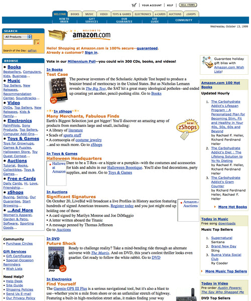
Amazon 2008

Apple
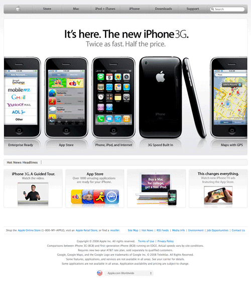
We always like how folks at Apple design their website. They’ve always been the trend setter and their designed inspired a lot of the Web 2.0 design out there. That said, have you seen how their website looks like 10 years ago?
Apple 1998
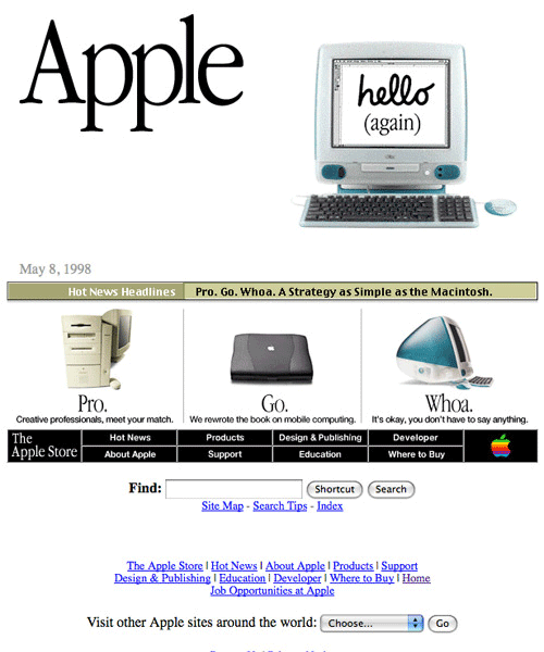
Apple 2008
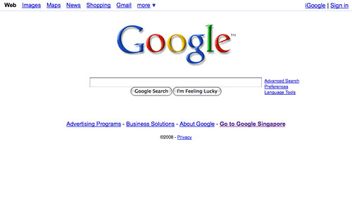
Google
Google was still in beta ten years ago. These guys believed in simplicity and there’s no exception whether it’s 1998 or 2008.
Google 1998
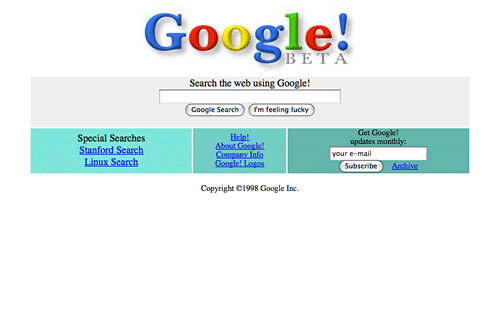
Google 2008
Hotmail
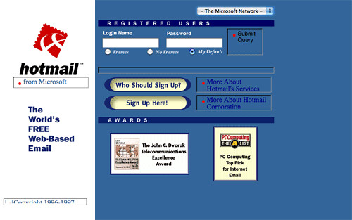
Most of us start playing with e-mailing on a free account when we were introduced to the Internet, and when it comes to free email Hotmail is amongst the hottest. Here’s how the web interface looks like before Microsoft decided to turn call it the Windows Live Hotmail.
Hotmail 1998
Hotmail 2008

Microsoft
Microsoft had done tremendous changes to their web frontend over the pass ten years. The old one lacks of graphics and the current definetely has a very strong corporate look.
Microsoft 1998
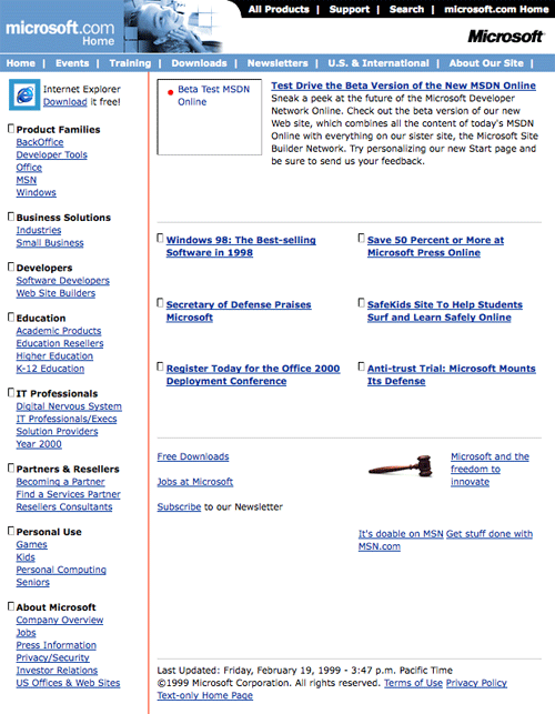
Microsoft 2008

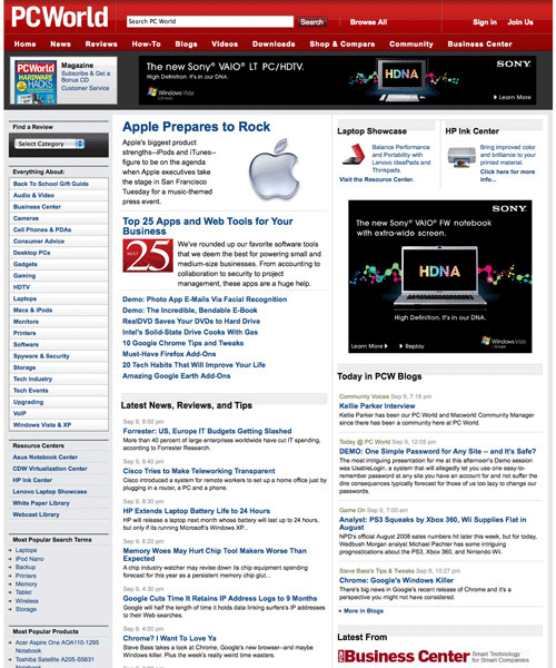
PCWorld
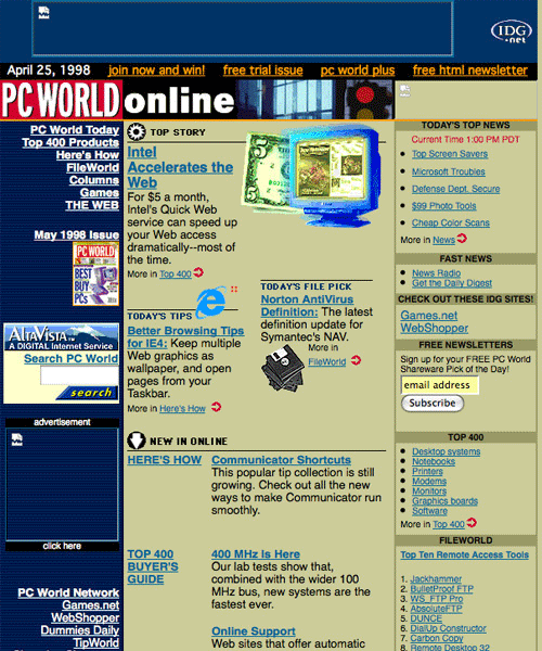
Ten years ago, PCWorld was using a 3-column display. You can imagine the site to be really congested, considering the fact that most of us (if you already started surfing) were still on monitor resolution 800×600 and below. But over the pass decade, the site has been much more better. Content arrangement is neat, well-organized and the red header with white background definetely make the entire display looks clean.
PCWorld 1998
PCWorld 2008
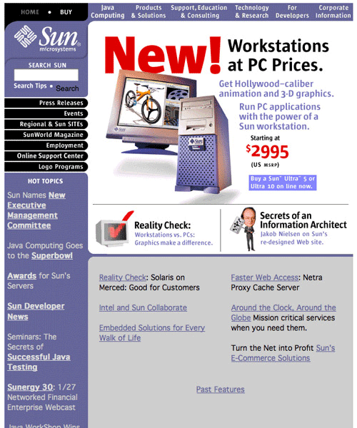
Sun Microsystems
Sun Microsystems in 1998 totally recalled us how a typical Geocities and Tripod free template were like.
Sun Microsystems 1998
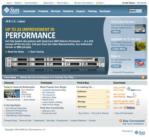
Sun Microsystems 2008
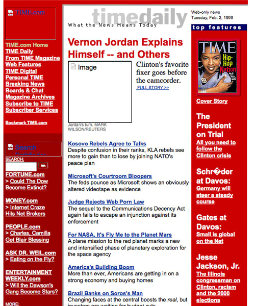
Time
Time maintained their 3-column display over the pass ten years. Only difference is, they’ve managed to make it way cleaner and neater, even though contents on the website is like 5x more.
Time 1998
Time 2008

Wired Magazine
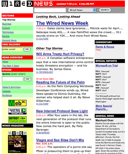
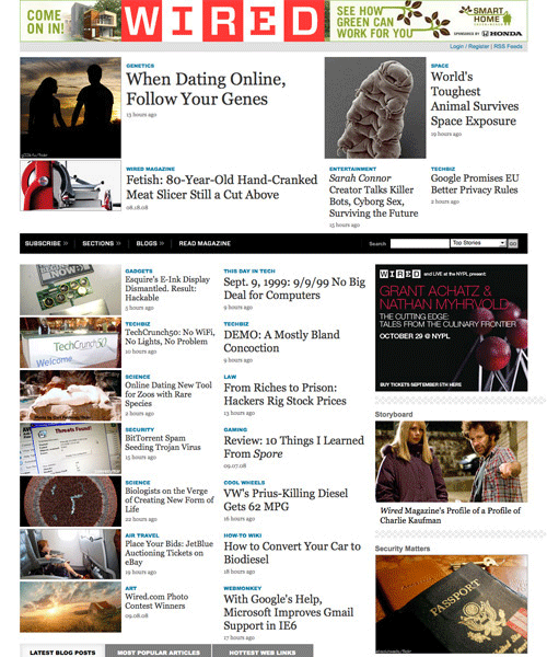
Wired ten years ago was too text-based and we think the left navigation looks odd with titles in red background and listings in light green. It’s hard to imagine the website to be what they are now, because it totally rocks.
Wired 1998
Wired 2008
Yahoo!
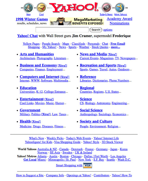
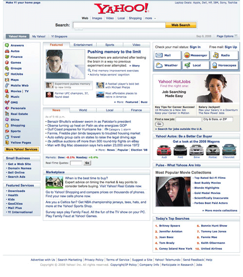
Comparing to what we’ve seen ten years ago and now, Yahoo had undergone quite a significant change in terms of their business model and that totally reflects their web front end. The search-engine based company used to be very ’search engine focused’ but it’s looks more like a information portal now.
Yahoo 1998
Yahoo 2008
If you enjoy my post; please add a rep+
Clear-cut navigation is very important for any e-commerce site and we believe Amazon handles this pretty well. The site has not been changing over the pass decade in terms of the amount of content they put forward on the first page. The most obvious change over the pass ten years in Amazon is perhaps swapping the horizontal tab navigation to a left sidebar drop down and bringing their search box to the top.
Amazon 1998
Amazon 2008
Apple
We always like how folks at Apple design their website. They’ve always been the trend setter and their designed inspired a lot of the Web 2.0 design out there. That said, have you seen how their website looks like 10 years ago?
Apple 1998
Apple 2008
Google was still in beta ten years ago. These guys believed in simplicity and there’s no exception whether it’s 1998 or 2008.
Google 1998
Google 2008
Hotmail
Most of us start playing with e-mailing on a free account when we were introduced to the Internet, and when it comes to free email Hotmail is amongst the hottest. Here’s how the web interface looks like before Microsoft decided to turn call it the Windows Live Hotmail.
Hotmail 1998
Hotmail 2008
Microsoft
Microsoft had done tremendous changes to their web frontend over the pass ten years. The old one lacks of graphics and the current definetely has a very strong corporate look.
Microsoft 1998
Microsoft 2008

PCWorld
Ten years ago, PCWorld was using a 3-column display. You can imagine the site to be really congested, considering the fact that most of us (if you already started surfing) were still on monitor resolution 800×600 and below. But over the pass decade, the site has been much more better. Content arrangement is neat, well-organized and the red header with white background definetely make the entire display looks clean.
PCWorld 1998
PCWorld 2008
Sun Microsystems
Sun Microsystems in 1998 totally recalled us how a typical Geocities and Tripod free template were like.
Sun Microsystems 1998
Sun Microsystems 2008
Time
Time maintained their 3-column display over the pass ten years. Only difference is, they’ve managed to make it way cleaner and neater, even though contents on the website is like 5x more.
Time 1998
Time 2008

Wired Magazine
Wired ten years ago was too text-based and we think the left navigation looks odd with titles in red background and listings in light green. It’s hard to imagine the website to be what they are now, because it totally rocks.
Wired 1998
Wired 2008
Yahoo!
Comparing to what we’ve seen ten years ago and now, Yahoo had undergone quite a significant change in terms of their business model and that totally reflects their web front end. The search-engine based company used to be very ’search engine focused’ but it’s looks more like a information portal now.
Yahoo 1998
Yahoo 2008
If you enjoy my post; please add a rep+


