Photoshop Trix To You My Friend .....

creativeN

Well-known member
  • Jul 13, 2009
    5,667
    991
    113
    CATCH ME IF U CAN
    01.


    This tutorial will go through the steps I took to create the image.
    Get Digitised


    All you will need for this is an image of someone in a suitable pose. This was an image purchased from iStock so I am unable to share it with you. Saying that, any image should suffice. If they are not on a white background then you may wish to cut out your subject first for this technique to work to its fullest.
    For this tutorial you will already need to know about layers and masks and Cloning.
    As always the first step is to load your subject into Photoshop.

    Make sure the page is big enough to leave some empty space above your subject. This can be done in the canvas size options (Image > Canvas size).


    Once this is done create a new white layer under your subject image. Then add a mask to your subject image layer. You will also need to select the brush tool.

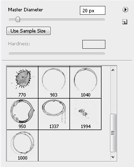
    The first part of the effect is to punch square like holes through your subject. This can be done with the right brush shape on the layer mask. With the brush tool selected you need to open up the brush options as in the image below (click the small down arrow next to the brush size at the top of the page). Once this window opens you need to click the right arrow button at the top right of the options to open up a drop down menu. From the list select “Drop Shadow Brushes”. Select the faded square shape, set a size of about 35 for now and then close the window.

    Next, open up the brushes window. If its not already open you can do so by Window > Brushes.
    In this window click on the word Scattering and make sure its highlighted and that its box is ticked. The options should change to appear similar to those below. What we will use these options for is to make the brush strokes more random and dispersed.
    Set the options to the following:
    Scatter – 1000%
    Count – 1
    Count Jitter – 31%
    The preview screen at the bottom should give an idea of how the brush will now work.

    Next I set the texture for the brush. Make sure Texture is highlighted and its box is ticked. Then adjust the settings to the following.
    Scale – 52%
    Depth – 51%
    Minimum Depth 0%
    Depth Jitter 0%

    The brush is now set to work as needed. Select the mask on your subject layer and set your brush colour to black. Next use the brush over the image to punch holes through your subject revealing the background.

    Repeat this with brushes of various sizes. The brush settings should remain the same, you simply need to alter the brush size. You can even use the short cuts [ and ] to adjust this. The final result should have some randomly placed and sized holes in your subject.

    Time to add the pixels being sucked off the subject. This is done in a similar way but using the clone tool. The same brush effects can be added to this tool as well as the plain brush.
    We will need a clean copy of the original subject to work with. To do this, duplicate your subject layer and then remove the mask. Your subject should now be whole again. Once this is done create a new blank layer at the top of your layers stack.

    Select the clone tool and open up the brush options as before. From the drop down menu make sure “Drop Shadow Brushes” is selected again. Once the settings have been made, close the window.

    Open up the Brushes window again and as before set the Scattering options. These were set the same as before except this time the Count Jitter was set to 0%.

    There is no need to add texture this time so we can get straight into the cloning. Select the top blank layer. Make sure ‘sample’ is set to ‘Current & Below’. The trick is to sample random pieces of your subject then spray a few cloned squares above it and repeat. You will also want to clone some squares directly onto your subject to. This gives a great sense of randomness to the composition. Start off with a brush size suitable for larger squares. I used about 35 but this will change from image to image.

    Repeat this process with different size brushes. The options should all stay the same so no need to change anything else. Once all the cloning is done hide the layer you cloned from by clicking the eye symbol next to it to show the complete effect.

    The last step is just some simple clean up. I found I had to many Pixels at the top of the page and wanted to give the impression of them flying off to a single point. All that is needed to fix this is to add a layer mask to the cloned layer and mask out the excess that wasn’t needed. After that hide the layer you were cloning from.

    You may want to add any final tweaks at this point. I found that this process made my image slightly lacking in contrast. This was fixed by adding a black fill layer with its blend mode set to ‘Soft Light’.

    You have just been digitised.
     

    creativeN

    Well-known member
  • Jul 13, 2009
    5,667
    991
    113
    CATCH ME IF U CAN
    02.

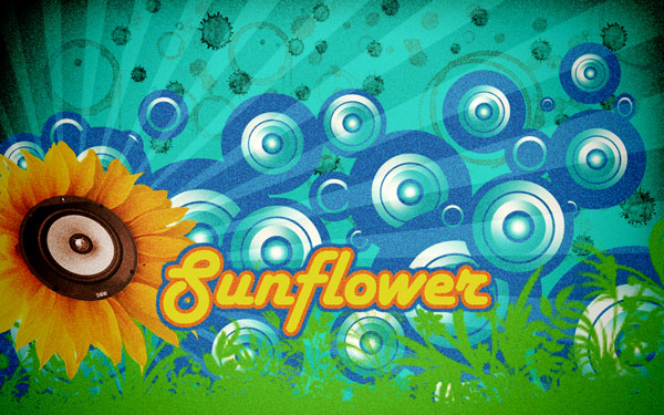
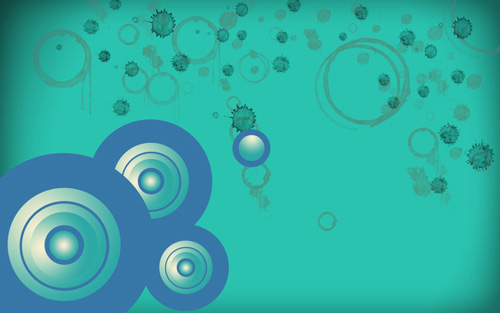
    Final Image Preview

    76.jpg

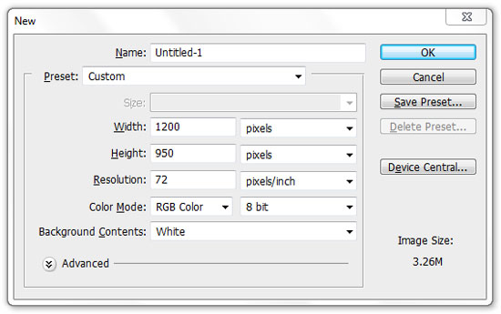
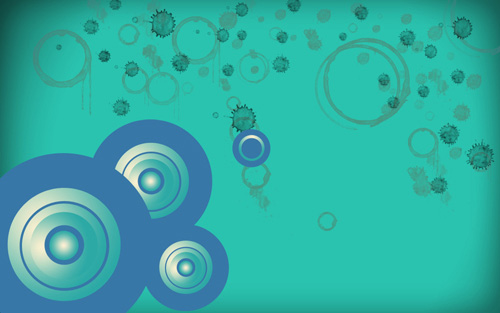
    Create a new document (Ctrl+N) in Adobe Photoshop with the size 1024px by 640px (RGB color mode) at a resolution of 100 pixels/inch. Use the Paint Bucket Tool (G) to fill with #2AC3AF color the new background layer.
    1.jpg

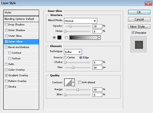
    Click to Add a layer style icon from bottom part of the Layers panel and select Inner Glow:
    2.jpg

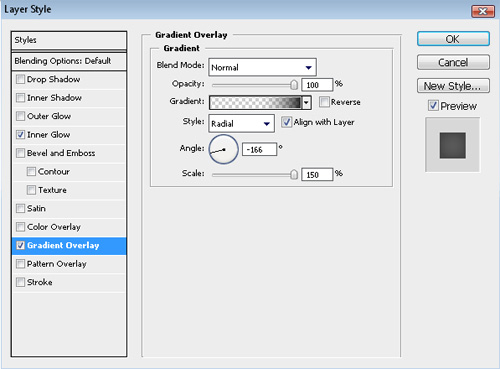
    Add Gradient Overlay
    3.jpg

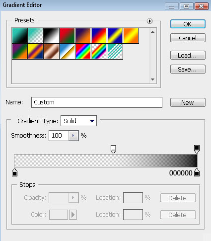
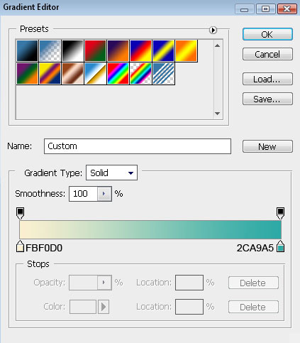
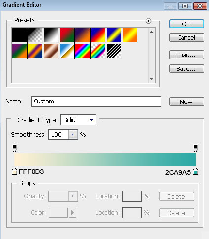
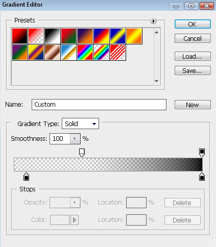
    Click in the color bar to open the Gradient Editor and set the color stops as shown. Click OK to close the Gradient Editor dialog box.
    4.jpg

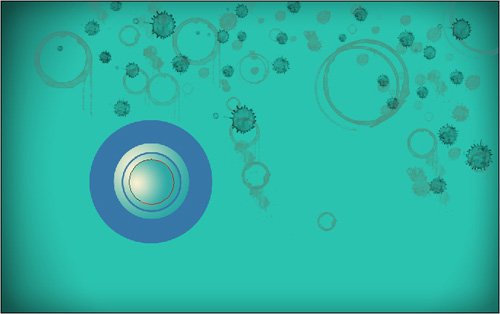
    We’ve got the next background:
    5.jpg

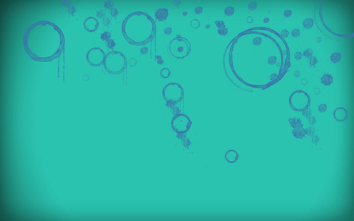
    Next we have to download a set of ready to use brushes for Adobe Photoshop: Coffee_Stains from qbrushes. Then create a new layer (Create new layer) and select the next brushes from Coffee Stains set.
    6.jpg

    Use this brushes to add some coffee stains on our background as shown:
    7.jpg

    Set Fill to 70% for this layer and change the Blending Mode to Exclusion

    8.jpg

    We’ll use the next brushes from Coffee stains set for the next layer, but for the beginning create a new layer and select a darker color for brushes.
    9.jpg

    Set Fill to 80% for this layer

    10.jpg

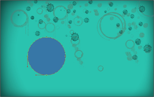
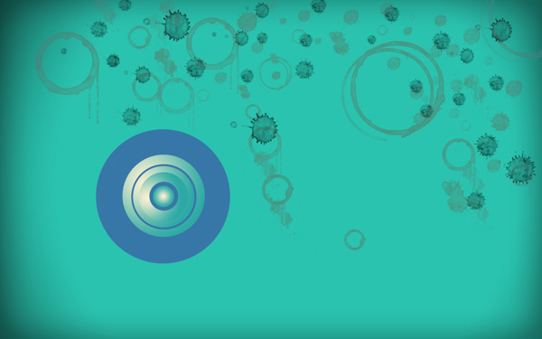
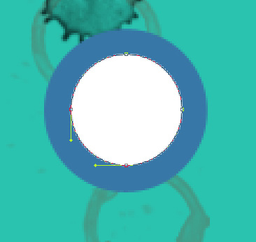
    Take the Ellipse Tool (U) now and try to represent a ellipse, filled with #3777A7 color
    11.jpg

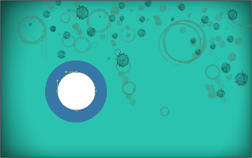
    Using the last tool, we may represent another small ellipse inside the previous one:
    12.jpg

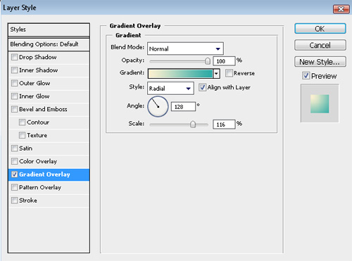
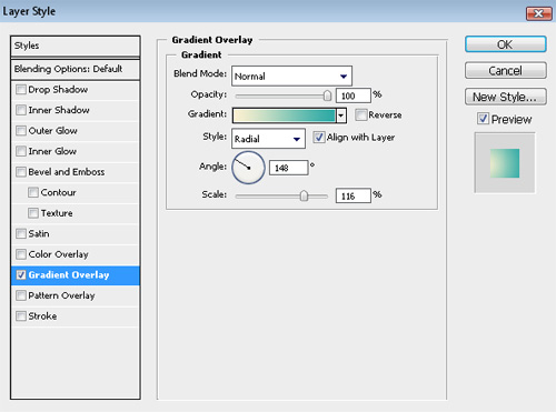
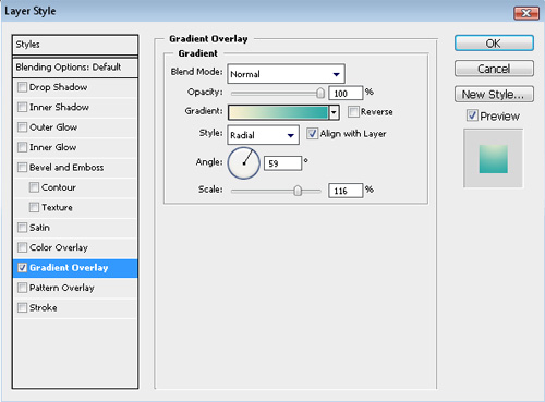
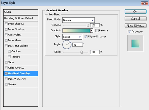
    Click Add a layer style icon from bottom part of the Layers panel to select Gradient Overlay:
    13.jpg

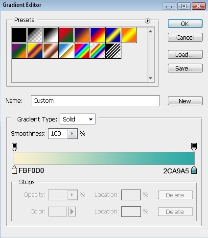
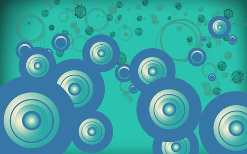
    Click in the color bar to open the Gradient Editor and set the color stops as shown. Click OK to close the Gradient Editor dialog box.
    14.jpg

    We’ve got the next result:
    15.jpg

    Make a copy of the earlier made blue ellipse and choose the Free Transform (Ctrl+T) command to make the copy smaller and to place it the way it is demonstrated next picture:
    16.jpg

    Make a copy of the earlier made ellipse with the Gradient Overlay style and then select the Free Transform (Ctrl+T) command to make the copy smaller and to place it the same way presented below:
    17.jpg

    Make one more copy of the last layer and choose again the Free Transform (Ctrl+T) command to make the copy smaller but changing the layer’s Gradient Overlay:
    18.jpg

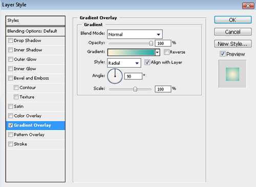
    Gradient Overlay settings:

    19.jpg

    We’ve got the next result:
    20.jpg

    Make a copy of the small blue ellipse, represented earlier and use the Free Transform (Ctrl+T) command to make the copy smaller and to place it the way it is shown below:
    21.jpg

    Next we have to select the Ellipse Tool (U) and represent a small ellipse on the central part of the previous blue small ellipse.
    22.jpg

    Click on Add a layer style icon from bottom part of the Layers panel and select Gradient Overlay
    23.jpg

    Click in the color bar to open the Gradient Editor and set the color stops as shown. Click OK to close the Gradient Editor dialog box.
    24.jpg

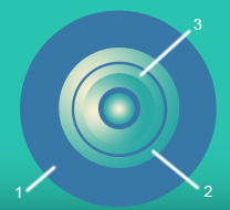
    We’ve got the next speaker:
    25.jpg

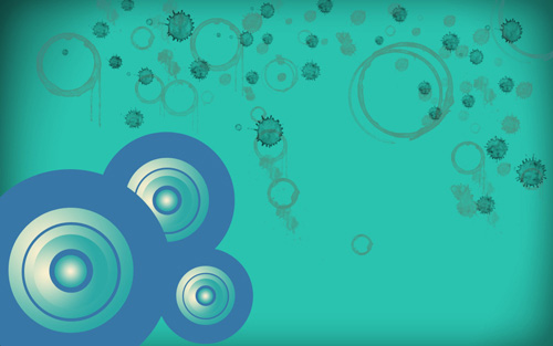
    For our convenience we’ll combine in a group all the layers, composing those several ellipses (press the Ctrl button and select the necessary layers, keeping pressed the left mouse’s button drag the selected layers down on Create a new group icon from bottom part of the Layers panel). Make three copies of the group and select the Free Transform (Ctrl+T) command to change the group’s copies’ sizes
    26.jpg

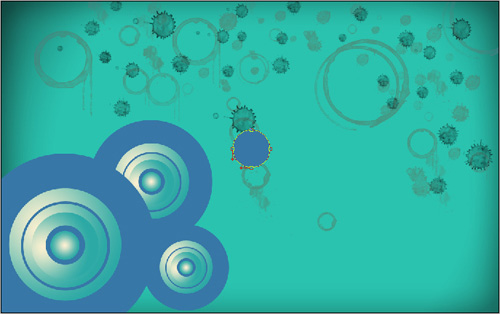
    Select again the Ellipse Tool (U) and make a ellipse, filled with #3777A7 color

    27.jpg

    Try to represent inside the made ellipse one more smaller ellipse:
    28.jpg

    Click on Add a layer style icon from bottom part of the Layers panel and select Gradient Overlay
    29.jpg

    Click in the color bar to open the Gradient Editor and set the color stops as shown. Click OK to close the Gradient Editor dialog box.
    30.jpg

    We’ve got the next result:
    31.jpg

    Make a copy of the earlier made blue ellipse and use after that the Free Transform (Ctrl+T) command to make the copy smaller and to place it on the central part of the element:
    32.jpg

    33.jpg

    As we have described earlier, we have to combine in a group all the layers, composing those three small ellipses (keep pressed the Ctrl button to select the corresponding layers and drag the layers down on Create a new group icon). Make eight copies of the last made group and select the Free Transform (Ctrl+T) command to change the copies’ sizes and to place them as it is indicated on the next picture:
    34.jpg

    Next we’ll work with the first group.
    35.jpg

    Make seven copies of the group and select again the Free Transform (Ctrl+T) command to change the copies’ sizes if necessary, placing them the way presented below:
    36.jpg

    Make one more copy of the ellipses’ group and changing the Gradient Overlay settings, we’ll get two more groups of circles.
    37.jpg

    Changing the Gradient Overlay settings of the second and of the third circle on this one indicated below:
    38.jpg


    39.jpg

    Make a copy of the last made group and place it the way it is shown next picture:
    40.jpg

    Next we have to select the Free Transform (Ctrl+T) command to minimize the first circle for getting another group.
    41.jpg

    Now make the necessary number of copies and change the Gradient Overlay settings of the second and of the third circles to get two types of groups, placing them again the same way presented below:
    42.jpg

    Select the Custom Shape Tool (U) in the Tools bar, in the Options bar click the Shape to open the selection menu. Find Registration Target 2 shape at the bottom of the menu, and then double-click a shape thumbnail to select it.
    43.jpg

    Click and drag to draw the shape.
    44.jpg

    The color is #A9A59E

    45.jpg

    Set Fill to 30% for this layer and change Blending Mode to Linear Light.
    46.jpg

    In the next step we’ll download a set of brushes for in Adobe Photoshop, named: Tiny Flower Elements by ca_pris. Create a new layer after that and try to represent the grass with the earlier downloaded brushes, filled with #76B328.
    47.jpg

    Click on Add a layer style icon from bottom part of the Layers panel and select Outer Glow:
    48.jpg

    We’ve got the next result:
    49.jpg

    Find now a stock photo, representing a sunflower.
    50.jpg

    Remove the background using your favorite tools like Pen Tool (P), Magic Wand Tool (W), Magnetic Lasso (L) or even a simple Filter>Extract and insert it on a new layer in our main document.
    51.jpg

    Turn around the flower’s layer, applying the Free Transform (Ctrl+T) command and select for this layer the next options: Image>Adjustments>Hue/Saturation.

    52.jpg

    We’ve got the next result:
    53.jpg

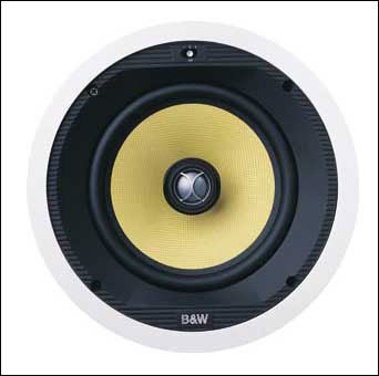
    Now we have to find a stock photo of the loud speaker:
    54.jpg

    Cut it out and apply for this layer Image>Adjustments>Hue/Saturation.
    55.jpg

    The Free Transform (Ctrl+T) command may be helpful in changing the position of the speaker as shown:
    56.jpg

    Next step includes creating a new layer (Create new layer) and then using the Paint Bucket Tool (G), we can fill it with the color #CDCDCD.
    57.jpg

    Set Fill to 70% for this layer and change the Blending Mode to Color Burn

    58.jpg

    Click the Horizontal Type tool (T). Select a font, size and color in the Character panel.
    59.jpg

    Click in the image and type Sunflower text. Press Enter to apply the text.
    60.jpg

    Click on Add a layer style icon from bottom part of the Layers panel and select Outer Glow:
    61.jpg

    Add Stroke
    62.jpg

    We’ve got the next result:
    63.jpg

    Create again one more new layer (Create new layer) and fill the layer with the color #00FFFF, using the Paint Bucket Tool (G).
    64.jpg

    Select for the layer in case the next filter: Filter> Filter Gallery>Grain

    65.jpg

    We’ve got the next effect:
    66.jpg

    Set Fill to 30% for this layer and change the Blending mode to Soft Light
    67.jpg

    Select Create new fill or adjustment layer from bottom part of the Layers panel and click to Brightness/Contrast to adjust the Brightness and Contrast as shown.
    69.jpg

    We’ve got the next effect:
    70.jpg

    Select once again Create new fill or adjustment layer from bottom part of the Layers panel and click toHue/Saturation.
    71.jpg

    We’ve got the next result:
    72.jpg

    Choosing the RectangleTool (U), it’s possible to represent the next rectangle.
    73.jpg

    Set Fill to 0% for this layer and click on Add a layer style icon from bottom part of the Layers panel and select Gradient Overlay
    74.jpg

    Click in the color bar to open the Gradient Editor and set the color stops as shown. Click OK to close the Gradient Editor dialog box.
    75.jpg

    We’ve got the next result:
    76.jpg
     

    creativeN

    Well-known member
  • Jul 13, 2009
    5,667
    991
    113
    CATCH ME IF U CAN
    3.
    Final Image Preview

    pink_preview.jpg

    1.Step

    Create a new document with 1500x1200,rgb color,72dpi. Now double click on the little padlock in the layers palette to unlock it.
    step_1_bg.jpg

    In the layers palette, click the circular icon with the letter in the middle or go to Layer-> Layer style-> Gradient overlay. Let´s add some layers style in our background. Now follow the settings below.
    step%201_1.jpg

    2.Step

    Now open your photo and name this layers "Girl". Use the tool of your choice to extract it. Drag it to your document and resize if necessary. Use the image below as reference. (NOTE:the image I used is not a free stock. Do not use without permission from his owner.). Image copyright: Vulcanccit.
    step_2.jpg

    3.Step

    Now let's create an displace effect. I use this brush set. Create a new layer and name "Brush". Dont worry, this layer will be deleted soon. Now load your brush and paint in any area over the girl where you want to apply the effect. In the brush layer press Ctrl+click in the small thumbnail to load selection.
    step_3.jpg

    With the selection active go to girl layer and hit Ctrl+C to cut and Ctrl+V to paste in a new layer. Drag a little bit to create a displace effect and name this layer "Displace". Return to brush layer and delete this layer now.
    step_3_1.jpg

    4.Step

    Create a new layer and name "Clouds". Put this layer below the girl layer. Download this clouds brush pack. Choose white to color and paint some clouds behind the girl layer.
    step_4.jpg

    Still in the clouds layer use a soft round brush with smooth tips to create some circles. Use different sizes.
    step_4_1.jpg

    5.Step

    Create a new layer and name "Shapes". Put this layer above clouds layer. Choose pen tool (press p) and draw some shapes like the image below. Right click and choose fill path. Fill this path with color white.
    step_5.jpg

    Now press A to select selection path tool. Click in the path and drag down like the image below. Now fill this path with a dark pink.
    step_5_1.jpg

    Or if you wish you can download this shape in the psd file available here. Press the icon of layer mask in the layers pallet and choose a round soft black brush to mask some areas of the shape. Use 20% or 30% for opacity. When finished, lower the opacity of the layer to 20%.
    step_5_2.jpg

    6.Step

    Now create another layer and name "Shape 2". Repeat the (step 5) again and make one more shape. Now use colors, white and different pink. Use the image below as reference.
    step_6.jpg

    If necessary adjust the perspective, just press Ctrl+T and choose perspective. One more time use the image below as reference.
    step_6_1.jpg

    Now press and hold (Ctrl) and click in the "Shape" and "Shape 2" layers, then press (Ctrl+G) to group this layers together.
    step_6_2.jpg

    After this add a layer mask in this group, choose a soft round brush 150px, color black, 20% opacity and mask some areas in this shape. Follow the image where you can see a example. Adjust the opacity of the layer to 75%.
    7.Step

    Create a new layer above the girl layer and name "Back splatter". Go to Media Melita and download this splatter pack. Choose a pink splatter of the pack and use the extraction tool of your choice. Now drag your document and place behind the girl.
    step_7.jpg

    8.Step

    Now let's create a circular shape. Create a new layer and name "Circular shape". Choose ellipse tool (press U), then hold Shift and drag to create a perfect circular shape. After creating the first shape press A and choose path selection tool. Now hold ALT key and drag to copy the first circular shape press Ctrl + T to resize to a smaller size and use the arrow keys to position correctly as shown below. Repeat this process ten or more times.
    step_8.jpg

    When you finish the circular shape choose a hard round brush 1 or 2px and then right click in your mouse and choose Stroke path without simulate pressure.
    step_8_2.jpg

    Now use Ctrl+T command to adjust perspective. Follow the image below as reference.
    step_8_3.jpg

    Put this layer below the "Girl" layer. Change the blend mode to Overlay. You can adjust layer opacity if you wish feel free.
    9.Step

    Create another layer and name "Circular shape 2". Now using the same techniques in step 8 and create another circular shape, but this time try to do something like the shape below.
    step_9.jpg

    Choose a hard hound brush 2px with color white and then right click in your mouse choose Stroke path and hit ok. Place this layer above girl layer like the image below. Press layer mask icon in the layers pallet to add a layer mask and choose a soft round brush 80 or 100px with black color and mask some areas in the circular "Shape 2" as shown below.
    step_9_1.jpg

    10.Step

    Create another layer and put above the girl layer. Name this layer "Splatter under feet". Now download this splatter brush pack. Choose black color and paint under the feet of the girl.
    step_10.jpg

    Hold Ctrl and click over the small thumbnail in the "Girl" layer to load selection, then press Ctrl+Shift+I to invert selection. Choose a small soft round brush with 30px and color black with 20% opacity and start to paint carefully to create a shadow effect under the feet. Follow the image as reference.
    step_10_1.jpg

    step_10_2.jpg

    11.Step

    Go back to circular "Shape 2" layer and copy this layer, press Ctrl+J. Name this layer "Circular motion" and go to Filter->Blur->Motion blur. Use angle -50 and distance 20 then hit ok.
    step_11.jpg

    Make one copy of this layer, then merge "Circular motion" and "Circular motion" copy layers together. Just press Ctrl+E.
    step_11_1.jpg

    12.Step

    Go to Deviantart or other site and search for any C4d render pack. After you find your c4d search for one of your choice inside the package and drag it to your document. Put this layer below "Back splatter" layer and name this layer "C4d". Place your c4d behind the girl. Now press Ctrl+U to open Hue-Saturation dialog box, check colorize and Hue:317, Saturation:45, Lightness:0. Then hit ok. Follow the image below as reference.
    step_12.jpg

    step_12_1.jpg

    13.Step

    Create a new layer and name "White circle". Choose Elliptical Marquee tool (press M), hold Shift key and drag to make a perfect circle, then press Ctrl+Shift+I to invert selection. Now press B and choose brush tool, use a brush a little bit larger than the circle you made. Place the brush on the circle and paint with white color as show below.
    step_13.jpg

    Put this circle behind the girl head and make two copies. Use Ctrl+T to decrease the size of the first and second copies as show below. Now group this layers together press Ctrl+G and name this group "White circle".
    step_13_1.jpg

    14.Step

    Create one more layer and put above the girl. Name this layer "Pink dots". Press B and choose brush tool, use a soft round brush with sizes between 15px and 30px with a dark pink and paint some pink dots. Now change to white color and 220px and paint near the girl knee.
    step_14.jpg

    15.Step

    Create a new layer above "Pink dots" layer and download this smoke brush pack. Name this layer "Smoke effect". Use a black brush and start paint near girl feet as shown below. When you finish, you can group "Smoke effects" layer and "Pink dots" layer together. Just press Ctrl+G.
    step_15.jpg

    16.Step

    Create a new layer and name "Lights". Press P and choose Pen tool. Draw some lines and apply layer styles. Go to Layer->Layer style->Outer glow and use a dark pink. Increase the opacity to 100% and preserve the other adjustments. Follow the image below. Also, I use this space brush.
    step_16.jpg

    17.Step

    Do you have a wacom tablet? If your answer is negative, you can jump this step or you can try using your mouse. Well, I could do something like a glasses using only my mouse. As you can see below.
    step_17.jpg

    Create a new layer and name "Glasses". When you finish, create another layer above "Glasses" layer and name "Lens". Now use the Magic Wand tool (press W) and select the two lenses. Then go to Edit->Fill to fill with white color. Reduce the layer opacity to 30%. Create another layer above "Lens" and name "Lens shine".
    step_17_1.jpg

    Now press L, and choose Polygonal Lasso tool. Draw a rectangular shape and fill with white color. Go to Edit->Fill, to simulate the shine as shown in the image below.
    step_17_2.jpg

    Now deselect. Than press and hold Ctrl and click in the "Lens" layer to load selection, press Ctrl+Shift+I to invert selection and hit delete button to delete the portion of the shape that you dont need. Follow the image below as reference. Then go to Filter->Blur->Gaussian blur, use radius 1px and hit ok. Reduce layer opacity to 40%. Now select this three layer together and press Ctrl+G to group these layers.
    step_17_3.jpg

    18.Step

    Create another layer below the "Girl" layer and name "Shadow". Press M and choose Elliptical Marquee tool, try make a circle as shown below and fill with black color. Go to Edit->Fill. After fill with black color go to Filter->Blur->Gaussian blur and use 30px radius then go to Filter->Blur->Motion blur and use angle:0 and radius:999, hit ok.
    step_18.jpg

    step_18_1.jpg

    step_18_2.jpg

    19.Step

    If you wish you can download these Vector balls and just drag to your document and resize with Ctrl+T command, then use Hue Saturation (Ctrl+U) to change color.
    step_19.jpg

    I'll finish here, but feel free to add your own elements in the composition. Thank you and I hope you all enjoy.
    Result: Stylish Pinky Portrait

    pink_preview.jpg
     

    creativeN

    Well-known member
  • Jul 13, 2009
    5,667
    991
    113
    CATCH ME IF U CAN
    Preview of Final Results

    Step13a.jpg

    Floral 3D Text Effect Photoshop Tutorial

    IMPORTANT: When ever you create any effects, use action palette to store the functions because again if you need the same effect so it will be easy for you to get the same effect.
    Step 1 - Create the 3D text

    As we start we need 3d text effect I'm taking help of illustrator to create 3D text. You can download the font from here. Feel free to use any program you like to create the 3D text. If you are using any other application like Maya, 3Ds max, etc, make sure that the file you save has transparency.
    Step1.jpg

    Step 2 - Create a new Document

    Choose File > New or press Ctrl/Command + N to create a new document. I'm using wallpaper size of 1440px(width) X 900px(height). You can use any wallpaper size as you wish.
    Step2.jpg

    Step 3 - Bring the 3D text to Photoshop

    You can save the image as .png format to get transparency or you can directly copy (Ctrl/Command + C) the 3D text from illustrator & paste (Ctrl/Command + V) in Photoshop. So you will get the 3D image in Photoshop as you see the image below.
    Step3.jpg

    Step 4 - Adding Color to the text

    Now we need to add some color to the text. To do this, choose Image > Adjustments > Hue/Saturation the use these settings:

    • Colorized: Checkmarked
    • Hue: 198
    • Saturation: 22
    • Lightness: 0
    Step4.jpg

    Step4a.jpg

    Step 5 - Adding Contrast to the Image

    Now we’ll need to add more contrast to the text. Choose Image > Adjustment > Levels then adjust the settings like shown in the image below.
    Step5.jpg

    Step 6 - Making the Color Little Bit Dull

    Now we’ll repeat what we did in Step 4. Choose Image > Adjustments > Hue/Saturation. Use the settings as shown in the image below.
    Step6.jpg

    Step 7 - Adding Filter Effects

    For this text, we’ll use the Craquelure effect. Choose Filter > Texture > Craquelure. Use these settings:

    • Crack Spacing: 18
    • Crack Depth: 6
    • Crack Brightness: 1
    Step7.jpg


    tep 8 - Making Selection of Same Color on Top of the Text

    Now choose the Magic Wand tool (W) then create a selection on the top of the text like the image below.
    Step7a.jpg

    Step7b.jpg

    Step 9 - Filling the Selection

    Create a new layer then fill the selected area with white.
    Step7c.jpg

    Step 10 - Adding Drop Shadow

    Now we’ll add more detail to the image by adding light and shadow. Follow these steps clearly. Create a selection of the text. To do this, hold down Ctrl then click on the thumbnail of the layer in the Layers palette. Create a new layer under the layer with the 3D text then fill the selected area with black.
    Step8.jpg

    Step 11 - Clear Finishing for Drop Shadow.

    On the new layer, choose Filter > Blur > Gaussian Blur then apply a slight blur to create a drop shadow.
    Step9.jpg

    Step 12 - Shadow Adjustment

    Now we’ll use the Smudge Tool will smudge the top and bottom sides of the shadow towards the center of the text so that it becomes hidden. Select the smudge tool then set the brush to the following:

    • Brush Size: 100px
    • Mode: Normal
    • Strength: 50%
    Step9a.jpg

    Step9Brush.jpg

    Step 13 - Finished Image

    This is what your shadow should look like after smudging.
    Step9FINAL.jpg

    Step 14 - Installing Brush in Photoshop

    Download and install a swirls Photoshop brush. We used Swirls and Circles by BSILVIA. Or, you can browse for swirl brushes on Brusheezy. Once you’ve picked your Photoshop brush, load it into Photoshop.
    Step10.jpg

    Step 15 - Making Floor with Design

    Now we are going to create a floor design for the image to show that the 3D text is on the floor. For that you need to Create a new layer, select the brush that you’d like to use, then paint it on this new layer. Choose Edit > Transform > Perspective then transform the swirl so that it matches the perspective of the text like the image below.
    Step10a.jpg

    Step 16 - Making of Plants & roots

    Now we’re going to add more plants coming out of the text. Choose a floral brush to paint it on and use green. Choose the brush which you see in the image & follow the image for the placement of the brush. Give this color(#326507) for the image. To give depth choose Dodge tool(O)> Brush size = 65 > Range = Highlights > Exposure = 50%. Drag the brush in the corner of the shape to make it light as in the image. Now u choose Burn tool & burn the opposite corner of the shape. Sure you will get the same effect.
    Step12.jpg

    Step 17 - Finishing touch.

    Follow the same Step 16 & create how ever you want to make the elements. So you can see the finial image below.
    Step13a1.jpg

    Step 18 - Final Image

    You can use colors to make it colorful as image below.
    Finial.jpg
     
    • Like
    Reactions: hansi_party

    creativeN

    Well-known member
  • Jul 13, 2009
    5,667
    991
    113
    CATCH ME IF U CAN
    4.

    n Photoshop, there are many ways of adding masks to layer. One Method is to go into Layer > Layer Mask from the top menu. Once you expand the Layer Mask menu, you will see a list of options such as “Reveal All”, “Hide All” and so on. In this tutorial, we will start with the first two options.
    Now Load any image into Photoshop, press Ctrl + J to duplicate the background layer then fill the background layer with then click on the “Reveal All” option:
    1-reveal-all.jpg

    As you can see, there is now a white layer mask being linked to this layer, as shown below:

    Now Right-click on the layer mask you just added, and choose “Delete Layer Mask”:

    Go back to Layer > Layer Mask and choose “Hide All” option this time:
    1-hide-all-500x327.jpg

    Now instead of a white mask, you will a black mask being attached to this layer, and in the mean time the image will become invisible on the canvas:

    In practice, if you have only a small portion of the image you wish to the conceal, you can choose the “Reveal All” and use brush tool the paint on it to hide the portion.
    Else, if you have a large portion of the image you wish to conceal, you can use the “Hide All” option, then use a brush tool to paint on it, in order to the reveal the portion you don’t wish to hide.
    A quick note: you can also add a layer mask by clicking on the button shown below on the layer palette:

    Additional Masking Options

    Now you may wonder: is there any extra settings I can apply to a layer mask? The answer is yes :)
    If you go into “Window > Masks” and click on it:

    Once you enable this mask window, you will see extra options appearing and you can adjust the settings to specific layer mask you wish:
    3-mask-op.jpg

    Have a try with those settings and see what result they bring you :)
    Use Soft or Hard Brush Tool to Paint on Layer Mask

    One quick way of hiding and revealing object is to use brush tool to paint on the mask. By adjusting the brush hardness, you will have totally different results. Therefore, depending on the effect you’re trying to achieve, adjust the hardness of your brush to before you start painting.
    To start painting on the mask, hold down Alt + Left-click to switch to the mask, then grab the brush tool from the toolbox.
    Here is an example of using a 0% hardness brush with a single-click on the centre: (a reveal-all mask)
    On the layer palette:
    4-paint-soft.jpg

    On the canvas:
    4-paint-soft-big-500x301.jpg

    The outcome:
    4-soft-effect-500x333.jpg

    Here is an example of using a 100% hardness brush with a single-click on the centre: (a reveal-all mask)
    On the layer palette:
    4-paint-hard-small.jpg

    On the Canvas:

    The Outcome:

    As you can see, by having a different set of brush hardness, the outcome is entirely different.
    There is no restriction as to which brush you use on the mask, you’re free to experiment any brush you prefer and see what results they bring you.
    OK that’s it for this part one of the beginners’ guide to masking in Photoshop. Hope you find these information useful :)
    In Part Two, I will be talking about advance masking such as:

    • Quick Mask
    • Clipping Mask
    • Mask on Image Adjustment Layers
    Stay Tuned and have a great day!
     

    creativeN

    Well-known member
  • Jul 13, 2009
    5,667
    991
    113
    CATCH ME IF U CAN
    5.


    First lets grab some images:

    Match Image
    Truck Image
    Step 1

    First we are going to start by opening up our matches image and start cutting one out using the pen tool. Bring the match that we just cut out into a new 1680×1050 document.
    matchcar_01.jpg

    Step 2

    Downsize your match to about 60% and fill the background with black.
    matchcar_02.jpg

    Step 3

    Now before we go any further, I want to establish a line with my guide so we can have everything sitting on the same spot horizontally.
    matchcar_03.jpg

    Step 4

    Go ahead and open up the truck image in Photoshop. Let’s start out by fixing a couple things. First off this truck is going to be flipped when we bring it into our other document, so we want make sure the text on the side will be facing the right way. Go into edit>transform>flip horizontally.
    matchcar_04.jpg

    Step 5

    Using the square marquee tool, create a box around the emblem on the door. Do control + J to duplicate that area, then go to edit>transform>flip horizontally. Now click on the mask icon at the bottom of the layers window (the square with a circle in the middle of it). Paint, with a 0% hard black brush around the emblem we duplicated. Be careful as to get rid of the unwanted lines, but make sure the old emblem doesn’t show through.

    matchcar_05.jpg

    Step 6

    Repeat step 5 with the decal on the back. Afterwards, cut out the truck, including the windows. Merge the truck layer with the emblem layers by linking them then control + e to merge them together.
    matchcar_06.jpg

    Step 7

    Load the path (control + click on the path) that you made to cut out the truck (in the paths tab of the layers palette). Do control + shift + I to get the inverse selection and delete. Then fill the background with black
    Since there will be no sky in our final image, we need to get rid of the blue reflections. So to do this go into image>adjustments>replace color. Click on a blue area and adjust the settings as I have below.
    matchcar_07.jpg

    Step 8

    Since the flames are going to be coming from the back of the truck we are going to darken the front side. Load the truck by control + clicking on the truck layer, and then, using a black to 0% opacity gradient, create a gradient from right to left. Change the opacity of the layer to 80%.
    matchcar_08.jpg

    Step 9

    Now we are going to adjust the curves, so open it up with control + m and adjust it as I have below.
    We are also going to drop down the saturation so do control + u to open up the hue/saturation window.
    matchcar_09.jpg

    Step 10

    Now we are going to change the color balance. Using control + b go into color balance and adjust the settings as I have done below.
    matchcar_10.jpg

    Step 11

    Merge the truck layer and gradient layer, and bring it into our document. Using control + t, resize the truck to 20%.
    matchcar_11.jpg

    Step 12

    Go onto Image After and grab some fire images. Change the blend mode of each one to lighten, this will make it so you don’t have to cut them out, the black will just disappear. Using control + u change the saturation to -40 for each one.
    matchcar_12.jpg

    Step 13

    Now we are going to have the top of the match fade into the darkness. So to do this we are going to add a layer mask (second icon from the left at the bottom of the layers palette). Using a black to 0% opacity gradient, click and drag something you like.
    matchcar_13.jpg

    Step 14

    We are going to create a gradient below the truck and flames to serve as a base that everything is going to be sitting on. So to do this, we are going to create a radial gradient using a color that we can pull from the flames. I’m using #C98640. Move the gradient so the brightest part is under the flames.
    Using control + t stretch out the gradient and move the bottom of the gradient so it is just below the guide. Select your square marquee tool and drag a box around the whole area above the guide and delete. With mine, I am going to drop the opacity down to 70% and the saturation (control + u) to -40.
    matchcar_14.jpg

    Step 15

    Create another radial gradient with the color #FF9C00 that covers the area around the flames. Adjust it with control + t until you get something you like. Change the blend mode to color burn. This layer should be just above the ground gradient we made it step 14.
    matchcar_15.jpg

    Step 16

    Create another radial gradient on the back end of the truck, this time it is going to be white. Stretch the gradient out and change the blend mode to overlay. This will give the back of the truck more of a highlight.
    matchcar_16.jpg

    Step 17

    Now I am going to give the wheels a blur so it looks like they are moving. Using the circular marquee tool, create a circle around the front tire. Go to Filter>Blur>Radial Blur and adjust your setting as I have below. Repeat for the back tire.
    We also want to get rid of the back tire because it is off the ground. So, using your pen tool, cut out the area and delete it.
    matchcar_17.jpg

    Final

    I added some text, and that’s it, a truck coming out of the flames of a match.
     

    creativeN

    Well-known member
  • Jul 13, 2009
    5,667
    991
    113
    CATCH ME IF U CAN
    6.
    Preview of the result:

    face_final.jpg

    Step 1

    Open the photo of the lady in Photoshop and go to Image>Image size. Switch the width value to 2000px and make sure that “constrain proportions” is checked. We have resized the image because too large and it could be more difficult to find a texture of the same size.
    face1.jpg

    Step 2

    With the Lasso tool select the head of the lady and add a layer mask (click on the “add layer mask button” at the bottom of the layer’s window). Layer mask is the best way to isolate an object without lose pixels. This is not a simple argument for Photoshop beginners, and I suggest you to read some articles about this topic that is fundamental if you want to seriously work with Photoshop.
    face2.jpg

    Step 3

    Select the lady’s layer (not the mask) and go to Image>Adjustments>Threshold. Put 90 as threshold value. Now you can use the erase tool to eliminate unwanted pixels, or (the better method) select the mask and remove unwanted pixels with a black brush. (When you use layer mask, black eliminate while white restore the image).
    face3.jpg

    Step 4

    The aim of this step is to isolate black parts of the image. So make sure to have black as foreground color and go to select>Color range. Set fuzziness to 200 and hit OK.
    face4.jpg

    Step 5

    In the Paths window click on the right arrow and select Make Work Path with tolerance 1,0. Now in the layer window create a new layer, grab the pen tool and right click on the canvas>Fill Path. Call this layer “lady black” and hide the other lady’s layer. Voila! White has disappeared. You can also delete the path.
    face5.jpg

    Step 6

    Create a new layer and with a black brush start painting over the white parts in the hair of the lady. Also create a new layer, fill it with white and place it below the “lady black” layer.
    face6.jpg

    Step 7

    Create a new layer and use splatter brushes to paint around the hair of the lady. This is my result:
    face7.jpg

    Step 8

    Paste in the texture. At this point we have to play again with selections and layer mask: with the texture layer selected, ctrl+click on the “lady black” layer to select its pixels. Then shift+ctrl+click on the layers where you’ve painted on with the brushes to select also their pixels. You should obtain something like this:
    face8.jpg

    Step 9

    Add a layer mask to the texture layer. Now you can hide all the other layers except the white background.
    face9.jpg

    Step 10

    Now we can add a gradient adjustment layer (click on the “create new adjustment layer” at the bottom of the layer window and select “gradient”). You can choose one of the default gradients or create a new one with the colors you prefer. Set the gradient layer to overlay. Finished!
     

    creativeN

    Well-known member
  • Jul 13, 2009
    5,667
    991
    113
    CATCH ME IF U CAN
    7.
    Utilizing blending modes in Adobe Photoshop is one of the essential skills for any designer. They not only allow manipulation and blending of images, they also can lead to spectacular visual effects in a design. In this tutorial, Pawel Kiec will take you though the steps of extracting an image, creating a background, and then making an electrifying glowing guitar that resembles pure neon light.
    You’ll learn how to manipulate blending modes to achieve color and light, and you’ll also learn how to extract images with the pen tool, and even create flowing lines in Illustrator to compliment the Photoshop work.
    This tutorial is for intermediate and beginner Photoshop users. After the two larger and expansive tutorials, this one is shorter and will allow you to create a brilliant result in a shorter timeframe, and you’ll still learn valuable skills.

    Tools Required:


    • Adobe Photoshop
    • Adobe Illustrator (Brushes or pen tool in Photoshop also work).
    Here is a preview of the image we’re going to create. We’re going to use stock photos and lots of different tools and filters available in Photoshop to achieve this kind of an image. This tutorial is rather for intermediate users of Photoshop because in order to complete it with the same result you should already know how to adjust your image, add some glow to the elements etc. That’s actually rather basic, but you should already know how to play with them.

    Stock Photos

    You’ll need a few stock photos in order to start. My current favorite place to get stock photos is CGTextures.com which offers lots of different textures (though some of them are of poor quality and other are noisy but for this tutorial it should be enough). They are free for personal and commercial use. Browse their library and download a guitar photo and different sparks photos. You will also need clouds photo later.
    Step 1

    First of all open up your Photoshop. My document’s dimensions are 1680 by 1050 pixels. Fill the background layer with black color.
    1.jpg

    Step 2

    Paste your guitar photo and use ‘Pen Tool’ to cut it out. In order to do it just create a path on the edges. Then go to ‘Paths’ tab and save your path with guitar outline. We’ll need it later. Right-click on your path with ‘Pen Tool’ still selected and click ‘Make Selection…’. Once you have your selection hit Ctrl/CMD + J to create a new layer with guitar on a transparent background.
    2.jpg

    Step 3

    Create a new layer. Set you ‘Brush Tool (B)’ to 2px radius and hardness to 0%. Select ‘Pen Tool’ again and go to ‘Paths’ tab. Load previously saved path with the guitar’s outline and right-click on a canvas. Choose ‘Stroke Path…’ and hit OK.
    3-473x900.jpg

    Step 4

    Now you’ll have to do the same with other guitar elements. I would recommend to create a separate path for each group of elements and then use ‘Stroke Path…’ on a different layers. I created like six or seven different paths (for outline, strings, wheels, smaller details etc.). Here’s how it looks afterward:
    4.jpg

    Step 5

    Once you’ve done all that open up Adobe Illustrator and create a curvy path. Create another one right next to the first like on the image below and use a ‘Blend Tool’ to make three more paths in between. Copy and paste your vector shape into the Photoshop. Hide the layer with it. We’ll use it later.
    5.jpg

    Step 6

    Now it’s time for the background. I use star field backgrounds often and they seem to work pretty well in most cases. I’ve already described how do I create nice star backgrounds twice. Both tutorials are available online so you can either read my tutorial on how to create spectacular space explosion or newer tutorial presenting how to create a vibrant abstract space artwork on CreativeFan. Both describe entire process in detail so there is no need to write about it third time.
    6.jpg

    Step 7

    I haven’t specified any colors or values so far so most likely your image doesn’t look quite good now. I’ve added over 20 adjustment layers in total so it would be hard to show them all here.
    First of all grab your ‘Brush Tool (B)’ and paint some darker areas using black color (hardness: 0%, radius: 200px or so) on top and bottom of your image. Lower the opacity of this layer and change its blending mode to Multiply, Soft Light or Overlay (these will work with most dark layers). Lower the master and fill opacity if necessary. Create similar layers there where you want your image to be darker. You may also try to duplicate them to make effect stronger.
    You should also create white layers there where you want your image to be brighter (usually in the middle of the image).
    The next type of adjustment layers are layers with some color. For instance you may fill your layer with blue color and set it to ‘Color’, ‘Hue’ or ‘Linear Dodge (Add)’ blending mode (these are modes that I use most of the time for this type of layers). It will make your work colorful.
    Lastly, you can go to ‘Layer -> New Adjustment Layer…’ and create a few new layers like ‘Brightness/Contrast’ or ‘Hue/Saturation’ to adjust everything else.
    There’s really no good solution for all the images. Try to experiment yourself until you get something cool. It’s all about using brush and experimenting with different blending modes.
    7.jpg

    Step 8

    Now it’s time for some sparks. That’s easy step. Paste three or four different images of sparks into the Photoshop and scale each one to 10% (hit Ctrl/CMD + T). Change their blending modes to ‘Screen’ and their color to blue if necessary (by going to Hue/Saturation options). Move them on top of the guitar’s outline. Duplicate each one several times and place next to each other.
    8.jpg

    Step 9

    Once you get something like on the screenshot below try to adjust your image again like in the seventh step but this time add your adjustment layers only there where you’ve placed sparks (note that I moved adjustment layer from the seventh step on top of the layers from this step and I’ve added some glow to paths by going to layer styles).
    10.jpg

    Step 10

    That’s pretty much everything we need so it’s time for details and final touches. I’ve created some notes around the guitar. They can be created using ‘Custom Shape Tool (U)’. I smudged them a bit using ‘Smudge Tool (R)’ so they are not perfect now. They’ve got some scratches on them (that were painted using brushes) and inner glow applied.
    9.jpg

    Step 11

    Finally make your layer with paths from Illustrator visible and place it the way you want. I’ve moved it in the middle of the image, change its blending mode to ‘Color Dodge’ and then duplicated it several times to make the effect stronger. I also made a copy of it and rotated it by 90 degrees.
    11.jpg

    Conclusion

    At the end add some little details (mainly paths that are missing) and you should get something like on the final image. I’d recommend to adjust your image once more at this point (go back to the seventh step for a little while). I hope that it was helpful for you. Please, comment it below and let me know what do you think!
     
    • Like
    Reactions: Po Di-Al

    creativeN

    Well-known member
  • Jul 13, 2009
    5,667
    991
    113
    CATCH ME IF U CAN
    8.
    In this Photoshop tutorial I’ll show you a simple technique that can be used to enhance any kind of subject with stunning light effects. We will use in particular selection tools, gradients and brushes to achieve the result.

    Preview:

    Click on the image for a larger preview
    Step 1

    Start creating a new Photoshop document. Mine is 2000×2600 pixels. Grab the gradient tool and add a radial gradient going from a dark grey (#454545) to black (#000000)
    zen1.jpg

    Step 2

    We will create some clouds now. So create a new layer, make sure to have black and white as foreground and background color and go to Filter>Render>Clouds. Now press alt+ctrl+F to increase the effect strength and set the layer to screen with opacity 10%.
    At this point you can use the erase tool (E), or a mask if you prefer, to remove unwanted pixels. Use a large soft (hardness 0%) brush for this purpose. As you can see in the screenshot below, I removed clouds from the bottom of the canvas, where I have in mind to place the text. I created soft clouds in the top center, where I want to put the dancer.
    zen2.jpg

    Step 3

    Let’s add a text. This tutorial can be used as a reference point for a poster design. You could replace “wegraphics” with the name of the event. In my case I wrote the name of my brand using Cicle, that is a thin elegant font. I made some blending effects to the text. So right-click on the text layer and select Blending options. I selected a gradient overlay and the outer glow. Take a look at the screenshot for the settings.
    zen3a.jpg

    zen3b.jpg

    zen3c.jpg

    Step 4

    Create a new layer and use a soft white brush to enhance the text:
    zen4.jpg

    Step 5

    Create another layer and use the rectangular marquee tool to make a selection as shown in the screenshot below:
    zen5.jpg

    Step 6

    With the gradient tool create a linear gradient going from white to transparent. Then go to Select>Deselect (or press Ctrl+D).
    zen6.jpg

    Step 7

    At this point create a layer mask by pressing the “Add layer mask” icon at the bottom of the layers window, and use a large soft BLACK brush to make the gradient thinner.
    zen7.jpg

    Step 8

    Place the just created light effect at the bottom of the text and reduce the opacity to 40%.
    zen8.jpg

    Step 9

    At this point I decided to create a nice star to make the text shiner. We will create a custom brush for this purpose. So create a new layer and use the ellipse tool to create a thin black ellipse:
    zen9.jpg

    Step 10

    Now go to Filter>Blur>Motion blur and apply the effect
    zen10.jpg

    Step 11

    Duplicate the ellipse (press ctrl+J) and rotate it of 90°. Now we can save the brush: go to edit>define brush preset. Perfect! You can notice our new brush at the bottom of the brushes window.
    zen11.jpg

    Step 12

    We can now switch to our main canvas. Create a new layer and use the just created brush to add nice light effects to the text.
    zen12.jpg

    Step 13

    You can now paste in the subject. I bought the nice image of a dancer, but you can use any kind of image. The effect we are going to create can be applied to everything.
    zen13.jpg

    Step 14

    The actual result is so boring! Let’s apply a gradient map layer. Go to Layer>New adjustment layer>Gradient map and add a gradient going from purple (#6f156c) to green (#00601b) to orange (#fd7c00). Set the layer to overlay and reduce the opacity to around 75%. Take in mind that this layer from now go on shall be at the top of all the other layers.
    Better, don’t you agree?
    zen14.jpg

    Step 15

    At this point I decided to add abstract effect to the backgrounds, so I downloaded a beautiful image of a fractal. You can create these kind of effects using Apophysis, which is a cool free tool (for windows only,unfortunately). Place the fractal above the clouds, set the layer to Linear dodge and reduce the opacity to 50%. Again use the erase tool to remove unwanted parts:
    zen15.jpg

    Step 16

    Now the cool effect! Start creating a rectangle using the rectangle tool.
    zen16.jpg

    Step 17

    Now ctrl+click on the rectangle layer in order to select its pixels, select the dude’s layer and hide the visibility of the rectangle. We have only the selection visible. Move the selection using the move tool (V). Then press ctrl+D to deselect.
    zen17.jpg

    Step 18

    Grab the marquee selection tool and create a linear gradient going from white to transparent into a new layer (as in step 5). Then press ctrl+D to deselect and set the layer to overlay.
    zen18.jpg

    Step 19

    Press ctrl+T to activate the transform tool and rotate the light effect to cover the part of the dude we moved out from the body.
    zen19.jpg

    Step 20

    At this point we can create a mask and use a large soft black brush to make the light effect thinner.
    zen20.jpg

    Step 21

    Now you simply have to apply the same technique several times.
    Here you can see the dude after I divided him in parts:
    zen21a.jpg

    And this is the result after I create light effects:
    zen21b.jpg

    Step 22

    As a final touch you can create a new layer, select a large soft brush and paint over the dude using blue or purple. Then reduce the opacity of the layer.
    We’ve finished! Hope you appreciate this tutorial.
     

    creativeN

    Well-known member
  • Jul 13, 2009
    5,667
    991
    113
    CATCH ME IF U CAN
    9.
    The Apple iPhone was one of the revolutionary devices of the new millennium. Apple’s overall brand recovery and rebuilding process has been stunning, charging back onto the market after losing significant market share to Microsoft, IBM and other technology giants during the 1990′s. Part of the reason for Apple’s success has been excellent advertising and branding.
    In this tutorial, you’ll learn how to design a tropical underwater iPhone advertisement, complete with clownfish, starfish, and bubbles. You’ll learn how to isolate a variety of stock images, using custom brushes, extraction methods, and image manipulations. You’ll also see how to visually compose an image for maximum effect.
    Hopefully you enjoy the tutorial, and please, leave feedback so we can provide tutorials that you want to see.

    Tools used:


    • Photoshop
    • Stock Images
    Final Image Preview:


    Step 1: Document Setup and Background

    To start off this tutorial we will start by creating a new Photoshop document; If you have Photoshop open already you can press ‘CTRL N’ on the keyboard to do this. We will set our document at 2000*3000 with the settings I have below. If your system is a tad slow you can obviously change the resolution to something that would work better for you. However you will want to keep it in the same height and width ratio.
    1.jpg

    Now that we have our document set up we can go ahead and start on the background. To start off we will change the white background layer to a darker color, black will work fine but you can play with it and choose a dark blue or violet if you want. So once you have your color selected we will press ‘G’ on the keyboard to bring up our fill tool and fill this layer. Once the layer has been filled we can head over to Sxc to grab a nice stock image which will become our background. The stock image we will use is a underwater shot with some fish swimming around, it can be found here: http://www.sxc.hu/browse.phtml?f=download&id=1214466
    Once you have the stock we can grab it and drop it into our document.
    1-2.jpg

    Now we need to apply a Gaussian blur, this will help out by creating a sense of depth in the image as well as just make it look better then the dark fill layer from before or a phone pasted atop of a bland stock. So to apply a Gaussian blur we will go to the filter drop down menu and choose ‘Blur’ > ‘Gaussian blur’. Once you have done this a new dialog box should appear showing your settings for the Gaussian blur. We will use a semi small radius, something around 20-30 pixels; we are using a smaller blur so we can retain some sense of the forms in the stock, that way we will be able to see the shadows or blurs that look like fish and such.
    1-3.jpg

    One you have applied the blur and set the blending mode for the stock image to screen your document should look similar to mine in the below screen shot.
    1-4.jpg

    Now we need to darken our stock because it seems too bright for out water stocks to stand out. We can do this by selecting a dark violet and filling it the same way we did in the previous steps. So go to your color platelet and choose the color I have selected in the below screenshot. However this is another area you can play with, you can change the color to a dark blur or a dark green for instance; just keep in mind to keep it dark!
    1-5.jpg

    Once we have selected the dark color we can create a new layer above the stock image; to create a new layer we will press ‘CTRL SHIFT N’. Once we have a new layer created we can press ‘G’ on our keyboard to grab the fill tool and just click anywhere on our document to fill this layer. Once the layer has been filled we will set the opacity of our layer to around 45-50% and set the blending mode to overlay.
    1-6.jpg

    Our document should now look something like the below screenshot, but remember if you changed the colors around or the opacity your result may look slightly different. That’s okay though just as long as you like where you are at up until this point.
    1-7.jpg

    Step 2: Phone Isolation and Placement

    Now that we have created the background for our piece we can start to fill the canvas up with various stock images, the first and most important stock image is of course our stock of the Iphone. So we will go to http://www.brosscar.com/wp-content/uploads/2008/12/iphone.jpg and get the stock of the phone, once you have it just paste it into your document as we did with the background stock image.
    2.jpg

    Alright so now that we have our phone we need to begin the isolation process. Since our phone is essentially just a rectangle the isolation should be for the most part extremely simple. So to start off we will press ‘W’ on our keyboard to grab the magic wand tool; set your tolerance to 25% and then just click the white that surrounds the phone
    2-1.jpg

    Once you have created a selection around the phone we can now apply a layer mask, go to your layer toolbar and click the icon that looks like a square with a circle in it, this is the “Layer Mask” tool. It will remove the selection but unlike deleting it, it will allow you to add it back as you wish. Once you have clicked that you will notice a duplicate view of your layer in the layer toolbar, this one being in black and white. The white represents what you can see and the black what will remain invisible. We will be working on this layer for the majority of the isolation process. Once you have clicked the layer mask our phone should disappear leaving the white around it, we can fix this by pressing ‘CTRL I’ on our keyboards to invert the current selection; inverting the current selection will cause all of our black to become white and vice versa. Your document should look similar to mine in the below screenshot.
    2-2.jpg

    You will notice that the shadow at the bottom of our phone has stayed with the phone. Since we have a layer mask we can fix this pretty easily. We will start off by pressing ‘E’ on the keyboard; this will grab the eraser tool. Once you have grabbed the eraser tool we can right click on our document to setup the brush. We want to use a small hard brush so we don’t erase anything we don’t mean to, however if you do erase something by mistake don’t worry you can press ‘X’ on the keyboard and repaint the section that was previously removed. Once the brush dialog comes up just set your brush up as mine is in the below screenshot, but remember if you changed the resolution in the beginning you may want to go with a smaller brush.
    2-3.jpg

    Once your brush is setup just zoom in and clear all the ugly white stuff out at the bottom.
    2-3-1.jpg

    Now that the ugly white section is gone at the bottom we can clean up the rest of our edges. To do this we will start off by pressing ‘M’ on the keyboard; this will enable the marquee tool. Make sure your marquee tool is set up to rectangle and has no feather before continuing. With the marquee tool selected we can now make a rectangular selection going down one side of the phone, once you have made that selection hold ‘CTRL’ on the keyboard and make selections around the rest of the sides. Keep in mind that our edges are smooth and not hard edges so we do not want these selected. Also try and make sure your marquee selection just barley goes inside the phone, we are just trying to create straight edges and remove any odd things that might be there from the previous steps.
    2-4.jpg

    Once you have a selection going all the way around the phone we can press ‘DEL’ on the keyboard to delete everything we have selected. Your phone should look similar to mine in the below screenshot.
    2-5.jpg

    Now that we have our phone isolated it’s time to place it, but it seems way too big for our document so we will be free transforming it. To enable the free transform tool we will press ‘CTRL SHIFT T’ on the keyboard. Once you have pressed ‘CTRL SHIFT T’ a box should appear around our phone, you will notice that this box has smaller boxes on each of the sides as well as the corner. We will ignore all of this and use the free transform toolbar at the top which has a space for us to input the width and height as well as the angle. Set your height, width and angle the same as mine in the below screenshot, but keep in mind this is only if you have kept the original document size of 2000*3000.
    2-6.jpg

    Once we have free transformed our phone we are going to need to move it and place it around the center of our document. To do this we will press ‘V’ on the keyboard to grab the move tool and then just simply move the phone until it appears as if it is in the middle of the document.
    2-7.jpg

    Step 3: Water Stock Manipulation

    So now that we have a phone isolated atop our underwater background we need to place some water stocks around the phone to give the illusion that the phone is underwater. So to start off this process e will head back over to Sxc to grab a nice splash shot. The splash stock can be found at http://www.sxc.hu/pic/l/2/26/26081992/1180590_78315975.jpg
    Once we have the stock we will just paste it into our document below the phone layer. But it looks strange since it’s at a different angle than the phone. To fix this we will free transform our splash the same way we did the phone in the previous step, however this time we will just be adjusting the angle of the splash and not the size. So press ‘CTRL SHIFT T’ on your keyboard and change the angle from 0% to -13%. Once you changed the angle you can press ‘ENTER’ on the keyboard to apply the transformation; your document should look similar to mine below.
    3.jpg

    Now we have a few options with how to deal with our water stock as far as its isolation goes. We will be choosing to apply this layer as a screen since the effect will be identical to if you meticulously isolated it with a layer mask. So we will start off by pressing ‘CTRL SHIFT U’ followed by ‘CTRL SHIFT L’; this will desaturate our image and also auto level it. Once that is done we will change the blending mode to screen, this will cause only the whites of our image to show.
    3-2.jpg

    This looks good but we can still see parts of the glass. To remove the glass we will press ‘E’ on the keyboard to grab the eraser tool; with the eraser tool enabled you need to right click on the document and set your brush up as I have mine in the below screenshot.
    3-3.jpg

    Now that we have our eraser set up we will start removing all the visible pieces of the glass. All we are trying to keep is the splash at the top as well as the water on the right hand side. So with our new eraser selected we will just clear up all of the stock on the left hand side and any that may have gotten down to the bottom. Your splash stock should look similar to mine in the below screenshot.
    3-4.jpg

    To continue our splash look we will head back over to Sxc and grab this stock http://www.sxc.hu/pic/l/d/dj/djeyewater/884260_47915322.jpg
    This time we will keep the splash atop the phone layer and position it so the tallest point of the splash is moving up the left side of the phone. We will not free transform this stock but you will need to just move it around so it looks like mine does in the below screenshot. To move the splash around just press ‘V’ on the keyboard to grab the move tool and click and drag the layer.
    3-5.jpg

    Despite the fact that our stock is primarily black and white its till best to play it safe, so we will press ‘CTRL SHIFT U’ followed by ‘CTRL SHIFT L’ on the keyboard once again as we have done with the previous water stock. Now we can set the blending layer for this stock as a screen just as before. Once you have done all of this your splash should look similar to mine in the below screenshot.
    3-6.jpg

    Now we need to remove all the glass and splashes aside from the splash that is moving up the left hand side and any of the tiny water droplets that are flying off the glass, these will become our ‘Bubbles’. To do this we will press ‘E’ on the keyboard as we have done before and then right click on the document to set up our brush. This time since there is so much of the stock that needs to be removed we will use a larger softer brush rather than in previous steps.
    3-8.jpg

    Once you have erased everything but the tall splash on the side of the phone your image should look similar to mine in the below screenshot. However If you want you can leave some of the little bubble shaped splashes that seem to be flying around on this stock, just be sure you have erased all of the glass and the other main splashes that cover the phone.
    3-9.jpg
     

    creativeN

    Well-known member
  • Jul 13, 2009
    5,667
    991
    113
    CATCH ME IF U CAN
    Now that we have created those two splashes it’s time to place a splash atop the phone to finish this step. However the phone is not as dark as it could be. To fix this we will be creating a new layer and painting some black over the top black bar on the phone.
    So to start off we will press ‘CTRL SHIFT N’ on the keyboard to create a new layer, we will leave this layer as a normal blending mode with 100% opacity. Once your new layer has been created and is above the phone layer we will setup our brush. We will be using a medium soft brush with a low opacity setting this time. So press ‘B’ on the keyboard to grab the paint brush tool and set your brush settings as I have done mine in the below screenshot.
    3-10.jpg

    Now we need to paint on top of the black bar at the top of the screen, but be careful we don’t want any black fading out onto the chrome around the phone or the screen itself. Once your black has been painted over the phone it should look similar to mine in the below series of screenshots. Keep in mind if you painted yours extremely opaque you may want to bump the opacity of this layer down to around 70%.
    3-11.jpg

    3-12.jpg

    Now that we have darkened the phones top bar we will go back to Sxc and grab the previous stock once more. http://www.sxc.hu/pic/l/d/dj/djeyewater/884260_47915322.jpg
    Once its pasted into our document we will need to transform it 180 degrees, to do this we will click the edit drop down menu and then ‘Transform’ > ‘Rotate 180 Degrees’. Once your splash has been rotated we can then press ‘CTRL SHIFT U’ followed by ‘CTRL SHIFT L’ just as before. Now that we have flipped and desaturated our splash all that’s left is for it to be placed. So we can now press ‘V’ on the keyboard to grab the move tool. With the move tool enabled we just need to move the stock so it’s placed like the below screenshot.
    3-13.jpg

    Now we want to delete everything but the small ‘C’ shaped splash on the top left side of the glass and the splash that is atop of the black bar we darkened in the previous steps. To do this we will press ‘E’ on the keyboard and use the same eraser as in the previous step. Once you have erased everything but the ‘C’ splash and the top piece that covers the black bar, your document should look similar to mine in the below screenshot. If you want you can leave some of the little bubble shaped splashes that seem to be flying around on this stock, just be sure you have erased all of the glass and the other main splashes.
    3-14.jpg

    All that’s left to do is set this layer up as a screen layer and we are done with our splashes!
    3-15.jpg

    Step 4: Coloring with Photo Filters

    Now that we have some plashes around our phone we need to color the scene so it appears as if it is underwater. To do this we will be using photo filters. Photo filters are similar to and of the other adjustment layers you can apply and are very useful when used properly.
    So to start off we will go to the ‘Layer’ drop down menu and go to ‘Adjustment layers’ > ‘Photo filters’, once you have clicked this a new dialog box should appear with a few presets we can choose from as well as the opacity or ‘Density’ of the layer. We will click the drop down menu and choose underwater with a density of 34%. Then just press ok!
    4.jpg

    Now that we have applied the photo filter layer your image should look similar to mine in the below screenshot. If your photo filter layer is not above all your previous layers be sure to click and drag it so it is the top layer that way it affects the water as well as the phone and anything else we add in later.
    4-2.jpg

    Now we can apply another photo filter however this time we only want it to affect the phone itself. So to do this we will need a selection around our phone that way when the layer is created only the selected area will be affected. To make a selection you can use the magic wand tool (‘w’ on your keyboard) or hold ‘CRTL’ on the keyboard and click the phone layer mask. Either way your selection should only be around your phone as mine is in the below screen shot.
    4-3.jpg

    Once we have the selection we can go back up to the layer drop down and create a new photo filter layer. This time we will choose the ‘Cooling filter (80)’ option and we will leave the density at 25%.
    4-4.jpg

    Now that we have applied the second photo filer our color adjustments are done! Now your document should look similar to mine in the below screenshot.
    4-5.jpg

    Step 5: Anemones

    Now we will be adding sea life into our document, anemones to be exact. We are choosing to drop anemones into our document because the wallpaper for our phone is two clown fish in a patch of anemones. Since the wallpaper contains anemones the addition of them into our document will creating an interesting theme for the rest our piece.
    So to start off we will go grab this stock of anemones http://www.seattleyates.com/Bulbous anemone green.jpg
    This stock of anemones will be the only anemone stock we use for the entire piece, but that’s okay because it won’t be a main player in the final composition, just a nice addition.
    5.jpg

    Much like the water stocks before, the anemones are extremely hard to cut out due to the complexity in shape and the fact that they seem to fade away in the darkness. We can combat this by applying them the same way we manipulated our water stocks. So to begin our manipulation of the anemones we will press ‘CTRL L’ on the keyboard; this will bring up the manual level editor rather than just a simple auto level. Just use the same settings as I have in the below screen shot and press ok. But first ill try and describe what it is. The three triangles are in order of left to right, black level, gray level and the white level. I have moved the black level triangle closer to the grey level triangle. Since the black level was moved to closer to the grey level the black spots have become even blacker, if we had done the opposite the grey sections would become whiter.
    5-2.jpg

    Once you have pressed ‘Ok’ your anemones should look similar to mine in the below screenshot.
    5-3.jpg

    Now we need to erase some of the anemones, we will only remove the section were the bulb of the anemone is not visible and all that’s visible is the top tube section. To do this we will press ‘E’ on the keyboard and then right click to set our brush up just like in previous steps.
    5-4.jpg

    5-5.jpg

    Now we can set this layer to screen mode and drag it beneath the phone layer. Once this layer has been set to screen and placed beneath the phone layer we can press ‘V’ on the keyboard to grab the move tool. With the move tool enabled just move the anemones so they are placed similarly to the below screenshot.
    5-6.jpg

    Now we can just duplicate this layer a few times and move them around to other sections of the phone. This part is up to you as to where you want to place them, I placed another set around the top right and bottom right of the phone, but it’s up to you where you think they look the best.
    5-7.jpg

    Now we need to darken a few of our anemones, to do this we will just create a new layer beneath them and paint under them with black.
    So to start off we will press ‘CTRL SHIFT N’ on the key board to create a new layer and then just drag it beneath all of our anemone layers. Once you have created the new layer we can press ‘B’ on the keyboard and then right click on the screen to set our brush up. Make sure your brush color is set to black! You may want to vary your size if you’re having difficulties staying inside the anemone but this is the brush I used and suggest you use.
    5-8.jpg

    Essentially all we are doing now is filling the ‘Bulbs’ of our anemone with the black, this will dramatically increase the way the bulbs look since they are no longer screening to a light surface. Once you have filled a few bulbs your bulbs should look similar to mine in the below screenshot. However keep in mind that by doing this you create the illusion that some of the bulbs are closer than others, so don’t fill every single bulb or you will ruin this illusion.
    5-9.jpg

    We are now done with our anemones! However if you want you could try out some different color choices for your anemones or even change the background fill color to something like dark blue or dark green. But let’s say you don’t necessarily like the colors that the anemones are to begin with. We can easily go back and change their color by pressing ‘CTRL SHIFT U’ on the keyboard. This will bring up our hue and saturation adjustment menu. We don’t want to go overboard with our saturation so turn it down a tad depending upon what colors you choose. Try and experiment with different colors and techniques, just because I did it a certain way doesn’t always mean it was the best way to do it or the best color choice for that matter.
    5-10.jpg

    5-11.jpg

    Step 6: Adding Fish

    Since we are trying to keep with the phone wallpaper theme we will only be using clown fish for this piece. The first of which can be found here
    http://www.sxc.hu/browse.phtml?f=download&id=895395
    So head over to Sxc again and grab and drop this into your document as I have done.
    6.jpg

    Now we can use the magic wand tool just like we did with the phone. So to start off we will press ‘W’ on the keyboard to grab the wand tool once again, we will leave its tolerance at 25% as it was with the phone. With the magic wand tool enabled we can start clicking around our fish, if we hold the ‘SHIFT’ key down after the initial click we should be able to keep the current selection and only add to it. Once you have clicked all around the fish your selection should look similar to mine in the below screenshot.
    6-2.jpg

    Now we can apply a layer mask as before and then press ‘CTRL I’ just as before to make the fish visible.
    6-3.jpg

    Once the fish has become visible we can use the standard hard 19 pixel eraser. To select this eraser brush we will start by pressing ‘E’ on the keyboard and then right clicking on the screen to grab the 19px brush. Once we have the eraser we can erase everything that is left beside’s the fish. Once everything is cleared out we need to fill all those holes in the fish that were created when we applied the layer mask. To do this we will press ‘P’ on the keyboard to enable the brush tool and then right click and set the brush up as mine is below.
    6-4.jpg

    Now we will just use this brush to fill all the gaps that are in the fish. You may need to zoom in at times and maybe even size your brush down during the process. It might be easier if you create a new layer filled with blue underneath the fish layer so you can see all the places that need correcting. Once you have filled all your fish’s holes it should look similar to the below screenshot.
    6-5.jpg

    Once we have cleaned up the fish you may need to do some additional cleaning. To do this we will press ‘R’ on the keyboard to grab the smudge tool. Once you have the smudge tool selected set your brush and your smudge tool settings up as mine are in the below screenshot.
    6-6.jpg

    With the smudge brush we will make small (and I do mean small) smudges from the outside of fish inwards, this will get rid of any strange outlines that may be floating around the fish as well as to smooth out any bumps we may have created during the filling process. After the smudge process your fish should look similar to mine in the below screenshot.
    6-6-1.jpg

    Now all we need to do is size it down and place him! I chose to place one at the bottom of the screen as well as one in the top left corner of the phone. But you can place and duplicate him as many times as you want and where ever you want. It’s up to what you think looks the best!
    6-7.jpg

    6-8.jpg

    The next stock fish we will use is located on deviantart which can be found here http://fc07.deviantart.net/fs11/i/2006/248/7/9/Fish_Stock_1_by_Shoofly_Stock.jpg
    Once you have copied and pasted the fish’s into your document we will start by pressing ‘M’ on our keyboard to bring the marquee tool back up. With the marquee tool back up we can make a selection around the middle fish. Once you have made a selection around him you can press ‘CTRL C’ and followed by ‘CTRL V’ this will copy what we had selected and then paste it. Once we have pasted the duplicate of our fish we can hide the original layer by selecting the eye icon on the layer toolbar. With the original layer hidden we can begin isolating our fish with the magic wand tool. So press ‘W’ on the keyboard to bring the magic wand tool back up and select the white around the fish, once you have selected the white you can press ‘DEL’ on your keyboard to remove it and now our fish is isolated!
    6-10.jpg

    Now we need to free transform our fish, to do this we will press ‘CTRL T’ on the keyboard and adjust the height and width as I have in the below screen shot.
    6-11.jpg

    Once we have free transformed our fish we can pres ‘V’ on the keyboard to enable the move tool. With the move tool selected we can move our clown fish over to a cluster of anemone. If your clown fish is not beneath the anemone layer once you have moved him make sure to do this now.
    6-12.jpg

    Once we have moved the clown fish over to a cluster of anemone we need to zoom in extremely close. To do this we will press ‘Z’ on the keyboard to enable the zoom tool and then click twice. We are zooming in because as you can see our fish is showing beneath the anemone and this is not a good thing. We want our anemone to have the appearance as if they are 100% opaque, not transparent.
    6-13.jpg

    To fix this problem we will simply erase the fish out of our anemone bulbs. So once you have zoomed in go ahead and press ‘E’ on your keyboard to enable the eraser tool once again. Now we can right click and set our brush up with the settings in the below screen shot. However if you are having trouble be sure to size your eraser down or change the hardness.
    6-14.jpg

    Once you have erased your fish out of the bulbs your fish should look as if he is swimming out from behind a cluster of anemone. My result looks like the below screen shot.
    6-15.jpg

    Now we can unhide our original fish layer from before and get a new fish. This time we will use the top right fish. So we will start by pressing ‘M’ on our keyboard to bring the marquee tool back up. With the marquee tool back up we can make a selection around our fish.
    6-16.jpg

    Once you have made a selection around him we can copy and paste him the same way we did last time (‘CTRL C’ CTRL V’).Once we have pasted the duplicate of our fish we can hide the original layer again by selecting the eye icon on the layer toolbar. Now that the layer is hidden again we can isolate our fish with the magic wand tool again. So press ‘W’ on your keyboard to bring the magic wand tool back up and select the white around the fish, once you have selected the white you can press ‘DEL’ on your keyboard to remove it.
    6-17.jpg

    Now this time we will do things a little different. We will slightly change the hue of our fish so he is a tad bit redder than the other fishes. To do this we will press ‘CTRL SHIFT U’ on the keyboard to bring up the hue and saturation adjustment tool. Set yours the same as mine with a -8 hue adjustment.
    6-18.jpg

    Now we can free transform this fish and place him. So we will press ‘CTRL SHIT T’ on the keyboard and set the height and width to 37% * 37%.
    6-19.jpg
     

    creativeN

    Well-known member
  • Jul 13, 2009
    5,667
    991
    113
    CATCH ME IF U CAN
    Now we can press ‘V’ on our keyboard to use the move tool once more. I choose to place him around the top left corner of the phone near another fish but it’s up to you were you would like to place him, you don’t have to place him in the exact spot I did. Remember it’s always best to experiment and try new places to put them in!
    6-20.jpg

    Now all we need to do is repeat the placement and isolation techniques with a few more fish. I have placed links to all the rest of the clown fish stocks I used in the piece and put them below. Just keep in mind that not all of your fish have to be the same size or color, and try and vary there placement we really aren’t trying to get a school of fish; just a few swimming here and there.
    Clown fish links:

    Once you have placed a few more fishes your image should look something like mine below, but its doubtful that it will look identical and that’s ok. Just make sure your image is something you’re happy with!
    6-21.jpg

    Step 7: Starfish

    We will be placing two starfish in this piece and they will be placed directly on top of the phone. We are trying to give the look as if the starfish are clinging to the sides of the phone.
    So to start off we will go back to Sxc again and grab this starfish http://www.sxc.hu/photo/204970 and paste him into our document.
    7.jpg

    Once our starfish is in the document we will begin isolating him out the same way we have isolated our fish. So press ‘W’ on the keyboard to enable the magic wand tool; with the magic wand tool select all the white as well as all the grey shadow areas around our starfish.
    7-2.jpg

    Now that we have our selection we can press ‘DEL’ on our keyboard to remove it all. Now we need to free transform the starfish as well as place him. We can start this by going to the drop down menu entitled ‘Edit’ and selecting ‘Transform’>’Flip horizontal’. Once he has been flipped we can free transform him down to his appropriate size. To do this we will press ‘CTRL SHIFT T’ on the keyboard to enable the free transform tool once again. Once the free transform tool has been enabled set your settings the same way I have in the below screen shot.
    7-3.jpg

    Once he has been knocked down to a reasonable size we can press ‘CTRL SHIFT L’ on the keyboard to auto level him; we can then press ‘V’ on the keyboard to enable the move tool. With the move tool enabled we will move him to the lower left corner of the phone so it appears as if he is sliding off the edge as I have done in the below screen shot.
    7-4.jpg

    Now we can create a new layer beneath the starfish and paint some streaks with our mouse. To do this we will press ‘CTRL SHIFT N’ on the keyboard to create a new layer. Once the new layer is created we can press ‘B’ on the keyboard to enable the brush tool; with the brush tool selected we can right click on the screen and select the standard 3px brush.
    7-5.jpg

    Now just paint some curvy white lines coming off of the starfish. Be careful when doing this not to make them too straight or too long. My result came out looking like the below screenshot.
    7-6.jpg

    Now we can repeat this process with this stock image http://www.sxc.hu/photo/204974
    I choose to place this starfish on the top right underneath the water splash, but you can put him where ever you like.
    7-7.jpg

    Step 8: Were done!

    Well now we are done! There are a few more things you could do such as:

    • Add more fish or different kinds of fish.
    • Add new splashes.
    • Add small details.
    • Add more light with the dodge tool.
    • Keep it as is.
    It’s up to you! I choose to the standard 3px hard brush to paint some small extra reflections like in the below screenshot but that was just something I wanted to do, you can experiment all you want as long as it looks good to you!
    8.jpg

    I finalized the piece by merging all of the visible layers (‘CTRL SHIFT E’), applying the sharpen filter twice, sizing it down to 800*1200 and reapplying a 3rd and final sharpen filter. My end result came out looking like the below screenshot.
    Hopefully you came out with a result you liked and learned a thing or two along the way. Remember to experiment as much as possible, there’s no right or wrong way to do anything, just so long as you like the final outcome.
     

    creativeN

    Well-known member
  • Jul 13, 2009
    5,667
    991
    113
    CATCH ME IF U CAN
    10.

    Final Preview

    Have a look at the layout that we’ll be creating in this tutorial. You can see the final preview of the image below or click here for a full size version.

    Prepare your Photoshop document

    1 Create a new document in Photoshop (Ctrl/Cmd + N) using the settings from the following image.
    22-04_design_smashing_website.jpg

    Set the units and rulers settings

    2 Make sure that you are working in pixel units, which is the standard fixed unit for web design. Set up the following settings for your Rulers from the Preferences dialog window (Ctrl/Cmd + K); click on Units & Rulers and ensure that you have everything set as shown in the figure below.
    22-05_design_smashing_website.jpg

    Add guides to designate the content area

    3 Activate Photoshop Rulers from View > Rulers. Toggle the visibility of the rulers by pressing "Ctrl/Cmd + R". Also open the Info panel from Window > Info (shortcut key: F8). The Info panel gives useful information depending on the selected tool. By pressing "M", choose the Rectangular Marquee Tool and create a box that is 120px wide from the left corner of the canvas. You can adjust the size by looking into the Info panel while making the selection. Now click on the left ruler and drag a guide to the right of the marquee selection as shown in the image below.
    22-06_design_smashing_website.jpg

    4 Move this selection on the right edge of the canvas. Assign another guide to the left side of the selection.
    Your canvas now should look like this:
    22-07_design_smashing_website.jpg

    Creating the logo

    5 Now we are going to create the logo for our website. The logo is going to be very simple and it will have a color gradient effect. Create a new group (Layer > New > Group) and name it "logo".
    6 Select the Horizontal Type Tool (T) and type "SMASHING" (or the name of your website) in capital letters.
    7 Then in the Character panel, set the font to Arial, the style to Bold and the size to 42pt. Also set the anti-aliasing method option to Sharp and use the color #101112. You can also set these options in the Options bar when the Type Tool is the active tool.
    22-08_design_smashing_website.jpg

    8 Double-click to open the Layer Style dialog box. Select Gradient Overlay, click the Gradient Editor and use the settings as shown below.
    22-09_design_smashing_website.jpg

    9 Put the "SMASHING" type layer at the distance of 35px from top and 0px from left guide. You can do this accurately using the Move Tool (V) and your arrow keys. Duplicate this type layer (Layer > Duplicate Layer). Move the duplicated layer right next to the "SMASHING" word and edit the text to "Dzine". Repeat Steps 6, 7, 8 but use different gradient colors (Left color stop: #b27625, Right color stop: #e5ad27) for the word "Dzine".
     

    creativeN

    Well-known member
  • Jul 13, 2009
    5,667
    991
    113
    CATCH ME IF U CAN
    10 Select the Horizontal Type Tool (T) and add a tag line under the logo with following settings.
    22-10_design_smashing_website.jpg

    11 The final logo should look like the image below. To activate/deactivate the guides, go to View > Show > Grid or use the shortcut Ctrl/Cmd + ;
    22-11_design_smashing_website.jpg

    Creating the navigation bar

    12 Create a new group and name it "navigation", it should be above "logo" group. Drag a guide from the top ruler, 150px below the top edge of the canvas. Select the Rectangle Tool (U) and draw a horizontal line of 4px height with a color of #e3ab27, across the canvas.
    13 Add navigation links at 12px-high from this horizontal line and 20px to the right of the left guide. Select the Rounded Rectangle Tool (U) and draw a box with the size of 72px by 35px. Move this layer below the text links and name the layer "hover". Straighten the bottom rounded corners with the Convert Point Tool. Move the sides of uneven edges below with an 8px margin to make the edges equal to other inner edges at bottom. Double-click the "hover" layer to open the Layer Style dialog box and add gradient colors (Left color stop: #e5ad27, Right color stop: #b27625). Select the Horizontal Type Tool (T), select the text, "Home" and change color to #ffffff (white).
    22-12_design_smashing_website.jpg

    Creating the "call us" section

    14 Next we are going to create the "call us" section at the top-right of our design (exactly opposite side of the logo). Download this phone icon and place this near the right guide. Name this layer "phone icon". Select the Horizontal Type Tool (T). Add a phone number on the left of the phone icon using the font Arial, with the size set at 20pt and the color #292929. Add some related text below the phone number using font Arial, set at Bold, with a size of 11pt and a color of #595959.
    22-13_design_smashing_website.jpg

    Creating the header

    15 Now we are going to a create the header section. Create a new group and name it "header".
    16 Select the Rectangle Tool (U) and create a rectangle shape with the size of 1200px by 440px. Put this rectangle at a distance of 1px below the navigation bar and name this layer "header bg". Double-click the "header bg" layer, select the Gradient Overlay layer style and have these two colors in the Gradient Editor (Left color stop: #2e2226, Right color stop: #7a7556). See the image below for the rectangle position and colors detail.
    22-14_design_smashing_website.jpg

    17 Create another rectangle from the Rectangle Tool (U) with the size of 960px by 360px. Put this rectangle at the distance of 40px from the top of the "header bg" layer and 0px from the left guide. Name this layer "header container". Preview below what we have done until now with the design.
    22-15_design_smashing_website.jpg

    Creating the "featured project" section

    18 Next we will create the featured project section. Create a new group inside the header group and name it "fp". Select the Rectangle Tool (U) and create a rectangle with the size of 630px by 340px at the distance of 10px from the top and the left of header container. Give this layer color of #000000 and name it "fp container".
    22-16_design_smashing_website.jpg

    19 Open an image in Photoshop to place here as your featured project. Go to Select > All (Ctrl/Cmd + A), then Edit > Copy (Ctrl/Cmd + C). Come back to the our web design. Create a new layer above the "fp container" layer and go to Edit > Paste (Ctrl/Cmd + V) to paste in your featured project image. Rename this layer to "fp image". Right-click the "fp image" layer and select Create Clipping Mask. Now the image is visible only inside the rectangle ("fp container"). Make adjustments so that your featured project image is similar to the one shown below.
    22-17_design_smashing_website.jpg
     

    creativeN

    Well-known member
  • Jul 13, 2009
    5,667
    991
    113
    CATCH ME IF U CAN
    20 Go to Edit > Transform > Scale (Ctrl/Cmd + T). From the Options bar, click in the rotation box and type -4 and press enter twice to adjust the angle. Stay on the same layer ("fp image"), and select Luminosity as the blending mode of this layer.
    22-18_design_smashing_website.jpg

    21 Next we are going to create the title and description bar for the featured project image. Select the Rectangle Tool (U) and create a rectangle shape with the size of 630px by 90px using color #161718. Change opacity of this layer to 90% and name it "title bg". Place this rectangle as shown in the image below.
    22-19_design_smashing_website.jpg

    22 Create another rectangle with the size of 630px by 1px using color #9c9c9c and name it "title horizontal line". Place this rectangle on the top edge of the contents of the "title bg" layer.
    23 Add a title and description inside the rectangle we created in Step 21, using the following settings for title and description.
    For the title:


    • font: Arial, color: #ffffff, size: 25pt and anti-aliasing method option: Sharp
    For the description:


    • font: Arial, color: #a4a4a4, size: 12pt and anti-aliasing method option: None
    22-20_design_smashing_website.jpg

    Creating the "quick quote" section

    24 Create another group inside the header group and name it "quick quote". Select the Rectangle Tool (U) and create a rectangle with the size of 300px by 340px. Place this rectangle at the distance of 10px to the right of the featured project section and name it "qq container".
    25 We will copy a Layer Style from another layer we created in a previous step. Go inside the "navigation" group, right-click the "hover" layer, select Copy Layer Style, go back to the "qq container" layer, right-click and select Paste Layer Style. We have the same Layer Style of the "hover" layer for our "qq container" now.
    22-21_design_smashing_website.jpg

    26 Select the Horizontal Type Tool (T). Write "Quick Quote" inside "qq container" at the distance of 20px from the top and left edges of the containing box. Set the font family to Trebuchet MS (or a web-safe font of your preference) with thecolor of white (#ffffff) and anti-aliasing method option set to Sharp. We are going use the Rounded Rectangle Tool (U) to create three form fields. Select the Rounded Rectangle Tool (U) and set the radius to 3px. Then create two rounded rectangles with the size 260px by 35px using the color of white (#ffffff). Then name the shape layers as "field1" and "field2" respectively. Create the third rounded rectangle with the size of 260px by 75px using a white color (#ffffff) and name it "field3". Select the Horizontal Type Tool (T) and create labels for each form field.
    22-22_design_smashing_website.jpg

    27 Select the Rounded Rectangle Tool (U) and create a box of 80px by 35px and name it "submit btn".
    28 Double-click the layer to open the Layer Styles dialog window and tick the Gradient Overlay checkbox from left. Click the Gradient Editor and change colors of the gradient as shown below.
    22-24_design_smashing_website.jpg

    29 Select the Horizontal Type Tool (T) and type "Submit" using the font Arial, style Bold and size at 13pt. Select both layers in the Layers panel ("submit btn" and "Submit text").