Photoshop Trix To You My Friend .....

creativeN

Well-known member
  • Jul 13, 2009
    5,667
    991
    113
    CATCH ME IF U CAN
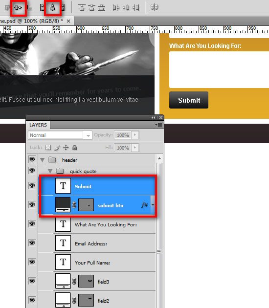
    30 Choose the Move Tool (V) from the Tools panel and click Align vertical centers and Align horizontal centers from the Options bar. (Alternatively, you can get the same result by going to Layer > Align > Vertical Centers and Layer > Align > Horizontal Centers).
    22-25_design_smashing_website.jpg

    Creating the main content area

    31 Create a new group and name it "content". Select the Rectangle Tool (U). Create a rectangle of 300px by 175px and name it "c01". Place this layer 30px below the header and 0px from the left guide. Double-click the layer and use the settings from the following image.
    22-26_design_smashing_website.jpg

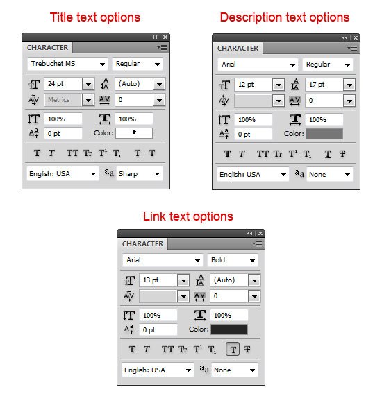
    32 We are going to add content to this box now. Select the Horizontal Type Tool (T) and add the text, "About SmashingDzine". Make a selection of the "About" word using the Horizontal Type Tool (T), and then change its color to #b47825. Then make a selection of the "Smashing" word, and then change the color to #2f2f2f. Add a little description and a link text beneath the title. The following options were used for the title, description and link text. (You can adjust these options as needed).
    22-27_design_smashing_website.jpg

    For the Title:


    • Font: Trebuchet MS, style: Normal, size: 24pt, anti-aliasing method: Sharp
    For the Description:


    • Font: Arial, style: Normal, size: 12pt, anti-aliasing method: None, color: #767676
    For the Link text:


    • Font: Arial, style: Bold, size: 13pt, anti-aliasing method: None, color: #252525, Underline
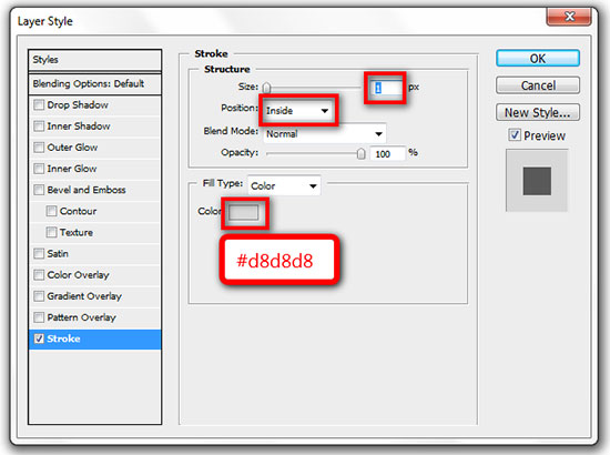
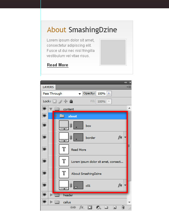
    33 We will add a square box next to the description now. Select the Rectangle Tool (U) and color #ffffff, hold down the Shift key to maintain the proportions and create a square with the size 88px by 88px. Move this square at a distance of 10px from the left of rectangle ("c01"). Name this layer "border". Double-click the layer to open the Layer Style dialog window, and add a Stroke layer style with the following settings:
    22-28_design_smashing_website.jpg

    34 Create another box with the size of 82px by 82px and place it in the center of the "border" layer. Name this layer "box" and change the color of this square to #d5d5d5. Select all layers in this group ("content" group), go to Layer > New > Group from Layers (Ctrl/Cmd + G) and rename this new group "about".
    22-29_design_smashing_website.jpg

    Note: The inside grey square box is a place holder for an image and can be replaced with any image of your choosing.
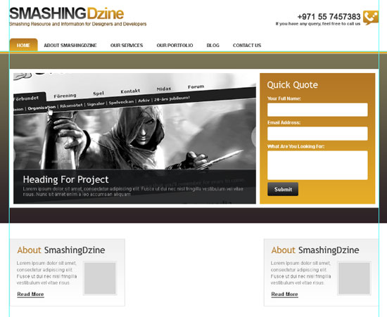
    35 Duplicate the "about" group (Right-click on the group and select Duplicate Group) and name it "services". Right-click on the "services" group and select Duplicate Group again and name it "portfolio". We have three groups now ("about", "services", and "portfolio"). Move the last group ("portfolio") to the right guide as shown below.
    22-30_design_smashing_website.jpg

    36 Select all three groups in the Layers panel, and then go to Layer > Distribute > Horizontal Centers to space them out equally. Click here to see the full size image of the following image.

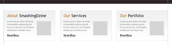
    37 Change the titles for the "services" group (center) and "portfolio" group (right) as shown below. (You can change these titles according to your requirement.)
    22-33_design_smashing_website.jpg

    Creating the footer

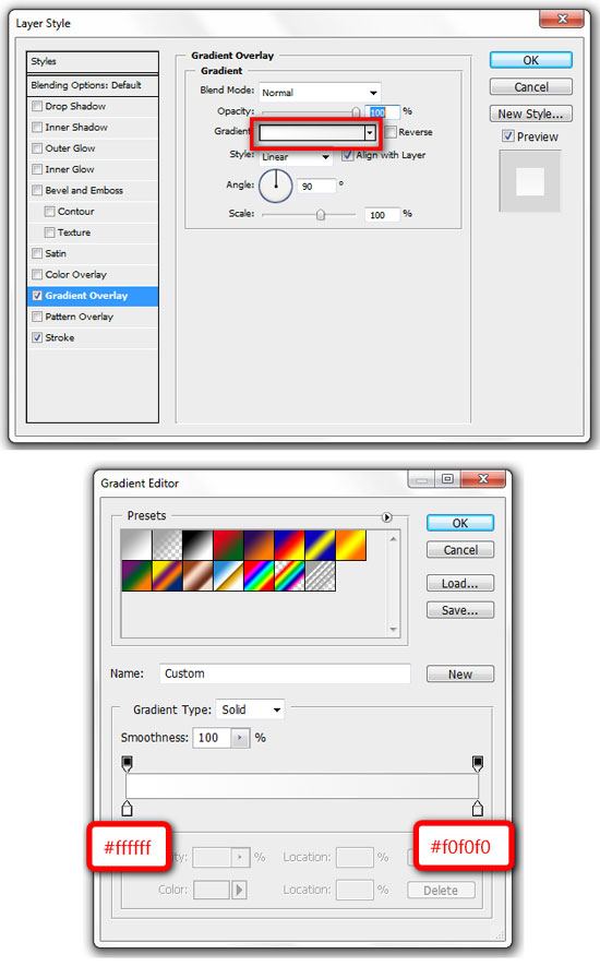
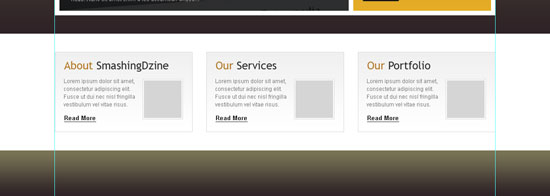
    38 Create a new group and name it "footer". Select the Rectangle Tool (U) and create a rectangle with the size of of 1200px by 100px at the bottom of our design layout. Name this layer "footer bg". Use the same Gradient Overlay style as the "header bg" layer by right-clicking the "header bg" layer and choosing Copy Layer Style. Go back to the footer group, right-click the "footer bg" layer and select Paste Layer Style.
    22-34_design_smashing_website.jpg

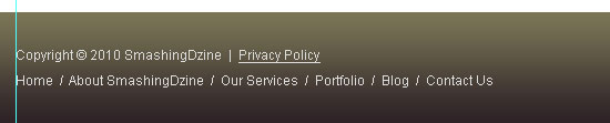
    39Select the Horizontal Type Tool (T) and add copyright text and footer links text on the left using the font Arial, size of 12pt and a grey color (#dddddd).
    22-35_design_smashing_website.jpg

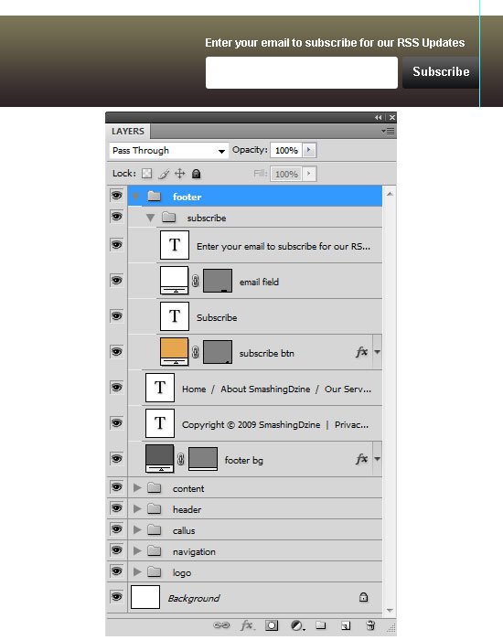
    40 We are going to add the email subscription section on the right. Create a new group inside the "footer" group and name it "subscribe". Select the Rounded Rectangle Tool (U) and create a rectangle of 85px by 35px. Name this layer "subscribe btn".
    41 Repeat Step 26 for adding the form fields and labels.
    42 Select the Horizontal Type Tool (T) and type "Subscribe" using the font Arial, style set to Bold and size at 13pt. Select both layers ("subscribe btn" and "Subscribe text").
    43 Repeat Step 28 for creating the subscribe button.
    44 Select the Rounded Rectangle Tool (U) and set the radius to 3px. Create a rounded rectangle with the size 210px by 35px using a white color (#ffffff) and name this shape layer as "email field". Add a text line above "email field".
    22-36_design_smashing_website.jpg

    22-37_design_smashing_website.jpg

    Final Result

    OK, that’s it and we are done. Here is the final result. Click on the image below to see the full size layout.
    Thanks for following along with my tutorial. I hope you all enjoyed and learned something new from this tutorial. Kindly leave your comments below and share your thoughts and opinions, I would love to hear them. You can also share this design tutorial to your friends if you think it could be helpful to them!

     

    Heshanck93

    Active member
  • Apr 26, 2007
    3,739
    22
    38
    33
    aney kauru hari mata Photoshop download link deeepangzzz...mage thibba eka delete wuna ...
    (File size 100mb walata adui nang hondai ..:) )
     

    Heshanck93

    Active member
  • Apr 26, 2007
    3,739
    22
    38
    33
    aney kauru hari mata Photoshop download link deeepangzzz...mage thibba eka delete wuna ...
    (File size 100mb walata adui nang hondai ..:) )
     

    creativeN

    Well-known member
  • Jul 13, 2009
    5,667
    991
    113
    CATCH ME IF U CAN
    EVIL EYE

    GoodEvil.jpg
    Split a photo into two distinct sides

    In this tutorial, we’ll be taking a photo and splitting it in two. One side of the photo will be light and colorful while the other in contrast, will be dark, evil and brooding. This is a complete re-write of my popular tutorial. With the new design, I figured it was time to update the tutorial and improve some of the confusing steps.​
    I’m assuming you have general knowledge of Photoshop, know how to use various layer blending modes and applying brushes. If you have any questions or have problems with a step, be sure to leave a comment and let me know.​

    Step_01_thumb.jpg
    Getting started with a good stock photo, managing layers

    The foundation of any good photo manipulation is to find the photo that suits your needs best. For this tutorial, I chose Stock-33 by Liquid Venus simply because it offers a front-facing shot, because she’s, quite frankly, very pretty, and the lighter eye color and contrasting eyeliner will simplify some of our work later on.​
    After you’ve grabbed and opened the photo in Photoshop, resize it to 800×690. Since we’re splitting the image in two, let’s create two layers from the two halves. Select your Marquee Tool and change the Style to Fixed Size. In the width and height boxes, enter 400×690 respectfully. Make your selection along the right edge of the photo, thus selecting half the photo starting from the right. Hit Ctrl+C to copy the selection followed by Ctrl+V to paste it in a new layer. If you need to, move the layer back into it’s proper location. Do the same for the left side as well.​
    Now would be a good time to rename your new layers so we don’t lose track. Rename the new layer to Right Side and the other to Left side. Set both layer’s blending modes to Soft Light to enhance features.​
    Create one more layer on top and rename it to Line. As its name suggests, we’ll make our separation line on this layer. Select your Single Column Marquee Tool and create a black line on the split.​
    Step_02_thumb.jpg
    Desaturate the evil side

    Select the Left Side layer and grab your Sponge Tool. Make sure the mode is set to Desaturate and at 40% flow. Select the Soft Round 100px brush and make a few passes on the layer, focusing on the skin and lips. Don’t go overboard. We’re trying to go for an “undead skin” look.​
    Take out the eye

    While we’re working on our dark side, let’s go ahead and remove that pretty eye. Create another new layer above Left Side and rename it to Evil eye. Select your Brush Tool and choose the Soft Round 35 pixels brush and select black as your foreground color. On this new layer, carefully brush over the eye in solid black. Set that layer to Overlay and create another layer above it. This time, will in the white area using a soft brush with color #200505 and again, set the layer Blending Mode to Overlay. Rename this layer to Eye Red.​
    Adjust your Hue for enhanced evil-ness

    Select the Left Side layer and head into the Hue/Saturation panel. In the sliders, move the hue slider to the right up to 155, the saturation level to 20 and the lightness to -30. Accept those changes and let’s keep going.​
    Step_04_thumb.jpg
    It’s texture time!

    Let’s start by grabbing an appropriate texture from a photo. I chose Concrete Texture Thing by Cranial Bore. Save the texture and open it in Photoshop. Place it in a new layer, above all of the others, but right under the Line layer. Rename this new layer to Texture and change its Blending Mode to Hard Light. Lower the opacity to 80% and apply a layer mask.​
    We now need to mask away parts of the image we don’t want to texture. To do so, click on the Layer Mask to active it and choose Black as your Foreground Color. Select the Brush tool and using the various round brushes, mask away the hair and the lips. You mask away the entire right side using a 400×690 rectangular marquee and filling the select in black.​
    Finally, open the Hue/Opacity Panel and drag the Saturation slider all the way down.​
    Burn ‘er

    Select the Left Side layer and grab the Burn Tool. Set the Range to Highlights and the Exposure to about 80%. Select a large, round brush and pass over the skin to create dark “burn” spots. I basically made one pass that covered the entire area, and a second one to target around the eyes and the lips. You can repeat the same process over a few select spots using the Highlights and Shadows Ranges as well.​
    Step_05_thumb.jpg
    Brush me gently

    Now that we have the texture in place and darkened the skin a bit, it’s time to get some detailing done. We’ll be using a variety of grunge brushes to create various effects.​
    First, let’s create a new layer right above the Left Side and rename it to Brush 1. Set the blending mode to overlay and reduce opacity to about 30%. Using a soft, round brush in black, brush around the eye to create a wound and make an outline around the left side of the face to create depth.​
    Create another layer, this time renaming it to Brush 2. Grab the Messy Makeup brush set and open them in Photoshop. Using the second brush in the set, place a run of makeup under her eye. Use the same brush scaled down to create another small drip under her lips on the Brush 3 layer.​
    That should be enough for now. You can add more detail if you’d like now that you have a good idea of what to go for.​
    Move to the light side

    Let’s get some work done on the light side by adding in some sparkles. Start by creating a new layer above Right Side and rename it to Sparkles. Select the Brush tool and from the default brush set, select the 14px star brush. Open the Brush panel and apply the following settings to your brush:​
    Brush Tip Set
    Spacing: 100%​
    Shape Dynamics
    Size Jitter: 100%
    Angle Jitter: 100%​
    Scattering
    Scatter: 1000%
    Both Axes Checked.
    Count: 3​
    Set your foreground color to white and brush a couple of strokes around the face and eye area. Once you’ve got something, apply a white outer glow to the sparkles to make ‘em shine.​
    Step_06_thumb.jpg
    Lighten up the eye

    While our model already has beautiful eyes, we’re going to go ahead and make them even better. Select the Right Side layer and select your Elliptical marquee tool. Create a selection around the colored portion of the eye, then create a new layer from the selection. Rename it to Eye color and open the Hue/Saturation panel.​
    Tweak the Hue and Saturation sliders until you find something you like. I made it purple and changed the Blending Mode to color, then masked away the extra material.​
    Making it all warm and fuzzy

    Select the Right Side layer and change the Blending Mode to Overlay and apply a Gaussian Blur of 10 pixels in strength. Notice how soft and smooth our light side now looks. Drop the opacity down to 50% to complete the effect. If you’d like to enhance the lightness effect, open the Levels panel and move the right-hand slider towards the center to increase white levels’ intensity.​
    Step_07_thumb.jpg
    Wrapping up

    We’re done. In a few short steps, we’ve taken a perfectly innocent picture and created an evil side and a light, soft side and maximized their respective attributes through the use of various tools, image adjustments, brushes and textures. If you have any questions regarding this tutorial, be sure to post a comment and I’ll do my best to help you out whenever possible.​
    Last but not least, throw in a frame by increasing your canvas size and filling the empty space in black and call it a day​
     

    creativeN

    Well-known member
  • Jul 13, 2009
    5,667
    991
    113
    CATCH ME IF U CAN
    Create An Elegant 3D Text Effect in Photoshop

    In this tutorial you’ll learn how to create an elegant 3D Text effect using simple the shape tool, layer styles and paths.​
    Step 1: Setting Size

    Make a new document. I’m choosing a standard desktop resolution of 1280×1024 so this can be used as a wallpaper.​
    Step 2:


    Now press “U” and select the rectangle tool. Create a rectangle that is the size of the document. Name this rectangle layer “Gradient”. Now apply a layer style with a gradient overlay using these colors #af1854, #f0d6c0 and #ffffff. Be sure the gradient is set to Radial.
    Step 3:

    Now transform the rectangle named “gradient” and increase it’s size from all sides. The gradient will stretch along with rectangle and the background will look like this:​
    Step 4:

    Now click on type tool and write “Think” on a new layer. Name this layer “Think”. I used Helvetica Neue 75 bold. Apply an inner glow with these settings:
    Blend Mode: Multiply
    Color – black
    Opacity – 8%
    Size – 13 px
    Note: These values may change depending on the size of your font. Use the image below for reference.
    The text will look like this:
    Step 5: Creating 3D Text

    Duplicate the text layer and position it behind “Think” layer. Name this layer “3D”. To give it a 3D look, we need to extract all the highlighted 3D faces of text . Let’s start with letter “T”.
    Press “U” and create a rectangle of equal width above the letter “T”. Don’t forget to turn on “shape layer”. Fill this rectangle with any color and give opacity 20%.
    Press “A” and select the direct selection tool. Select the upper two anchor points and align them by pressing the right arrow to give the top of your “T” a 3D look. Name this shape “T1″.​
    Create other faces shown below using the same process. Name these T2 and T3.​
    Step 6: Giving Shadows

    Select the face T1 and change it’s color to white. Hold Ctrl and click on layer T1 to get selection of layer. Create a new layer and name it “T1shadow”. Select a brush, and using the color black, hardness 0% and size 50 px. Drag from left to right to give it depth.
    Step 7:

    Repeat step 5 & 6 to the rest of the characters. Give shadows to other letters carefully. If everything is done correctly, the result will look like this.
    You may decide to apply your shadows differently. I’ve applied shadows that gives the text a bit of a soft glossy feel.​
    Step 8:

    Select all layers except the background layer, group them and name the group “Think”. Copy the group and merge all the layers of this group copy. This layer will be automatically named as “Think”. Duplicate the Think layer and change the blending mode to multiply with 50% opacity.
    Step 9:

    To create a perfect shadow we need to establish a perspective viewport. Create a new document of size 900 x 600 px. Press ctrl + ” to show the grid. Press print screen to copy the entire desktop. Open new document, paste the image and remove the area without the grid.
    Copy this grid and paste it in our work document. Change it’s blending mode to multiply to see through it. Transform it to create a plane on which the shadow will fall.​
    Step 10: Shadowing

    Duplicate the Think layer and fill it with black. Transform it to make it fall onto our grid.
    Fill in empty spaces where we added extra faces on our characters with black and merge them with the think shadow layer. Now our shadow will look like this:​
     

    creativeN

    Well-known member
  • Jul 13, 2009
    5,667
    991
    113
    CATCH ME IF U CAN
    Step 11:

    Apply a Gaussain Blur to our shadow layer “think shadow” and change it’s blending mode to multiply. Now add a layer mask to the “think shadow” layer to fade out the shadow using a gradient (or use a soft eraser).
    Step 12:

    Looking pretty good! Now let’s add some lighting effects. Press P to select the pen tool and create a Path like this.
    Now select a brush of size of 5px with 100% hardness. Select White as your foreground color. Select the pen tool again—the path you drew before should still be there. Right click and select “stroke path” tool. Select Brush from drop down menu and turn on “stimulate pressure”. You will get stroke like this:​
    Step 13:

    Name the this stroke layer as “Wave 1″ and duplicate the layer. Go to filter > Distort > Wave and apply filter with these settings:

    This will give an extra wavy look to the stroke.
    Step 14:

    Create some more waves by following the steps 12 & 13 and arrange them around the text. Apply a light gussian blur to some waves to give them a sense of depth. If everything is done correctly then it will look like this:
    Step 15:

    As an optional step, we can add some stars to our text. Press “U” to select the custom shape tool and select 5 point star.
    Make a new document of size 100 x 100 px and make a star with the 5 point star shape. Fill it with black and then ctrl + click the same layer to get selection of star. Go to Edit > Define Brush Preset, create the brush and name it star brush.​
    Step 16:

    Press F5 to access the brush panel and apply these settings:
    Brush tip shape – spacing 30%
    Shape Dynemics – size jitter & angle jitter 100%
    Scattering – 578% on both axis
    Other Dynemics – opacity 100%.


    Step 17:

    Select this star brush and keep its size to 15 px. Set foreground color to “#ff62ad“. Create another path with the pen tool, right click to select “stroke path”. Turn on stimulate pressure and create a wave of stars. Name this new layer something like “Star Wave”.
    Step 18:

    Now we just need to hide this star wave layer from some places to make it seem as if it is passing through layers. I prefer to use a mask, and manually filling in the areas I want to hide.