Photoshop Trix To You My Friend .....

creativeN

Well-known member
  • Jul 13, 2009
    5,667
    991
    113
    CATCH ME IF U CAN
    27.
    26.jpg

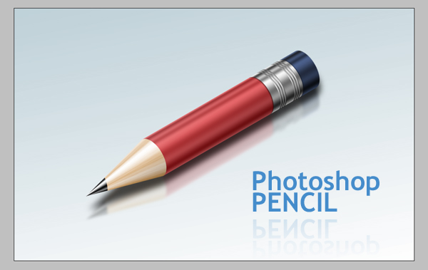
    The Pencil is one of the visual metaphors most used to express creativity. In this tutorial, I’ll show you how to draw a pencil icon. We’ll have a look at gradients, selection tools, and basic transform operations. Let’s have some fun with this.

    Step 1

    Create a New Document 950 pixels wide by 600 pixels heigh, set the Resolution to 300 pixels/inch, and the Background to white. Make a rectangular selection with a Style of Fixed Size, a Width of 400 px, and Height of 100 px.
    1.jpg

    Step 2

    Drag and snap guides to all edges and vertical center of the selection.
    2.jpg

    Step 3

    Open the gradient picker and select the "Steel Bar" preset from the drop down menu. If you can’t see the preset in the list, click the triangle button on the right and select "metals" from the list. Click Append. Create a new layer and name it "Body." Fill the selection with the gradient from bottom to the top of the selection.
    4.jpg

    Step 4

    To make our pencil more reflective go to Image > Adjustments > Curves (Command + M), and adjust it as in the below image.
    5.jpg

    Step 5

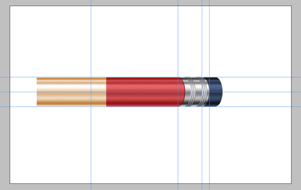
    With the selection still active, create a new layer and fill the selection with the color #d60005, then set the layer Opacity to 60%. Name the new layer "Color."
    6.jpg

    Step 6

    Right click the "Body" layer and duplicate it. Name it "Metal" and move it to the top of the layer stack. Select the Rectangular Marque Tool, set style to "normal," make a selection as in the image below, and hit Delete. Drag a guide from the left ruler and snap it to right edge of the selection.
    7.jpg

    Step 7

    Select the Elliptical Marque tool and make a selection from point 1 in the image while holding down the Alt and Shift keys. Right-click inside the selection and choose Transform Selection, then set the Horizontal Scale to 50%, and hit Enter twice to apply. Hit Delete to delete the selected area. This will give our pencil a perspective look.
    It’s a good idea to save it because we will need this selection later. Go to Select > Save Selection. Name the selection "Ellipse."
    8.jpg

    Step 8

    With the Marque tool still selected, drag the selection towards the right edge of the "Metal" layer. Drag another vertical guide until it snaps to the center of the selection.
    9.jpg

    Step 9

    Pick the Rectangular Marque tool, then while holding down the Shift key, make a selection as shown below. Go to Select > Inverse and hit Delete.
    10.jpg

    Step 10

    While holding down the Command key, click the "Metal" layer to load the selection (Click on the thumbnail of the layer, not on the layer name). With any selection tool selected, move the selection 4 pixels right. You can do it by pressing the Right Arrow on the keyboard 4 times.
    Go to Select > Inverse. While holding down the Command + Alt + Shift keys, click on the "Metal" layer. Alt + Shift combination is for intersecting the already selected area and the new selection that we’re going to make. The new selection is the metal part because we’re holding down the Command key as well. So the metal part and our current selection will be intersected. Using this selection make a thin line on the metal part selected. Use these lines to make the bumps.
    11.jpg

    Step 11

    Copy and paste the selection into a new layer and name it "Bump." Apply a Gradient Overlay and Bevel and Emboss with these settings. To make it slightly bigger than the metal layer, hit Command + T, and set the Vertical Scale to 102%.
    12.jpg

    Step 12

    Duplicate the "Bump" layer and move the copy 6 pixels to the right. Repeat this step once more to make a total of 3 bumps. Select these 3 layers and merge them (Command + E.) Duplicate the merged layer to create another set of bumps and place it as you like.
    13.jpg
     

    creativeN

    Well-known member
  • Jul 13, 2009
    5,667
    991
    113
    CATCH ME IF U CAN
    Step 13

    Duplicate the "Metal" layer and name the copy "Eraser". Drag the "Eraser" layer below the "Metal" layer. Move the "Eraser" layer about 60 pixels right. Go to Image > Adjustments > Hue/Saturation (Command + U.) See the image below for the Hue/Saturation settings.
    Duplicate the "Metal" layer again and name the copy "Shadow." Drag the "Shadow" layer below the "Metal" layer. Hit Command + U and bring the lightness to -100. Go to Filter > Blur > Motion Blur. Set the Angle to 0 and Distance to 5, then apply it. Now we can merge the layers related to the metal part of the pencil. Choose "Shadow," "Metal," and Bump layers, then Hit Command + E to merge them.


    14.jpg

    Step 14

    Create a new layer and name it "Tip." Using the Polygonal Lasso tool make a selection, as in the image below. Fill the selection with a light yellow orange. Move this layer down below the "Body." Go to Select > Deselect to loose the selection (Command + D).
    15.jpg

    Step 15

    Select and Duplicate the "Body". Name the new layer "TipGradient." Move this layer to the top. Hit Command + T, then set the scale and position as in the below image. Hit Command + U to bring up the Hue/Saturation dialog box and use these settings: Hue set to 33, Saturation set to 53, Lightness set to +37, and Colorize Checked.
    15a.jpg

    Step 16

    Drag "TipGradient" layer down below the "Body" layer. Hold down Alt and click between the "TipGradient" and "Tip" layers.
    16.jpg

    Step 17

    With "TipGradient" layer selected, go to Edit > Transform > Perspective and adjust the perspective like this.
    17.jpg

    Step 18

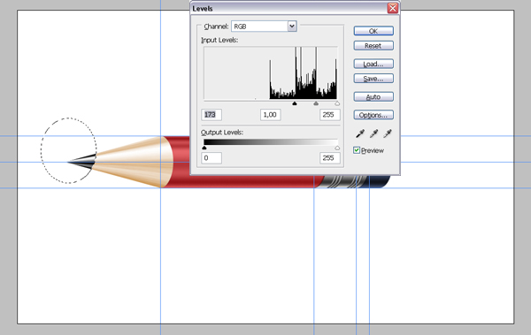
    Go to Select > Load Selection, and load the selection "Ellipse." Position the selection as in the image, then Delete the selected area from both the "Body" and "Color" layers.
    18.jpg

    Step 19

    With the "Color" layer selected, create a new layer and name it "Wood." Press D on the keyboard to change the Foreground and Background colors to black and white. Press X to make foreground white. Fill the selection with white. Then go to Filter > Render > Fibers. Use 10 for both variables. Hit Command + T, rotate it 90 degrees counter clockwise, and scale it as shown below.
    19.jpg

    Step 20

    Go to Edit > Transform > Perspective and adjust the perspective as shown. Set the Blending Mode to Soft Light and Opacity to 60%.
    20.jpg

    Step 21

    Get the Elliptical Marque tool and make a selection, as shown below. Select the "Wood" layer and hit delete. Select the "TipGradient" layer and hit Command + U, then set the Saturation to -100. Hit Command + L and apply these settings. This will make the tip darker and high contrast.
    21.jpg

    Step 22

    Now we’re about to finish. Select all the layers except the "Background" layer and Hit Command + E to merge them. Rename the layer as "Pencil." Duplicate the "Pencil" layer and name it "Reflection." Drag the "Reflection" layer below the "Pencil" layer.
    Duplicate the "Reflection" layer again, and name it "Shadow." With the "Shadow" layer selected hit Command + U and set the Lightness to -90. Hit Command + T and scale it to three-fourths of its height. Choose the "Reflection" layer, then go to Edit > Transform > Flip Vertical.
    22.jpg

    Step 23

    With all layers selected except the "Background" layer, hit Command + T, and rotate them -30 degrees. Move the "Shadow" and "Reflection" layers as shown below.
    23.jpg

    Step 24

    Choose the "Reflection" layer and go to Filter > Blur > Gaussian Blur. Apply it with a Radius of 3 and set the Opacity to 60. Choose the "Shadow" layer, then go to Filter > Blur > Gaussian Blur. Apply it with a Radius of 7 and set the Opacity to 80.
    23.jpg

    Step 25

    With the "Reflection" layer selected, add a Layer Mask using the Add Layer Mask button, which is located at the bottom of the Layer Palette. Fill the mask with the Gradient tool, from white to black, which makes the shadow vanish.
    24.jpg

    Step 26

    With the "Pencil" layer selected, apply a Gradient Overlay with these settings.
    25.jpg

    Step 27

    That’s it! You can change the position and also change the background color if you wish. You can view the final image below or view a larger version here.
    26.jpg
     

    creativeN

    Well-known member
  • Jul 13, 2009
    5,667
    991
    113
    CATCH ME IF U CAN
    28.
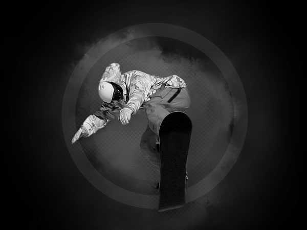
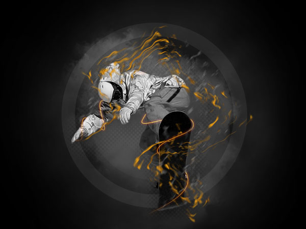
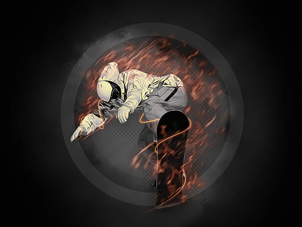
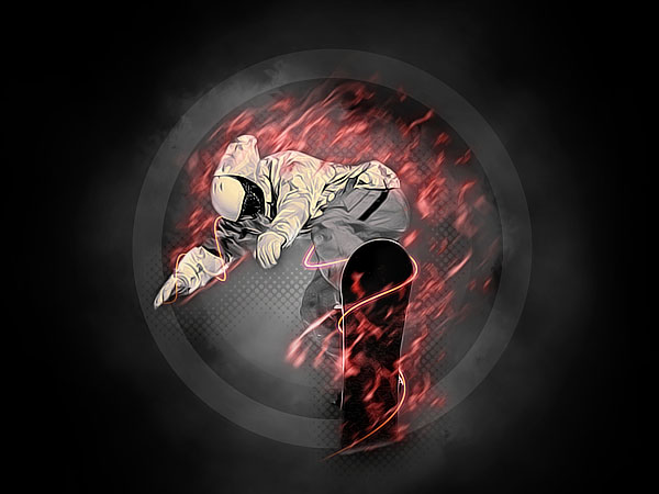
    Instead of riding snow, this boarder is flying through flames. In this tutorial, we’ll create fire and smoke without using any photos. You’ll learn how to combine both to create a flaming, dynamic image that jumps right at you.
    The Photo

    First, we need an image to work with. I chose an image of a snowboarder jumping from Stock.xchang, it’s great because he’s quite isolated against a straight blue background, which will make cutting him out much easier.
    snow.jpg

    Step 1

    Let’s start off with a subtle gradient. Create a Radial Gradient ( Layer > New Fill Layer > Gradient) with a black outside and a dark grey inside.
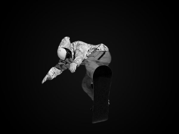
    Next, import the image you wish to edit on a new layer. Scale it, place it, and cut it out. If you choose a snowboarder against a blue sky like me, it’s easy to cut using color range ( Select > Color Range…) or the Magic Wand tool. I desaturated ( Image > Adjustments > Desaturate) the image because I only want the flames to be colored. This will give a punchier effect.
    01.jpg

    Step 2

    Now we’ll create the background and the smoke. Create a new layer under the snowboarder and use the clouds filter on it ( Filter > Render > Render Clouds. Make sure you have white and black as front and back color). Erase over the outside and over the place where snowboarder sits and then set the Opacity to 18%.
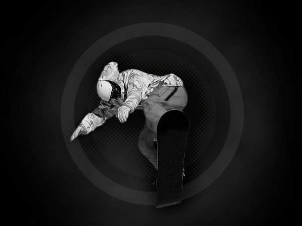
    On a new layer, use the Elliptical Marquee Tool (M) to create three circles and fill them with different shades of grey (start with the biggest one). You can also duplicate the layer, resize the circle (with Shift+Alt selected) and fill it with another shade. Change the opacity to make the circles less visible.
    I also used a halftone effect behind the snowboarder.


    02.jpg

    Step 3

    To create more smoke, I copied the snowboarder to a new layer and used the Smudge Tool (R) on it. Change the settings to what you see below and just move your mouse around to create a smoke-like effect. I set this layer’s opacity to 40%. It’s located beneath the boarder but above the other background layers.
    Smudge settings:
    Spacing: 10%
    (In Shape Dynamics:)
    Size Jitter: 46%
    Minimum Diameter: 64%
    Angle Jitter: 30%
    Roundness Jitter: 0%
    (In Scattering:)
    Scatter: 43%
    Count: 1
    Count Jitter: 86%
    (In Other Dynamics:)
    Strength Jitter: 100%
    03.jpg

    Step 4

    This has been discussed in other tutorials, but in case you haven’t seen it explained yet, don’t skip this step.
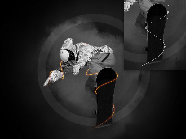
    Take out the Pen Tool (P) and create a path around the snowboard and the right arm. When you’re finished, right-click the path and choose Stroke Path (Set your brush to the right size first. In my case, a 1px hard brush.), you can use Simulate Pressure if you like.
    Delete the vector path (Right click > Delete Path) and erase the parts you don’t need (behind the board/arm) on the newly created line. In the Blending Options for this layer, I chose an orange Color Overlay and red Outer Glow set to Linear Dodge.


    04.jpg

    Step 5

    Now we’ll create the hardest part: the flames. Create a new layer and choose a 5px hard brush.(I chose a shade of grey because I wanted to add real color to it later. You can start with that already by choosing an orange color for this step, if you like). I used my Wacom to create some random flame-like strokes. If you’re using a mouse, you can right-click anywhere on the canvas to change your brush size easily. Try varying them and make them go in one direction. I’m making most go from bottom left to upper right.
    box.gif

    Step 6

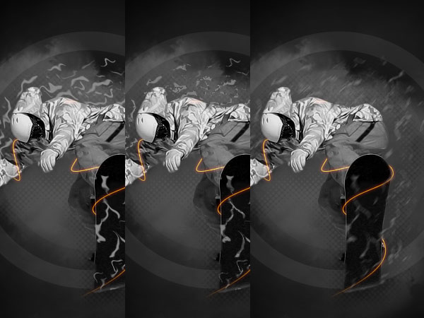
    Next, I used three filters on those flames to make them appear more realistic. I started with the ripple filter ( Filter > Distort > Ripple) at 100%. Next, I used ocean ripple ( Filter > Distort > Ocean Ripple) with default settings, this will not change the shapes but it will create some darker and lighter tones in the flames. I faded that filter ( Edit > Fade Ocean Ripple) to 40%. The last filter is a motion blur ( Filter > Blur > Motion Blur), set the angle right (45° here), and choose a low value. I changed the Opacity of the layer to 66%.
    06.jpg

    Step 7

    To create even more flames, I duplicated that layer and used wave ( Filter > Distort > Wave) on it with the default values. I set the layer to orange in the preview so it would be clear what kind of outcome you can expect. I also lowered the Opacity to 66% and erased some parts that didn’t look good.
    07.jpg

    Step 8

    To bring out the flames more, I applied the image on a new layer ( Image > Apply Image) and gave that layer an Unsharp Mask ( Filter > Sharpen > Unsharp Mask). Then I created a grey to orange Gradient Map ( Layer > New Adjustment Layer > Gradient Map) to give the border an orange tint.
    The flames are still in need of color. Ctrl+Shift+Click on all the thumbnails next to the flame layers so you have a selection of the flames. Fill this selection, in a new layer, with orange and set it to Color with an Opacity of 80%.
    08.jpg

    Conclusion

    As finishing touch, we need some more light and color. Add a new layer and use apply image ( Image > Apply Image). In the lighting effects ( Filter > Render > Lighting Effects) options, add more lights to the scene (drag the light bulb icon onto the small preview). Erase the part of the snowboarder because it might get overlighted. You can set this layer to Lighten. The smoke might not be visible enough now, so if needed you can copy one of the layers and set it on top with a low opacity and erase over the main parts.
    Creating realistic fire isn’t easy and might not work out for the first time. But after some tries you might even end up with something better than me. If you wish to make it even more realistic, you can try to focus on the colors of the flames and give them a yellow inside and a red outside.
    In any case, hope you enjoyed the tutorial. Along with the flames, the main point here is to see how a little Photoshop adornment when combined with a photo can make a really punchy graphic, especially when you contrast the black and white areas with some strong color.
    09.jpg
     
    Last edited:

    creativeN

    Well-known member
  • Jul 13, 2009
    5,667
    991
    113
    CATCH ME IF U CAN
    29.
    Step 1: Darkenning the Image

    To start things off, open the portrait you plan to use. Make sure the Layers Panel and Adjustments Panels are open (you can open both panels from the Window menu). Then add a Levels Adjustment Layer by clicking on the levels icon (second icon from left to right on the first row) on the Adjustments Panel. As soon as you click on this icon a new layer will show above the "Background" layer on the Layers Panel and the content of the Adjustments Panel will change in order to display the Levels options. On the Adjustments Panel move the middle slider (gray slider) to the right until you reach a gamma value of 0.40.
    step1.png

    Step 2 – Masking Over the Eyes

    Select the Brush Tool (B) by clicking on the Brush Tool icon on the Tool Bar or by pressing B (don’t press B twice as this will take you to the Pencil Tool, or three times as this will take you to the Color Replacement Tool), go to the Control Panel, click on the down-pointing arrow next to the sample brush tip in order to display the Brush Preset Picker. Choose a soft brush of Master Diameter 65px and Hardness 0% (if you don’t see the basic brush set go to the right-pointing arrow on the top right corner of the panel and choose Reset Brushes from the menu, then select the right brush).
    step2_1.png

    Look at the values on the panel to make sure the diameter of the brush is 65px and the Hardness is 0%. Press Enter to close the panel. Press D to get the default colors on the Tool Bar and then X to invert them, now black should be your foreground color. Make sure the opacity of the brush is 100% (look the value on the Control Panel). Zoom in on the eyes. If you accidentally deselected the brush tool, press B again.
    step2_2.jpg

    Now select the Levels Adjustment Layer Mask (white square on the right of the levels icon on the Layers Panel), you’ll see a black rectangle around it when it’s selected.
    step2_3.png

    Paint with black over the eyes in order to hide the levels adjustment for that area careful not to paint over the eyelids (when you paint over the image with a layer mask selected you’re actually painting over the mask, not the image itself). Check the layer mask thumbnail, it should have the two black areas you just painted.
    step2_4.png

    Step 3 – Reducing Saturation

    Double-click on the Hand Tool in order to fit the image on screen. Click on the left-pointing arrow on the bottom left corner of the Adjustments Panel in order to go back to the adjustments list. Add a Hue/Saturation Adjustment Layer by clicking on the second icon from left to right on the second row.
    box.gif

    A new Hue/Saturation Adjustment Layer is added on the Layers Panel above the Levels Adjustment layer. Move the saturation slider to the left until you reach a value of -50.
    step3_3.png

    Step 4 – Changing the Color

    Go back to the main view of the Adjustment Panel and add a Color Balance Adjustment Layer by clicking on the color balance icon (third icon from left to right on the second row). A new Color Balance Adjustment Layer is added on the Layers Panel above the Hue/Saturation Adjustment Layer. Move the Yellow/Blue slider to the right until you reach a value of +35.
    box.gif

    Step 5 – Darkening the Hair

    Alt-click on the Create New Layer icon on the bottom right corner of the Layers Panel, name the layer "Darker hair" and click OK.
    box.gif

    The new layer should appear above the Color Balance Adjustment Layer. If it doesn’t, drag the layer to this position on the Layers Panel.
    step5_2.png

    Zoom out on the image in order to see the pasteboard (grey area around the image). Select the Brush Tool (B), and then choose a soft brush of Master Diameter 600px and Hardness 0%. Press Enter to close the panel. Press D to get the default colors on the Tool Bar, black should be your foreground color now.
    Paint over the hair and the neck, then change the blend mode of the layer to Soft Light by clicking on the arrows next to Normal on the upper section of the Layers Panel and choosing Soft Light from the menu.
    step5_3.jpg

    step5_4.png

    Step 6 – The Iris

    Alt-click on the Create New Layer icon, name the layer "Iris" and click OK. Zoom in on the eyes. Click on the Foreground Color Picker on the Tool Bar in order to open the Color Picker window. Enter the following values for RGB: R=242 G=150 B=70 and click OK.


    Step6_1.jpg

    Select the Brush Tool (B) and open the Brush Preset Picker. Choose a soft brush of Master Diameter 35px and Hardness 0%. Click Enter to close the Panel.
    Paint over the iris of both eyes careful not to paint over the pupil, the eyelids or the white area. Change the blend mode of the layer to Vivid Light and reduce the opacity to 70%.
    step6_2.jpg

    step6_3.png

    Step 7

    Alt-click on the Create New Layer icon in order to create a new layer, name it "Iris border." Zoom on the iris of one eye. Press D to get the default colours. Select the Brush Tool (B) and open the Brush Preset Picker. Choose a soft brush of Master Diameter 9px and Hardness 0%. Press Enter to close the panel.
    Paint over the border of the iris. Move the view to the other eye (you can use the Hand Tool, the Navigator Panel or the mouse wheel). Paint over the border of the iris. Then change the blend mode of the layer to Multiply and lower the opacity to 80% either by clicking on the right-pointing arrow next to 100% and moving the handle to the left until you reach 80% or by clicking on the value and typing 80.
    step7_1.jpg

    Go to Filter > Blur > Gaussian Blur, select 2.0 pixels and click OK.
    step7_2.jpg

    Step 8 – Dramatic Eyes

    Zoom over the eyes. Alt-click on the icon Create New Layer, name it "Eye shadow" and click OK. Press I to get the Eyedropper Tool or select it by clicking on the Eyedropper icon on the Tool Bar. Click with the eyedropper below the eye in order to lift a brown color. Look at the colors on the Toolbar; you should see this color as your foreground color now.
    step8_1.jpg

    Select the Brush Tool and choose a soft brush of Master Diameter 100px and Hardness 0%. Press Enter to close the panel. Paint over the eyelids and below the eyes careful not to paint over the eye.
    step8_2.jpg

    Change the blend mode of the layer to Multiply and lower the opacity to 60%.
    box.gif

    Go to Filter > Blur > Gaussian Blur, choose a Radius of 24.0 px and click OK.
    Step 9 – Tiding Up

    Alt-click on the Create New Group icon on the bottom of the Layers Panel. Name the group "Eye adjustments" and click OK. Select the layers "Eye shadow", "Iris border" and "Iris" and drag them into the Eye adjustments group. Now the layers should appear indented. Close the group by clicking on the down-pointing arrow on the left of the group icon.
    step9.png

    Step 10 – The Lips

    Alt-click on the Create New Layer icon, name it "Lips" and click OK. Click on the foreground color icon on the Tool Bar to open the Color Picker window. Type the following values for RGB: R=120 G=80 B=90 and click OK. Zoom in on the lips.
    Select the Brush Tool, open the Brush Preset Picker and choose a soft brush of Master Diameter 45px and Harness 0%. Press Enter to close the panel. Check on the Control Panel the opacity is 100% (if it’s not 100% press one). Paint over the lips. Change the blend mode of the layer to Multiply and lower the opacity to 50%.
    step10_1.jpg

    Step 11 – The Lips Shadow

    Alt-click on the Create New Layer icon, name it "Lips shadow" and click OK. Select the Brush Tool and paint over the bottom part of the upper lip and the upper part of the lower lip.
    box.gif

    Change the blend mode of the layer to Multiply and lower the opacity to 70%.
    step11_2.png

    Go to Filter > Blur > Gaussian Blur, choose Radius 15.0 px and click OK. Double-click on the Hand Tool in order to fit the image on screen.
    step11_3.png

    Step 12 – Fixing the Hair

    Add a Hue/Saturation Adjustment Layer. Grab the Target adjustment tool which is on the left of Master above the Hue bar.
    step12_1.png

    Place the cursor over the blue hair, you’ll see an eyedropper, click and drag to the left, now you’ll see the saturation slider moving to the left as well, therefore reducing the saturation, keep moving to the left until you reach -80.
    step12_2.jpg

    If this doesn’t get rid of all the blue on the hair, adjust the sliders on the color bar at the bottom of the Hue/Saturation Adjustment Panel. The two slim rectangles on each side of the dark grey area define the range of color that will get completely affected by this adjustment. The two triangles on each side, next to the light grey area define the transition area, this means the colors that will get less and less affected by the adjustment.
    If there’s still blue on the hair move these sliders to extend the range of colors affected by the hue/saturation modification.
    step12_3.png

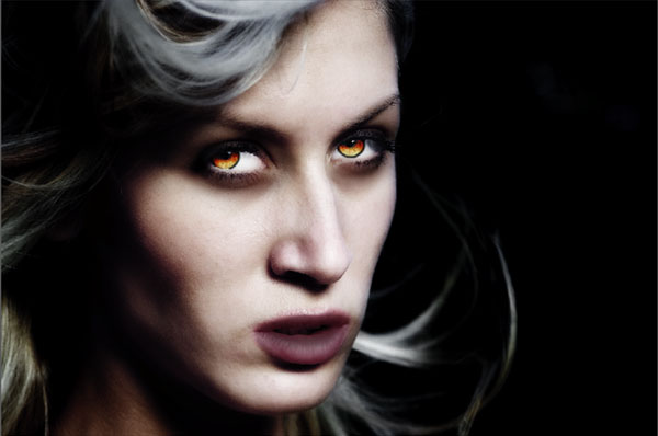
    Final Image

    excercise%20completed.jpg
     

    creativeN

    Well-known member
  • Jul 13, 2009
    5,667
    991
    113
    CATCH ME IF U CAN
    30.
    Step 1

    To start off, download Elegant Girl and open it with Photoshop.
    1.jpg

    First, isolate the image, you can use whichever method you like for this. I used the brush tool and a layer mask to isolate this photo (as well as all of the other stocks in the piece) but you should use whatever your most familiar with.
    2.jpg

    3.jpg

    4.jpg

    Step 2

    Once you have isolated out the female we will need to isolate the Marble Bust.
    5.jpg

    6.jpg

    7.jpg

    Step 3

    Now that we have our two main images, its time to start blending the two together. To do this we need to start off by creating a new document. So go ahead and press Cmd/Ctrl + N on your keyboard and set up the new document as I have done in the below screen shot.
    8.jpg

    Now drag and drop both of your stocks into the document. Create a duplicate of each layer (the bust you will need, the female just in case!). You will need to free transform them about 50% when doing this. To free transform them you will need to press Cmd/Ctrl + T on your keyboard.
    9.jpg

    When dropping the female in, free transform her (on top of the bust) so she fits about halfway up the bust as I have done in the below screen shot.
    10.jpg

    Step 4

    Once both stocks are in and sized appropriately, make a selection around the female stock by holding Cmd/Ctrl and performing a Right Click with your mouse on the layer. Once that is done, invert the selection by pressing Cmd/Ctrl + Shift + I on your keyboard.
    11.jpg

    Now erase away (on a layer mask) all of the bust that sticks out from behind our female stock.
    12.jpg

    Now switch back to your female stock layer. Once you have done that, grab a 400px soft edged eraser and erase away her edges too. Doing this will fade the statue into the female stock.
    13.jpg

    Step 5

    Now grab your duplicate bust and drag the layer above the female layer. Once you have done that select the female, invert the selection as we have done before, and remove all of the new statue that is not covering her.
    14.jpg

    Now set this to an overlay layer and erase any of the edges that are still hard. If need be, use your clone stamp (50px soft edged) to fill up any areas your overlay layer did not, for instance the neck.
    15.jpg

    16.jpg

    Step 6

    Now merge all of your layers. Once this is done, we will desaturate the entire layer; to do this press Cmd/Ctrl + Shift + U on your keyboard. Now that it has been desaturated we will fade this by pressing Cmd/Ctrl + Shift + F on our keyboards, fade the desaturation to about 40%.
    17.jpg

    18.jpg

    Now repeat the above process, this time fading it as an overlay at 100%. Next we will add in a little bit of color. To add in color we will press Cmd/Ctrl + U on our keyboards. Set up your hue and saturation editor as mine is below.
    19.jpg

    Step 7

    Now we can add in some more color. Make a new layer and fill it with purple, to create the new layer press Cmd/Ctrl + Shift + N on your keyboards, then press G on your keyboard to grab the fill tool. Once you have filled the layer with purple, go ahead and make a selection around the statue (as we did before) and delete everything that is not covering that statue.
    22.jpg

    Set this layer to overlay at 20%.
    23.jpg

    Next we need to add some more color in. To do this we will head over to the Layer drop down menu and go to Adjustment layers – Photo filters, once you have clicked this a new dialog box should appear with a few presets we can choose from as well as the opacity or Density of the layer. We will click the drop down menu and choose sepia with a density of 25%. Then just press ok! Just leave this layer as a normal layer at 100% and we will continue.
    24.jpg

    25.jpg

    Step 8

    Now we will head over to Zen Textures and grab a nice Rocky Texture.
    26.jpg

    Now we want to drop this in and repeat the isolation process as before (removing everything that doesn’t cover the statue). Once you have done this set it to overlay at 15% and then duplicate it and set it to color. Once you have set it to color you might want to add a Gaussian blur with a radius of about 5px so you get a nice smooth transition.
    27.jpg

    Next we will enhance our shadows/highlights. To do this create a new layer (Cmd/Ctrl + Shift + N) and then grab your brush tool. To enable your brush tool press B on your keyboard, once its enabled left click and set your brush up as mine is in the below screen shot.
    28.jpg

    Now press D on your keyboard, this will set your color swatches to black and white. Once you have done this just paint some black around the shadows and white around the highlights! Next apply a Gaussian blur with a radius of 4px.
    29.jpg

    Now set the layer that we painted as an overlay. Depending on how much black/white you painted you may need to tone the opacity of this layer down, I kept mine at about 75%. Also be sure to erase anything that gets off of your statue! Now just merge all of your layers, to do this press Cmd/Ctrl + Shift + E on your keyboard.


    box.gif

    Step 9

    Now we need to go ahead and choose our background image. We will use a stock of a Museum Gallery located at Shutter stock.
    box.gif

    Place this stock into a 2000 x 3000 document and apply a Gaussian blur with a radius of 9px.
    box.gif

    Step 10

    Now we can grab our final stock, the Greek Pillar. This is also located at Shutter Stock. Once you have the pillar stock isolate it out as you have done your previous stock images.
    box.gif

    box.gif

    Now pull the pillar stock into our 2000 x 3000 canvas and then pull in the statue. Once both are in, align them as I have done in the below screen shot.
    35.jpg

    Step 11

    Once everything is lined up nicely, go ahead and apply the same coloring techniques we applied to the female/bust to the pillar. This way everything will blend together nicely.
    36.jpg

    Step 12

    Now grab a Gold Texture. We will use this gold texture to give the statue a name plate.
    37.jpg

    Once you have the texture and have dropped it onto your canvas, apply a Gaussian blur with a radius of 4px as we have done prior. Once that is done all you need to do is free transform it into a tiny rectangle and clean off the edges with your marquee tool (M on your keyboard).
    box.gif

    Step 13

    To create the blood we will need to make a new layer. Once this is done enable your brush tool and set it up as mine is below.
    39.jpg

    40.jpg

    If you have a tablet, in your brush settings, enable the size jitter and set it to brush pressure. Now just draw some lines on your statue.
    41.jpg

    Step 14

    Next, we will draw some drips. To do this, draw a V like shape. The top of the V (the opening) will be where the drip meets the object (the statue) and the tip or point of the V will be the droplet. Once you have drawn a drip, set your brush settings as mine are so we can create some shadows/highlights.
    42.jpg

    Now that your brush is set up, just draw over the drip with your brush using black for shadows and white for highlights. If you’re having difficulty with this step you can adjust the opacity of the brush lower or use the burn and dodge tool. Now continue drawing drips for the rest of your statue. When doing so make sure all of your highlights and shadows face the same way!
    box.gif

    box.gif

    box.gif

    Step 15

    Using the same layer, we will now do some quick adjustments to the eyes. First off, set your brush back up to normal at 100% opacity and then set your color to white. Once that is done, make a slash in each eye to create a highlight. Once you have done that set your brush opacity back down to about 50% and using purple slightly cover the whites of her eyes.
    box.gif

    Now we can draw more drips and blood lines coming from the eyes. This is the epicenter of the blood, so make sure it looks good here!
    47.jpg

    Once you’re satisfied with your drips, we will create a new layer and set it to overlay. Now using the same red that we used for the drips, we can paint some ‘blood stains’ on the statue.
    48.jpg

    My image now looks like the below image.
    49.jpg

    Step 16

    Now repeat the blood process on the pillar.
    50.jpg

    Step 17

    Once you’re done with your blood we can start adding in some Cracks to the pillar and statue.
    51.jpg

    Drop this stock onto a new document and desaturate it as we did before, this time however do not fade it. Now we will do a manual level edit. To do a manual level edit press Cmd/Ctrl + L on your keyboard. This will bring up a diagram showing three different triangles, set yours up as mine is in the below screen shot.
    52.jpg

    Our stock now looks like the below image.
    53.jpg

    Now using a 300px soft edged eraser go ahead and clean up the sides/edges of the stock. We could clean up the inside as well but any texture given off will be fine.
    54.jpg

    Once you have cleaned the crack up a bit, make a selection around it. We will now create a brush out of our stock. To create the brush make sure your stock is selected and click the Edit tab, once you have clicked the Edit tab select Define Brush Preset. Now just apply your brush to the statue/pillar.
    55.jpg

    box.gif

    box.gif

    When doing this it’s best to use more then one crack stock. I used several as shown below.
    box.gif

    My image now looks like.
    box.gif

    Step 18

    Now we can repeat this process with a Spider Web stock to add some web effects.
    box.gif

    box.gif

    62.jpg

    box.gif

    Conclusion

    To finish the piece off I merged it down, applied a color adjustment (Cmd/Ctrl + Shift+ B on your keyboard), sharpened it and sized it.
    I hope you enjoyed reading my tutorial and have picked up a trick or two. Or at least came out with some ideas/an image you liked!
    final.jpg