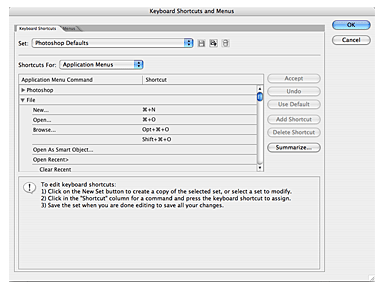
KASTIYAMA DAN NATHI DEWAL AHANNAAAAAAAAAAAAAAA

mama nan isi deyak danne nesharki333 said:aniwa photoshop gana dannathi dewal ahala danagannaaaaaaaaaaaaaaa
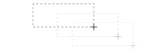
 menna meka karana hati


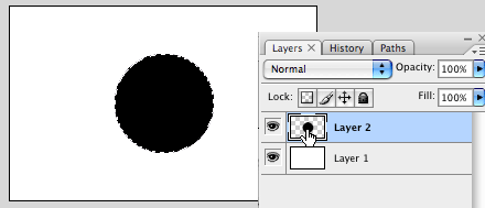
 menna hadana widiha
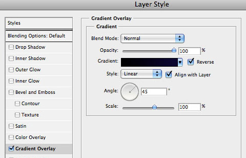
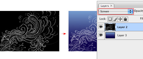
") . Again, open the layer styles panel, and mix Gradient Overlay with Outer Glow styles, and combine them with Screen, or Overlay as layer Blending Mode. A secret hint: when glowing, try using brightly and vivid colors, such as yellow, lime, pink, or cyan, picking the color that is in complementary contrast with the dark gradient we did on the beginning.
. Again, open the layer styles panel, and mix Gradient Overlay with Outer Glow styles, and combine them with Screen, or Overlay as layer Blending Mode. A secret hint: when glowing, try using brightly and vivid colors, such as yellow, lime, pink, or cyan, picking the color that is in complementary contrast with the dark gradient we did on the beginning.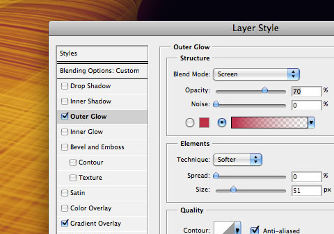

sharki333 said:Chroma Wallpaper
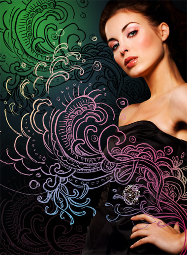
This tutorial explains how to create a energetic, vibrant, colorful wallpaper, like the ones available at Color Charge. These lines, which we’ll call Chroma were highly inspired by the iPod Nano Ad from 2006 and some Quantum Chromodynamics nerdery stuff. You will learn how to bend blurry shapes with Warp tool to draw the lines, beams, and steams. Then you’ll know how to add some glowing and vibrating color effects, and finally polish your drawing. Aside reading this tutorial, you’ll need Photoshop CS2 or CS3, and preferably a computer with a lot of memory and a larger screen to achieve that effect.
Download Photoshop file
Initial setup
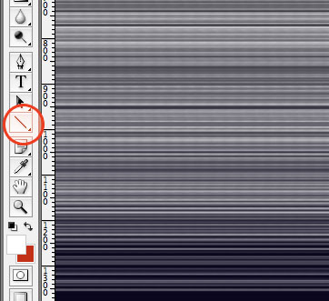
Start with a very, very large screen: 3000 px x 2000 px wide. Draw a rectangle as background for the whole area and fill it with a dark linear gradient layer style. Align that gradient with 45 degrees vertically (sometimes you may change that angle to 90 or 60 degrees). Since the beginning, pay special attention to colors: black and dark violet as base color. The waves colors will match a triad complementary balance with the base color, in our case, the violet-cyan-orange axis.

Warp Tool
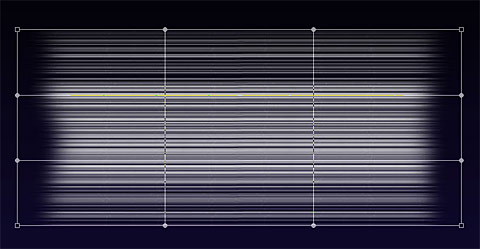
Draw lines! Many parallel lines (horizontal or vertical, or both!). Group them, duplicate, rasterize, group, duplicate, rasterize… and finally add some blur. In this example I used white as base-color for the line themselves (white is the easiest color to balance and add glowing and other layer styles):

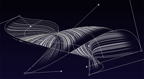
After you reach a wide and tall group of lines, is time for some magic: randomly distort the shape with Warp Transform Tool ( Photoshop > Edit > Transform > Warp ):

One thing you’ll probably notice is the amount of confusing structural lines crossing over the shape; your first attempts are going to be almost trial-and-error, later you’ll get used to this really amazing tool and will master the shapes of Chroma. Don’t worry trying to find the perfect shape so early, things will fit better together when you have more than 5 separate shapes matching a pattern or a familiar shape.
When complete, remember to press the Enter key, or click on the Apply Warp button, on the top. If your computer survives the intense rendering and image post-processing…your artwork should be something like this:

Remember to use the Erase Tool to remove sharpen edges and give the wave a surreal looking. Explore other combinations of shapes, lines, and textures - they’ll enhance your drawings.
If you did a small shape I don’t recommend you size it up or even warping again. The Warp tool isn’t that smart because you’ll be playing with rasterized shapes - not smart objects or vector shapes. If you insist warping the same shape again, your shape is going to get some unwanted sharpen or sometimes blurry edges (depending on your case). To avoid that, I recommend you the opposite way: start with a very large area and a large shape, then size it down. Better results, easier to distort.
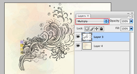
Glow, screen, multiply, and other layer styles
When you have the perfect shape, you will need to add its soul, I mean, the layer styles
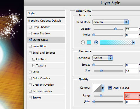
To achieve the Chroma effect, I used a gradient fill (yellow to gold), plus the following Outer Glow styles with the following configuration:

Brush polishing
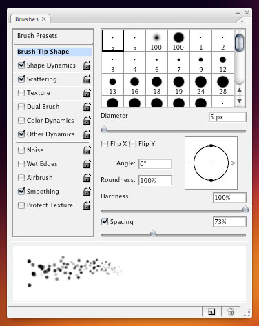
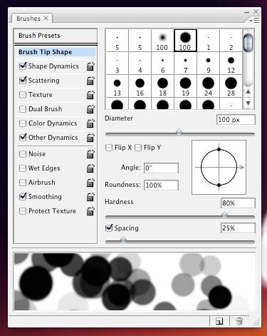
Bring your drawing to life with motion. Add some scattered round dots to simulate speed and movement. Within the Brushes panel ( Photoshop > Window > Brushes, or F5 ), explore the sizing, scattering (with fade), spacing, and pressure:

The big cells are just the way the smaller ones, except the size and spacing. A bit of randomness is really welcome and exciting:

The "range" option in this step is very important - it will give a cellular-looking to the glowing particles - like if they were intensely vibrating:

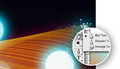
Poor kid…got any blurry edge? Don’t worry. Use the blur tool and correct that.

Finalizing the drawing
Be creative and fearless to do a complete mess with the shape - in my experience, the messier the better. Size down the area and crop. Draw as many layers as your computer’s memory can handle. Sometimes you won’t be able to merge layers because the effects and styles that were applied. Also use layer’s blending and opacity to give your shapes a translucent appearance.
Our final result, after cropping: